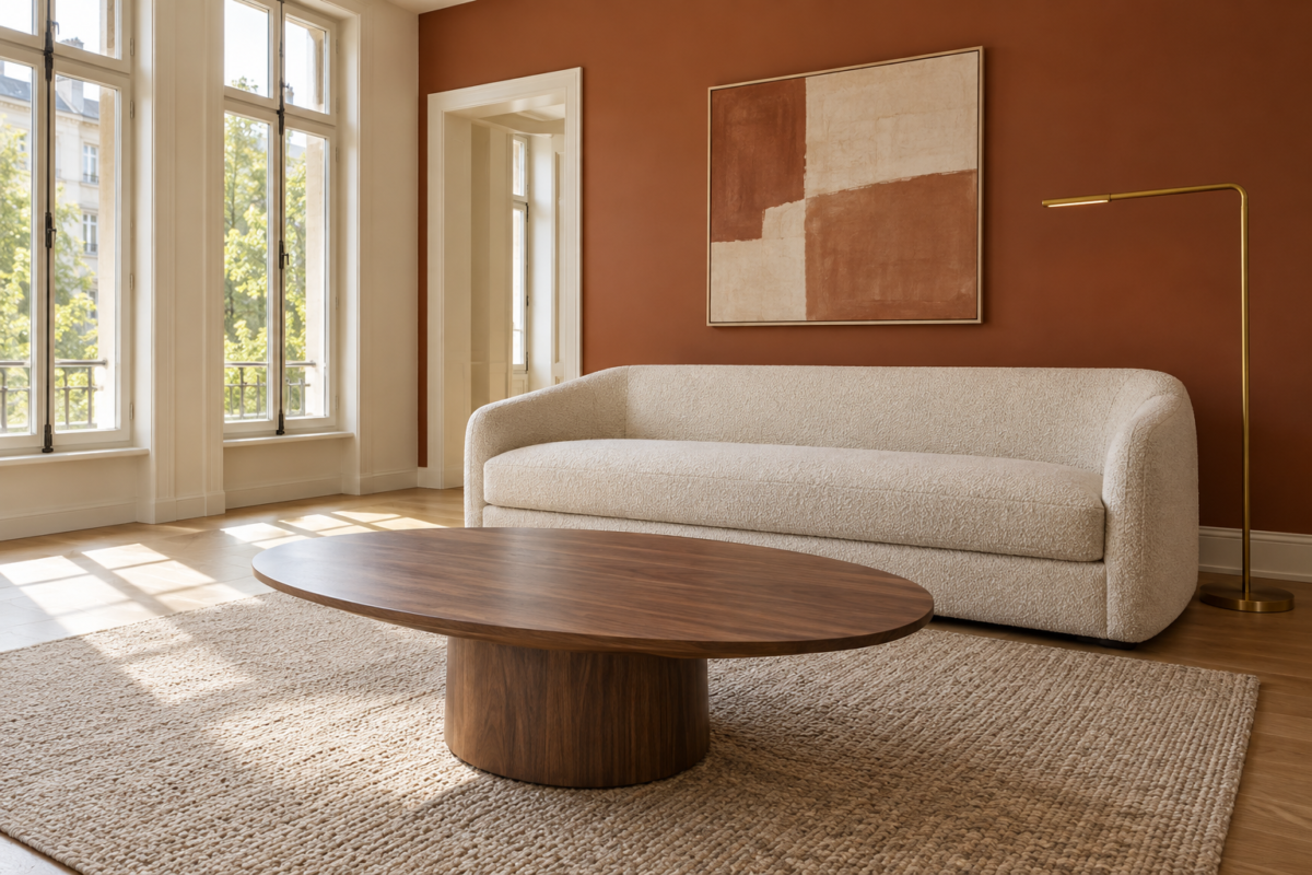
A living room has to do more work than almost any other room in the house. It hosts guests, absorbs a Tuesday evening, and somehow still needs to look considered when someone unexpected shows up. There isn’t one right way to do that, which is exactly the problem with most roundups of living room ideas: they show seventeen versions of the same beige room and call it inspiration.
These seventeen ideas are built around real design decisions, not a single look. Some solve a layout problem. Some are about where the color comes from, or what the room’s furniture is actually made of, or which wall gets to do the talking. A few will apply to your room directly. The rest are useful for the reasoning behind them, which usually transfers even when the specific room doesn’t.
Float the Sofa Off the Back Wall
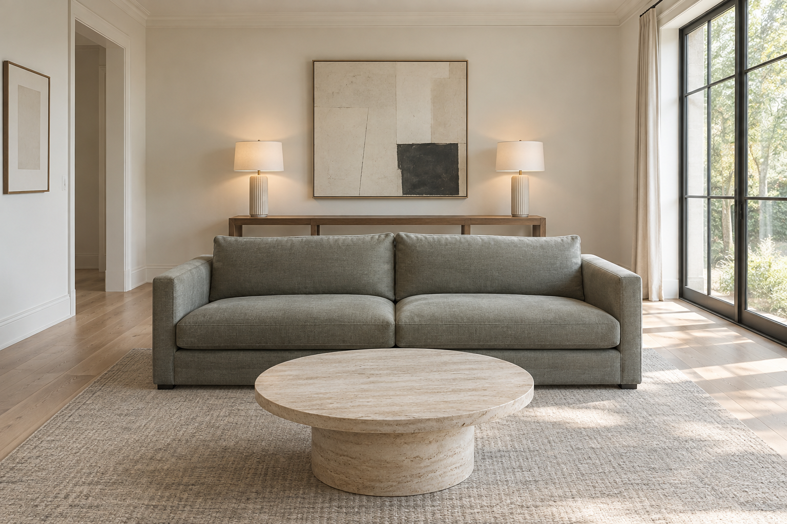
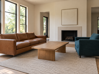
A sofa doesn’t have to sit against the back wall just because that’s where it fits. Floating it a few feet forward, even in a normal-sized room, turns the seating area into its own defined zone rather than furniture arranged around the room’s edges. It also opens up a second path behind the sofa, toward a window seat, a bar cart, or simply more room to walk through on the way to somewhere else. The gap doesn’t need styling to earn its keep. A console table behind the sofa is optional, not required, and an empty run of floor can read as more considered than a table with nothing meaningful on it.
Let the Fireplace Anchor a Symmetric Room
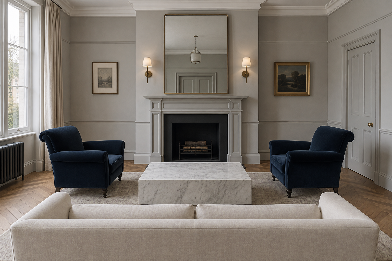
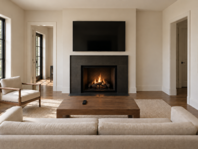
A fireplace is one of the few architectural features that earns a fully symmetric room without feeling stiff. Centering identical chairs on either side of a sofa, with the fireplace as the room’s true middle, gives the eye an obvious place to land the moment you walk in. Symmetry works best here specifically because the fireplace is already doing the organizing: everything else just has to agree with it. A pair of chairs in the same fabric reinforces the balance more than two different chairs would, even if that means holding off on a mismatched find you like separately. Save the personality for the mantel and the art above it, where a single asymmetric object against a symmetric base still reads as intentional.
Build the Layout Around a Single Sectional
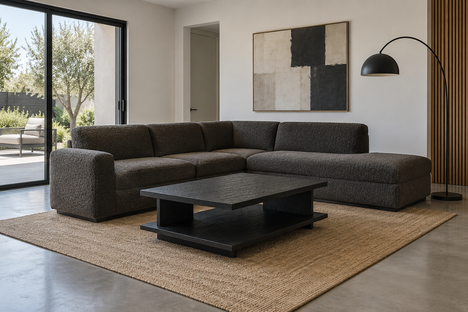
A sectional solves a problem two facing sofas create: a coffee table stranded between them that nobody can reach without standing up. One large sectional, arranged along two walls or floating in an L, keeps the entire seating group connected without a gap in the middle. It also tends to suit how people actually use a living room, which is rarely two symmetric rows facing off. Getting the scale right matters more here than with a single sofa, since a sectional too large for the room removes exactly the walkway the shape is supposed to create. Sofa Size Guide covers how to check that fit before committing to one.
Make a Gallery Wall the Real Focal Point
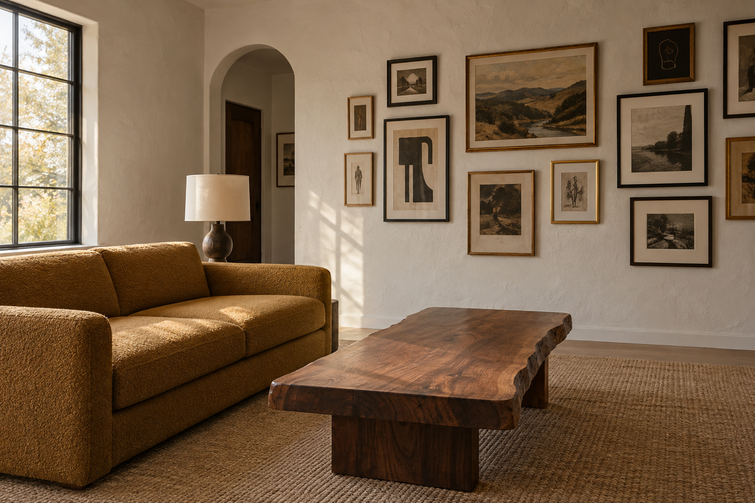
Not every living room has a fireplace or a TV to build around, and that’s not actually a problem. A confidently arranged gallery wall can carry the same organizing weight as either one. The trick is committing to real variation: different frame sizes, at least two different frame finishes, and pieces that don’t all match in subject or mood. A gallery wall built from six identical frames reads as a display case, and one built from six deliberately different frames reads as a collection. Hang the largest piece slightly off-center rather than dead center, which keeps the wall closer to something assembled over time than a grid. Wall Art Height Guide covers the actual hanging heights once the arrangement is planned.
Pair a Curved Sofa With Angular Case Goods
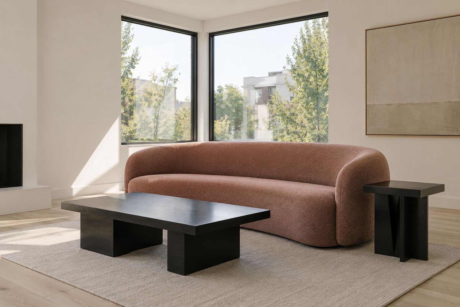
A curved sofa softens a room, but a room that’s soft everywhere starts to feel formless. Pairing one with sharp-edged tables, a rectangular coffee table or an angular side table, gives the eye something to register the curve against. Without that contrast, a rounded sofa can disappear into a room that has nothing to compare it to. This works in either direction: a boxier sofa paired with a rounded pedestal table reads just as intentional. What matters is that at least one major piece breaks from the other’s silhouette family, rather than every piece in the room agreeing on the same shape language.
Arrange Furniture in a Single File for a Long Room
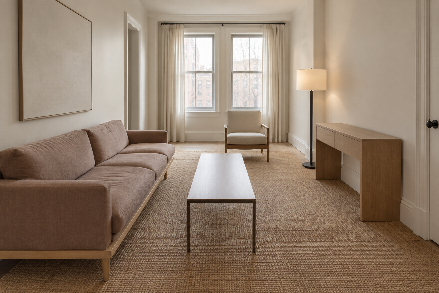
A long, narrow living room usually inherited its shape from something else: a hallway that got wider, or a room that was never meant to be this shape of a rectangle. Two facing sofas make it worse, since they turn the whole room into one long sightline with nothing to interrupt it. Arranging seating in a single sequence along the room’s length, a sofa, then a side table, then a chair further down, breaks the tunnel effect without fighting the room’s actual proportions. Rugs help mark where one zone ends, which matters more here than in a square room where the boundaries are usually obvious without help.
Borrow the Kitchen’s Palette in an Open-Plan Room
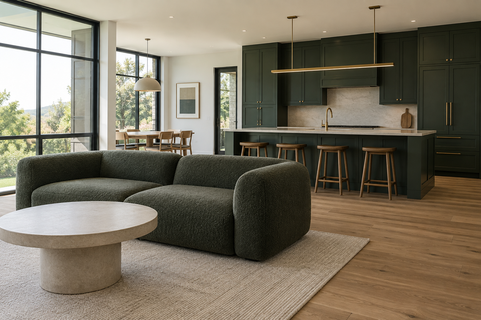
An open-plan living room borrows its architecture from the kitchen whether it wants to or not, since there’s often no wall marking where one ends and the other begins. Carrying a color from the cabinetry into the living zone, even just echoed in a sofa or a set of pillows, makes the transition feel planned instead of accidental. This doesn’t mean matching exactly. A sofa in the same color family as the cabinets, a shade or two softer, reads as connected without looking like the two rooms were furnished from the same catalog page. Skipping this step is the most common reason an open-plan living room feels like an afterthought tacked onto a kitchen that got all the attention.
Commit to a Deep, Moody Palette
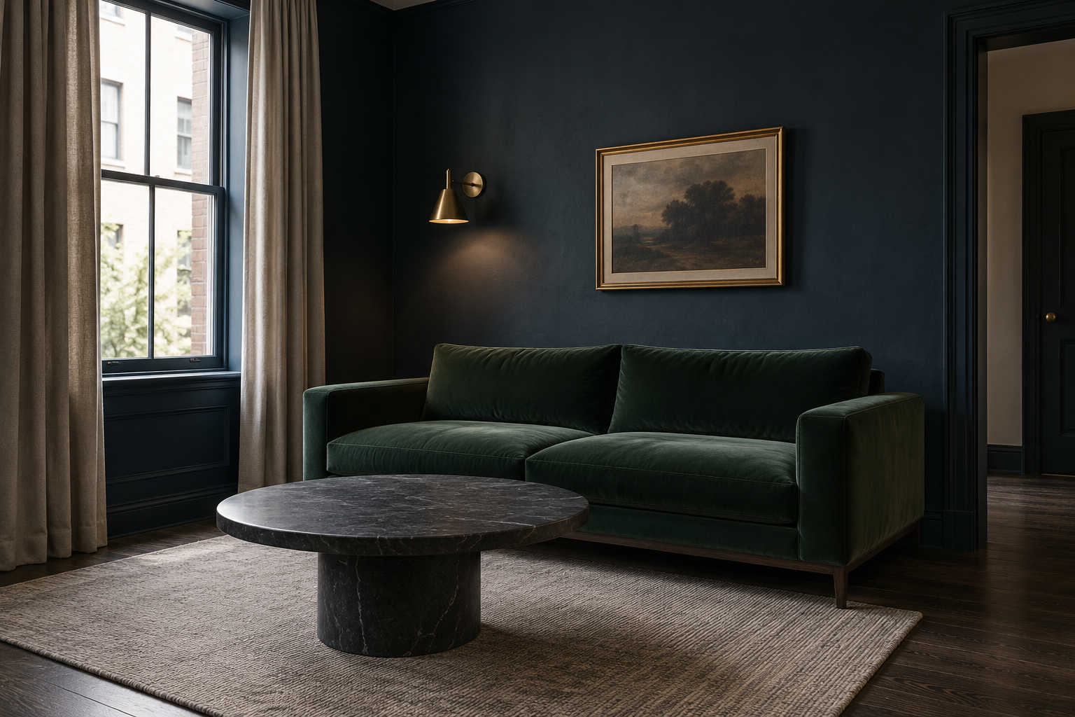
A dark living room isn’t a mistake waiting to be corrected. In a room with decent natural light, a genuinely saturated wall color, something closer to ink than navy, does more to make the room feel considered than another round of white walls ever will. The room needs at least one strong light source to keep the depth from reading as dim rather than deliberate, a floor lamp or a large window doing real work in the evening. Furniture in a lighter or warmer material, a pale stone coffee table or brass fixtures, keeps the dark wall from swallowing everything else in the room. The color is the commitment. Everything nearby should support it, not compete with it.
Keep a Compact Living Room Pale and Let Furniture Recede
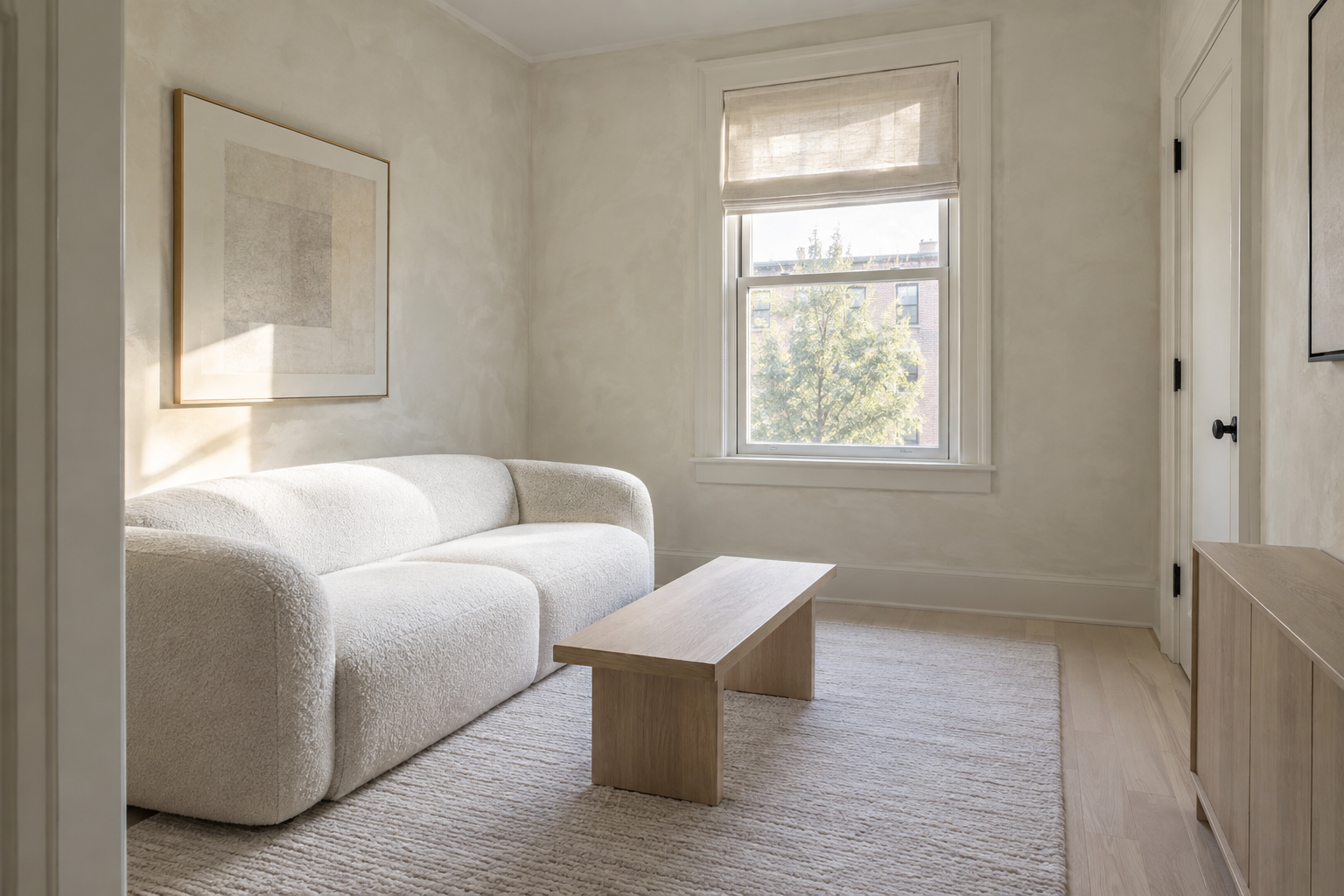
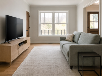
A small living room doesn’t need a layout trick to feel larger. Sometimes it just needs a pale, close-value palette that keeps furniture from reading as separate objects competing for attention. A sofa in a similar tone to the wall behind it recedes rather than announcing its own footprint, which matters more in a room where every piece of furniture is visible from every other corner. This is a color decision, not a furniture-arrangement one. If the room’s actual problem is fitting furniture into a tight footprint rather than how it all reads visually, Small Living Room Layout Ideas covers the arrangement math specifically.
Hang Curtains From Ceiling to Floor
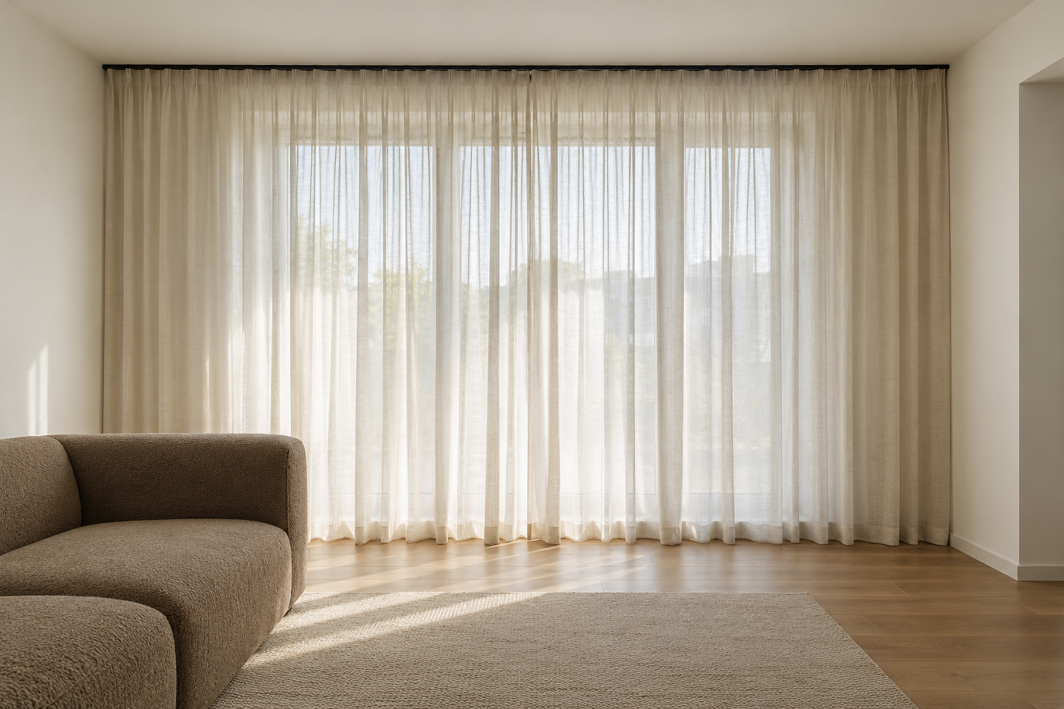
A curtain hung at the top of the window frame draws a visual line right where the ceiling starts to feel low. Mounting the rod a few inches below the ceiling instead, with the curtain running all the way to the floor, stretches the wall visually and makes the ceiling read taller than it measures. This costs nothing extra beyond a slightly longer curtain and a rod moved higher than expected. The mistake to avoid is stopping the curtain at the windowsill once the rod’s already been moved up, which just adds an odd gap instead of the intended effect. Curtain Length Guide has the exact math for how long a floor-length curtain needs to be for different ceiling heights.
Layer Three Light Sources Around the Room
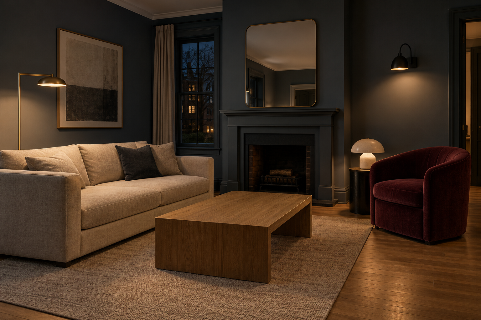
A single overhead fixture lights a room evenly, which sounds like a good thing until it also flattens everything underneath it. Three light sources at different heights, a floor lamp, a table lamp, and a wall sconce, do more to give a living room depth after dark than a brighter bulb in the ceiling fixture ever will. Each one should do a different job: one for the seating area, one for reading, one just for the corner that would otherwise disappear at night. How to Layer Lighting in a Living Room walks through how to place each type without turning the room into a maze of switches.
Make a Vintage Rug the Room’s Only Pattern
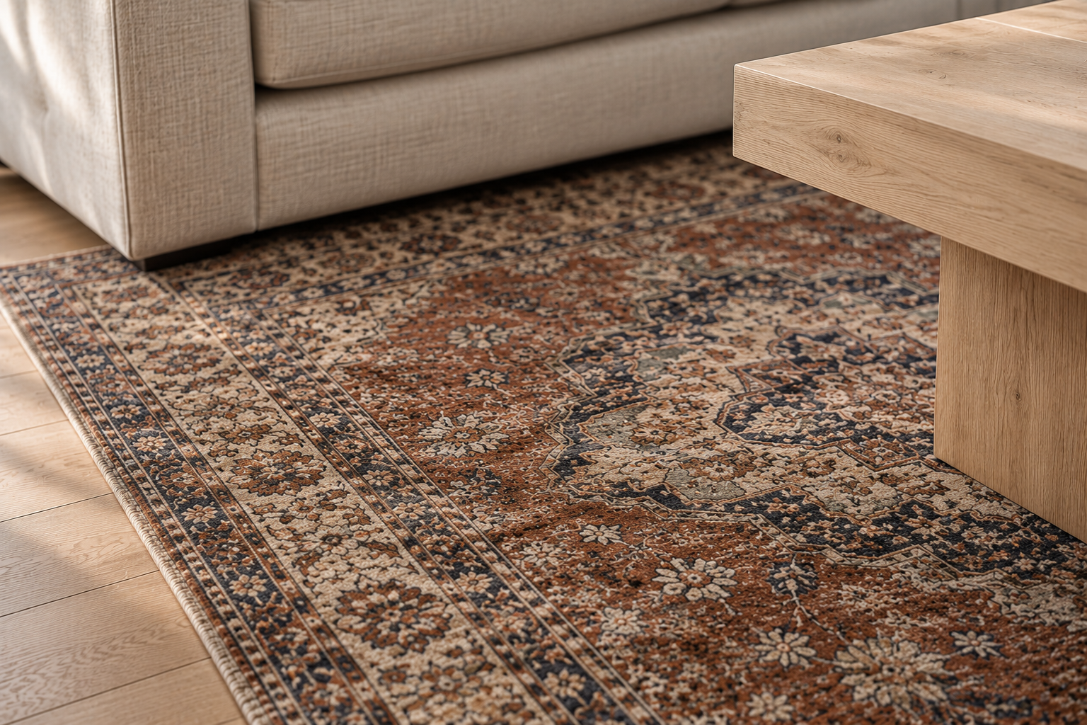
A patterned rug can carry an entire room’s visual interest by itself, but only if nothing else in the room is competing with it. Vintage and vintage-style rugs tend to have a faded, irregular pattern that reads as collected rather than printed, which holds up better as a room’s sole pattern source than something bold and new. Everything else nearby needs to go quiet: solid upholstery, plain curtains, art that leans tonal rather than graphic. Rug Size Guide covers how to size one correctly for the room, since an undersized patterned rug reads as a mistake in a way an undersized plain one doesn’t.
Turn a Corner Into a Reading Nook
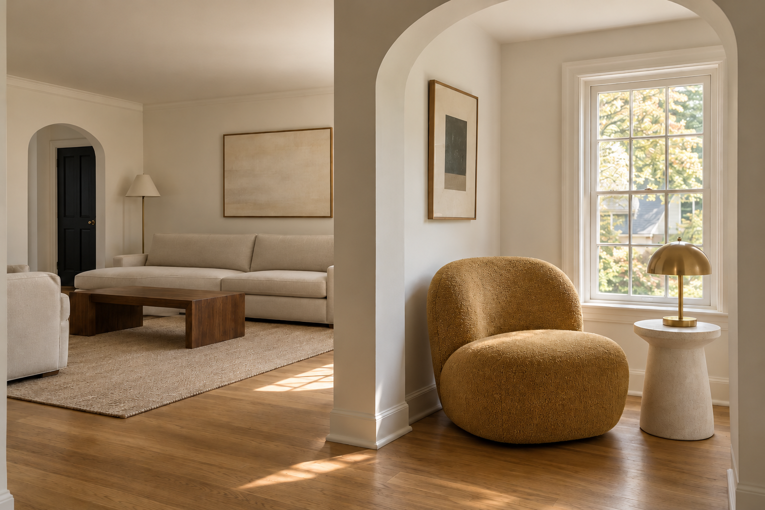
A living room’s main seating arrangement doesn’t need to do everything. A corner or alcove with its own chair, side table, and lamp gives the room a second zone that supports the main one instead of competing with it. This works best in a genuine architectural nook, an alcove, a bay window, a dead corner too small for the main furniture group, rather than carved arbitrarily out of open floor. Keep the chair’s material or color distinct enough from the main seating that the two zones read as related but separate, not like a stray chair that wandered away from the sofa.
Let a Bold Wall Color Replace the Art
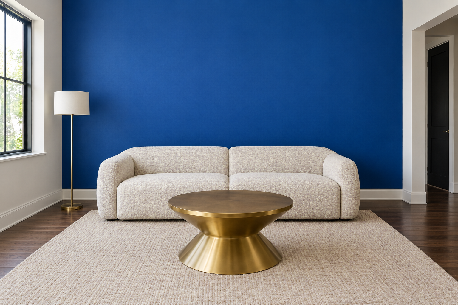
Art isn’t the only way to give a wall a focal point. A confidently saturated paint color, left without anything hung on it, can do the same job with less commitment and less cost. This works best on a single wall rather than the whole room, and it asks for real confidence in the color itself, since a bare wall in a timid color reads as unfinished rather than deliberate. The rest of the room should stay simple enough that the wall gets to be the one loud decision. A patterned rug and a bold wall in the same room usually means neither one gets to be the star.
Choose Performance Fabric for a Formal Room
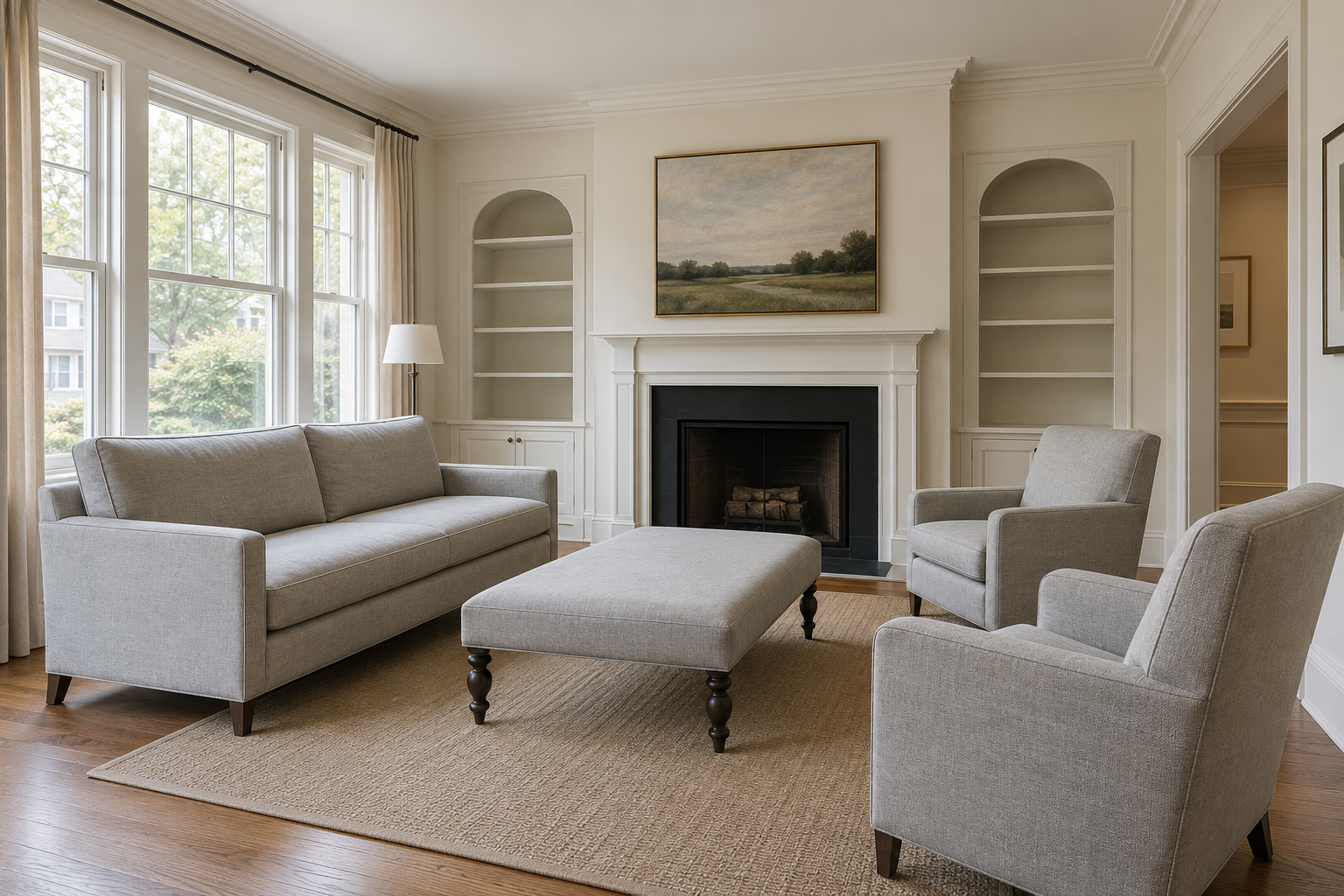
A formal living room doesn’t have to mean a room nobody’s allowed to sit in. Performance fabrics, originally developed for outdoor furniture, have gotten good enough that a tailored sofa or a pair of wingback chairs can be upholstered in one without looking like a patio set indoors. The practical upside is real: spills wipe clean, and the fabric holds up to daily use in a way a delicate silk or linen blend doesn’t. Throw Pillow Guide covers how many pillows a formal arrangement like this can actually hold before it starts working against the room instead of for it. For the upholstery choice itself, leather versus fabric is its own decision with its own tradeoffs, covered in Leather or Fabric Sofa?
Anchor a High-Ceilinged Room With One Oversized Piece
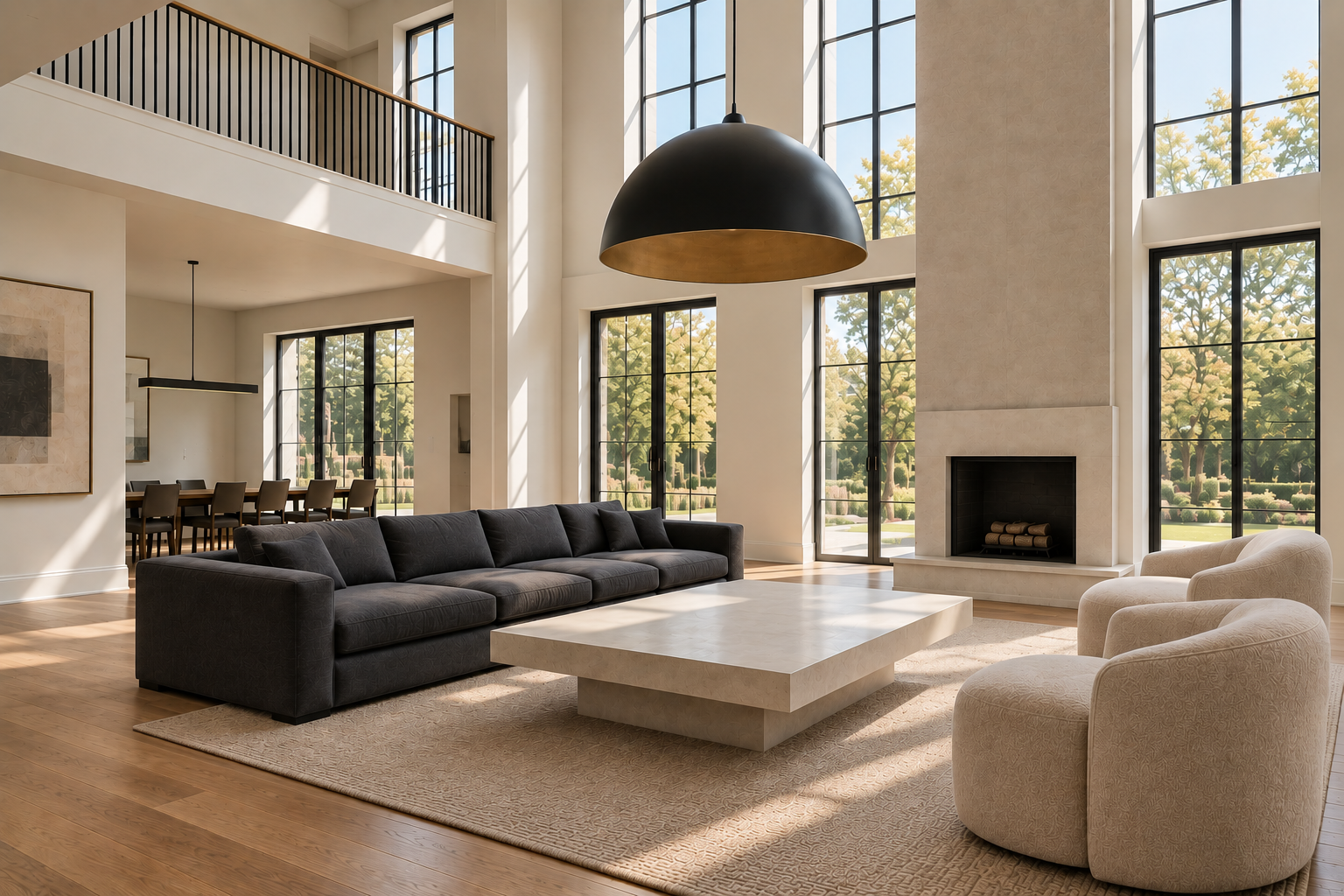
A room with real height doesn’t need more furniture. It needs furniture with enough presence to hold its own against the volume above it. A single oversized pendant hung low enough to sit within normal sightlines does more to make a double-height room feel considered than a cluster of smaller fixtures scattered across the ceiling. The same logic applies to the sofa: one substantial, correctly scaled piece grounds the room better than several smaller ones that get visually lost in the space. The goal isn’t more furniture, it’s larger furniture, and only where the room’s proportions actually call for it.
Repeat One Warm Metal Finish Throughout
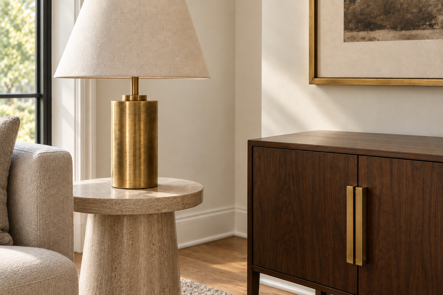
Mixing metals is often fine and sometimes the right call, but a room with brass lamps, black hardware, chrome legs, and a nickel mirror frame usually reads as unplanned rather than eclectic. Picking one warm metal, unlacquered brass is the easiest to commit to, and repeating it across a lamp base, a piece of hardware, and a picture frame gives the room a quiet through-line that’s easy to execute and hard to get wrong. This isn’t a rule for every metal surface in the house, just the handful actually visible in the same sightline. A closing habit worth carrying into every other idea on this list: consistency reads as intentional even when nothing else about the room matches.
Frequently Asked Questions
Do I need to use every idea in this list in one room?
No, and trying to would work against most of these ideas rather than for them. A room built around a bold wall color, a patterned rug, and a symmetric fireplace arrangement all at once usually cancels itself out. Pick the one or two ideas that solve an actual problem in your room, and let the rest of the space stay simple around them.
How do I choose one direction when several of these ideas appeal to me?
Start with whatever your room already has a strong opinion about. A fireplace, an odd-shaped alcove, or a set of furniture you’re not replacing all narrow the field on their own. Once the room’s real constraints are accounted for, whichever remaining idea solves the problem you notice most often day to day is usually the right one to commit to first.