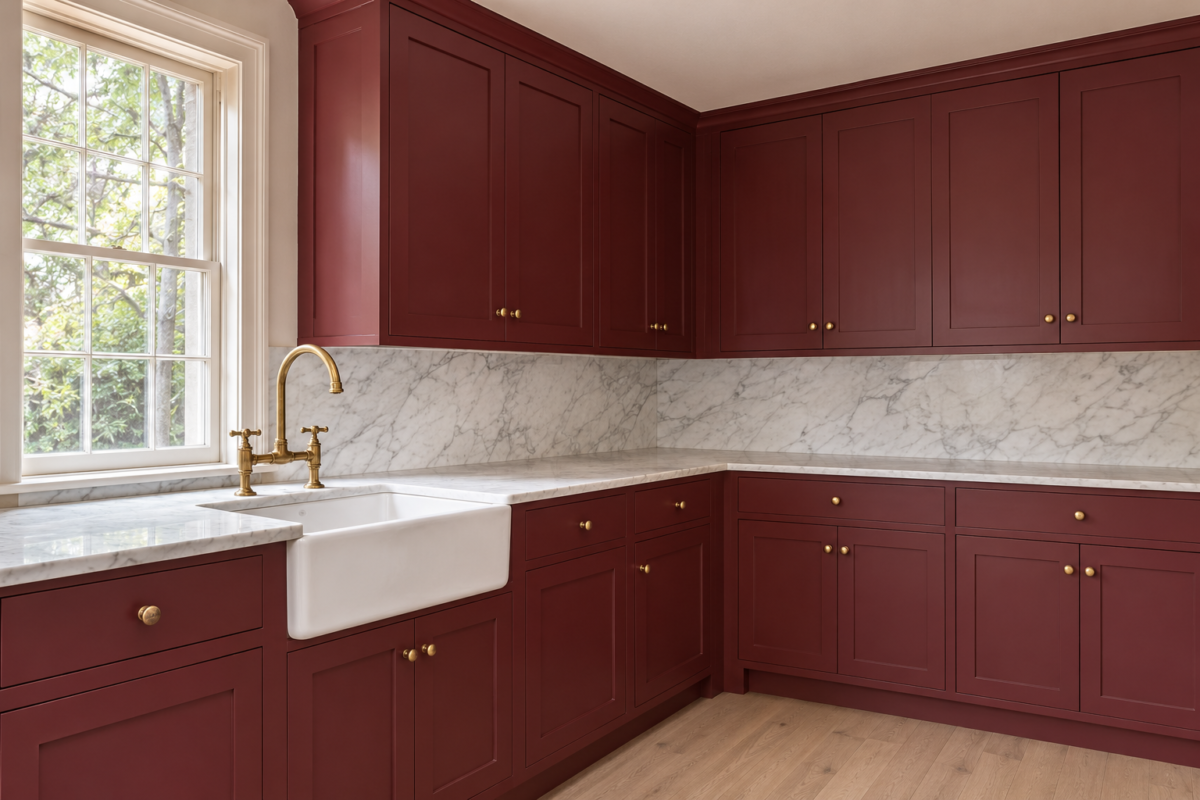
In most kitchens the cabinets cover more wall than paint or tile does, so their color is the room’s color. It is also never seen alone. The same paint looks different beside white marble than beside oak, and different again in the even light from a window facing north than in afternoon sun.
A small chip held up in a paint store shows little of that. Each idea here pairs a cabinet color with the thing it was chosen against, a counter, a floor, a tile, the light, or the room next door, and looks at what the pairing does.
Warm White Matched to the Stone
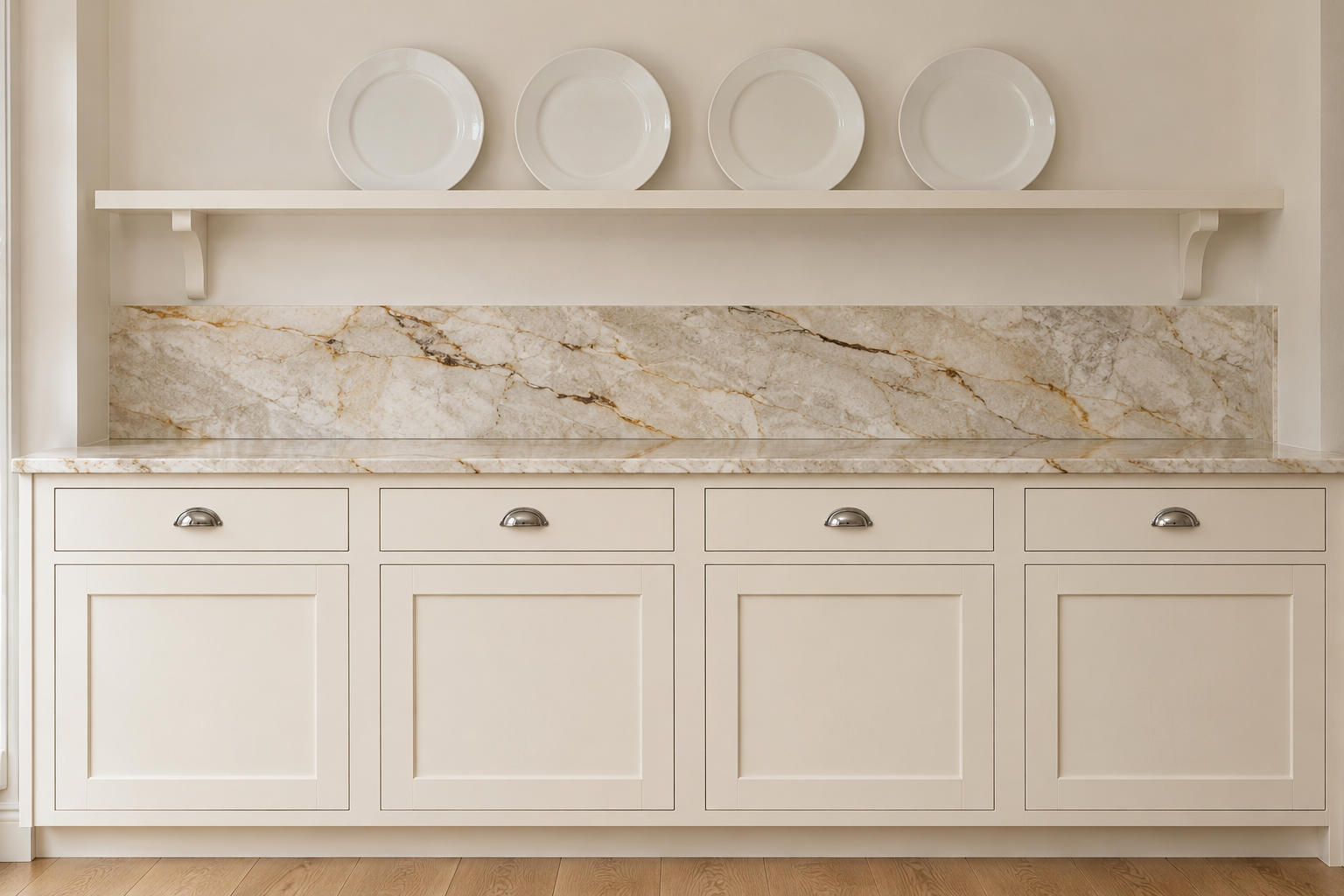
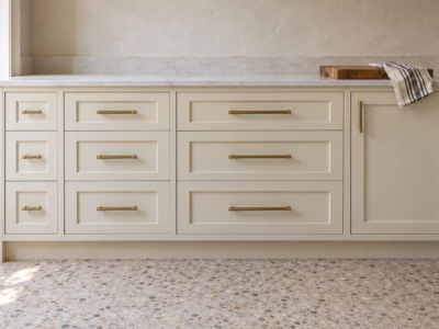
White cabinets come in a wide range of whites, and the counter decides which one works. A stone with warm brown or gold veining sits comfortably beside a cream or a white with a little yellow in it. Next to a bright white that leans blue, the same stone looks yellower and the cabinets look colder.
Hold the paint chip flat against the counter, not against the wall, since that is where the two meet. A white’s undertone shows most clearly beside another white or a pale stone.
Navy Below, White Above
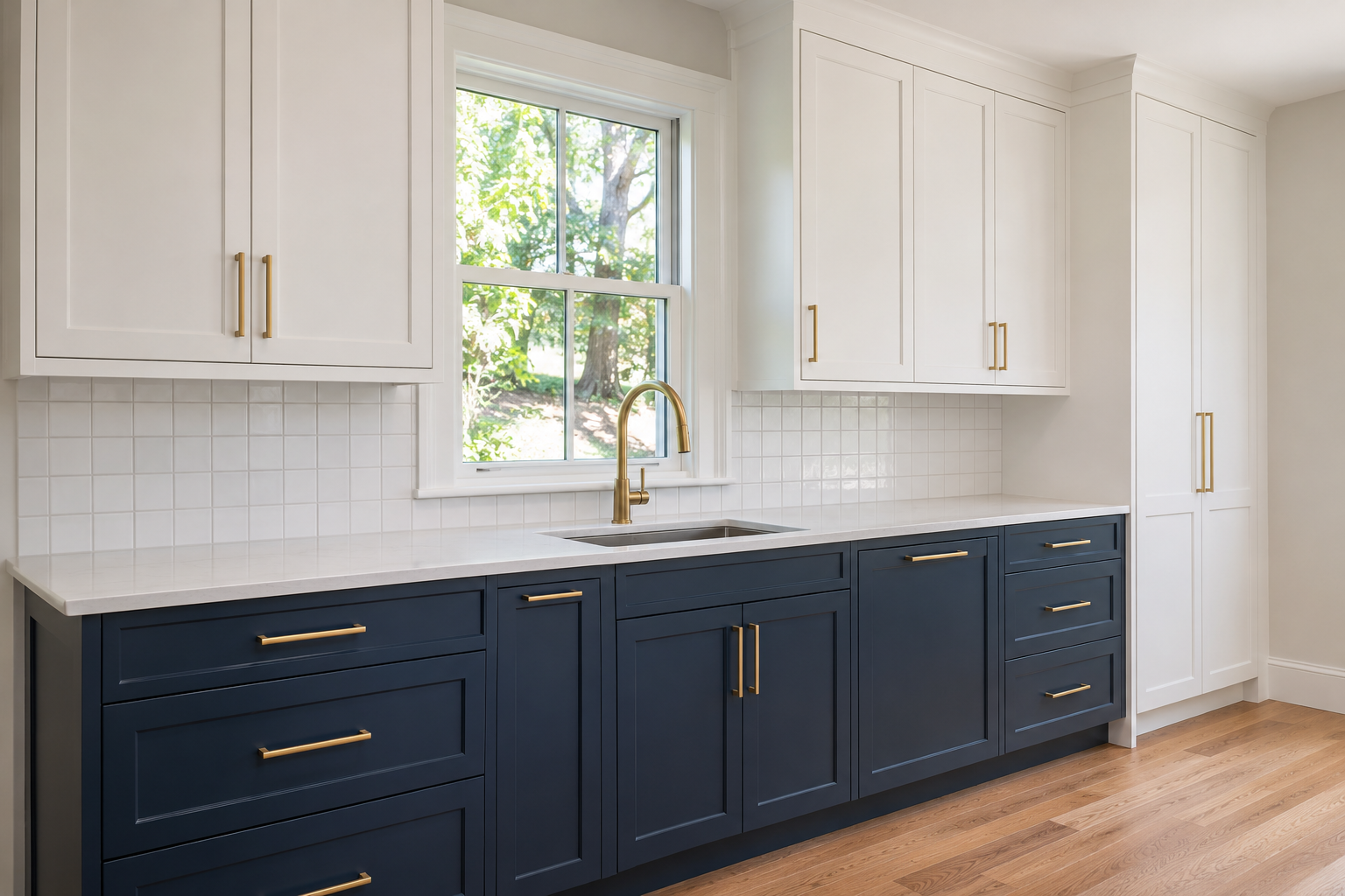
Dark lower cabinets with white uppers put the weight of the color near the floor and keep the upper wall light around the windows. Navy has the depth of black without its hardness, and in daylight it stays recognizably blue.
The split is clearest where uppers and lowers are separated by a counter and backsplash. A tall pantry or oven cabinet that runs floor to ceiling is better in one of the two colors for its full height than split partway up its doors.
One Color in Two Strengths
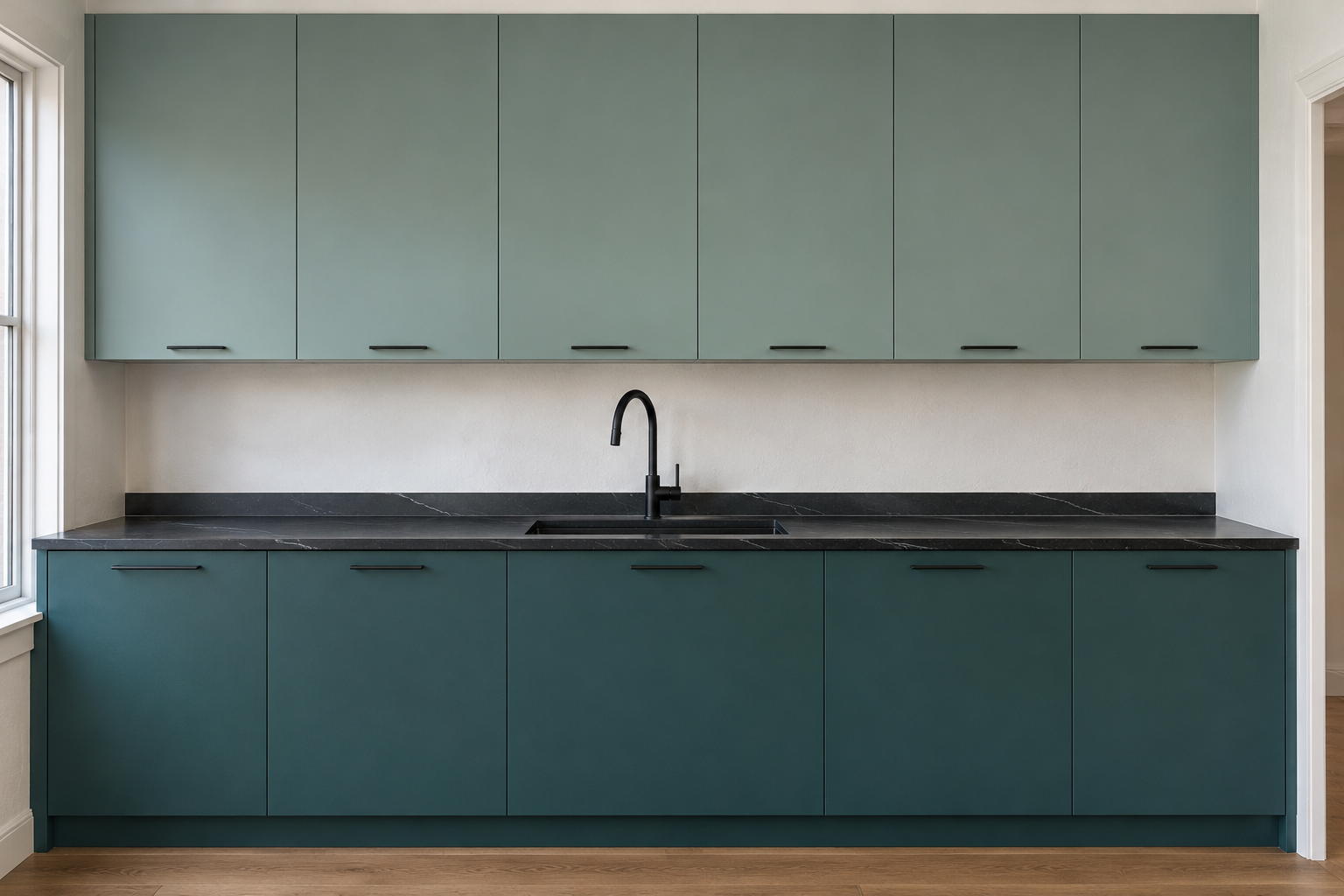
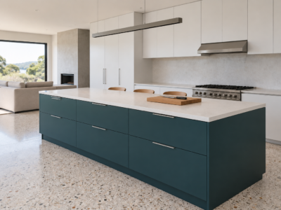
A tonal two-tone uses one hue at two depths, a pale blue-green on the upper cabinets and the same blue-green several shades deeper below. The kitchen gets the weight of a dark base without a hard line where the colors change.
Many paint strips run a single hue from light to dark, which makes the pair easy to choose from one card. Against a black soapstone counter, the deep lowers keep the counter from looking like a separate black band, since the step from cabinet to stone is small.
Painted Uppers Over Oak Lowers
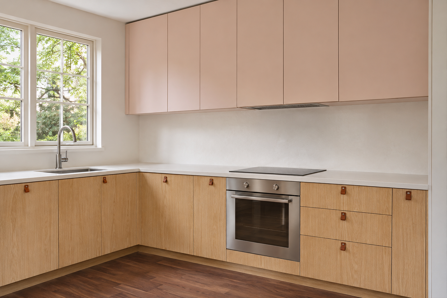
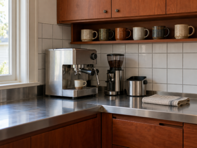
Oak lower cabinets keep wood where hands and feet meet the kitchen, and painted uppers keep the top half light. A pale clay, a soft pink with beige in it, picks up the orange warmth in oak without matching it, so the two halves look related.
Scuffs from shoes and mops at the base tend to show less on oak than on a painted door. If the floor is wood as well, the two wood tones work best when they are clearly different or very close, and a darker walnut floor under oak cabinets keeps them apart.
Black Cabinets Against an Oak Counter
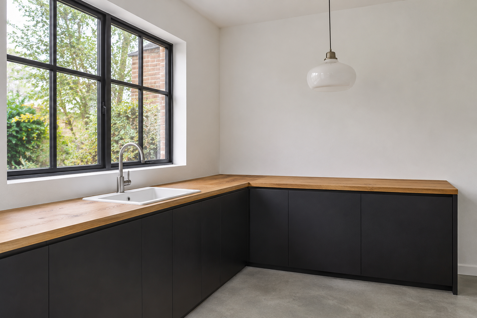
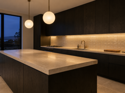
Black lower cabinets make an oak counter the lightest surface at hand height, so its grain shows along the whole run. It is the strongest contrast of any pairing here, and it suits a kitchen with plenty of daylight. In a dim kitchen, black on two walls can make the room feel smaller.
Black shows fingerprints and dust more than a mid tone does, most of all around the pulls. A satin finish wipes clean more easily than matte on the doors opened most.
Cabinets and Walls in One Color
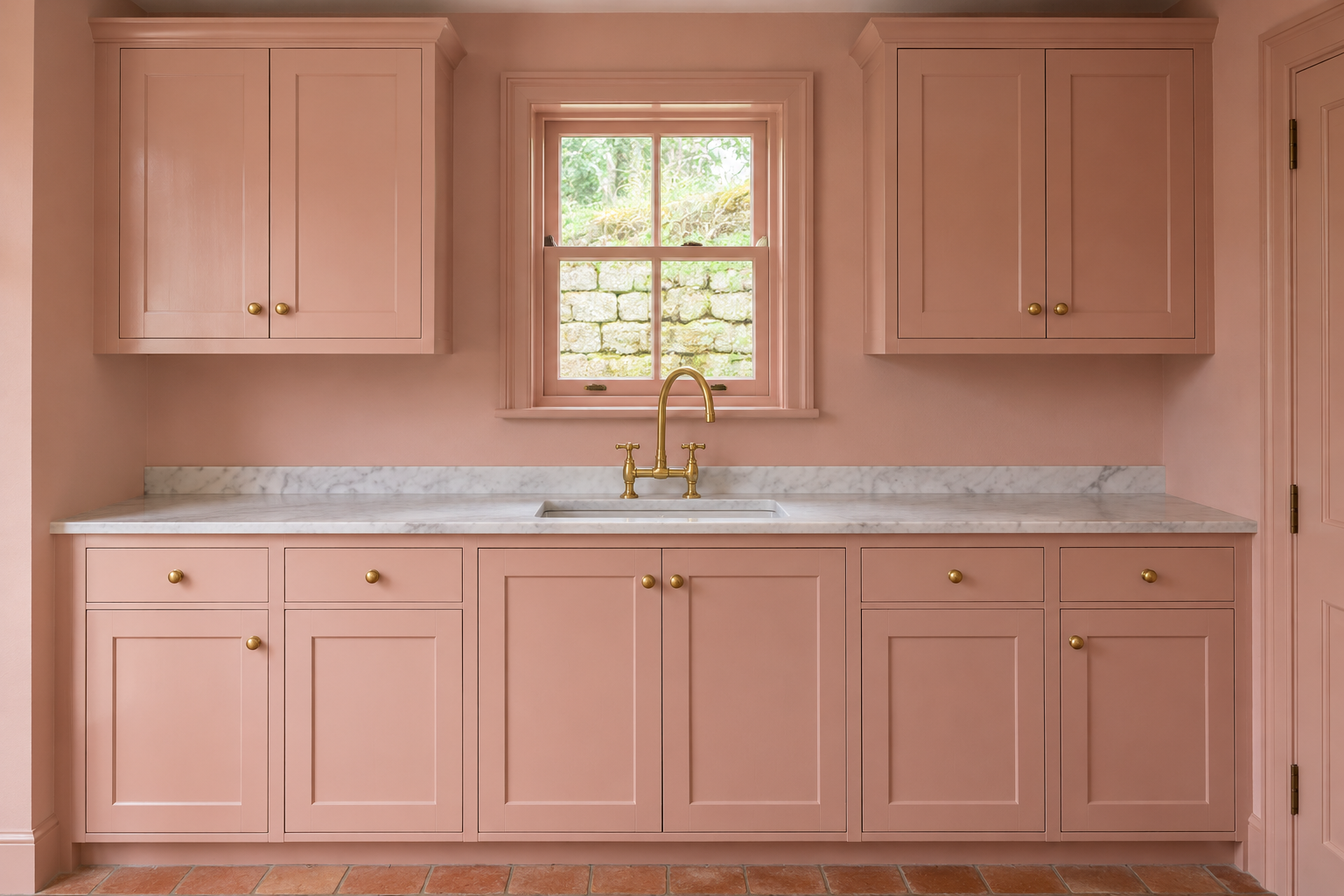
Painting the cabinets, walls, and trim one soft clay pink removes the line where cabinetry meets wall. The room looks calmer and larger, and the counter, the tile, and the brass become the contrast. It is color drenching applied to a kitchen.
Keep the color the same and change the sheen, satin on the cabinet doors so they stand up to cleaning and matte or eggshell on the walls. The two finishes catch the light differently, which outlines the doors without a second color.
A Green Taken From the Marble
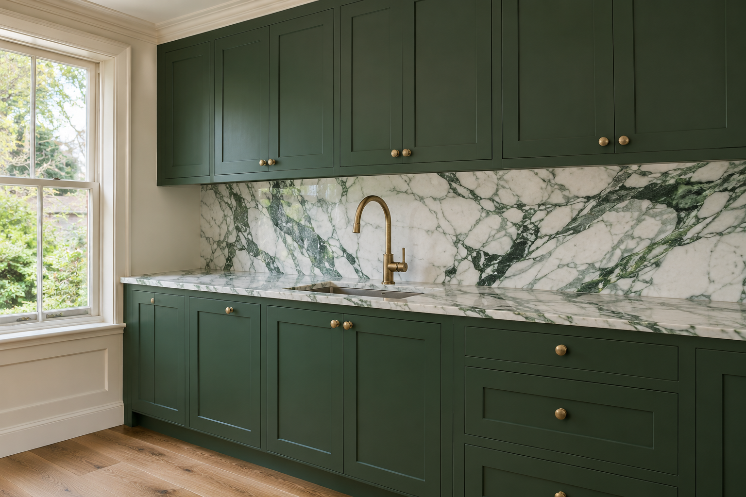
A stone with colored veining can supply the cabinet color. A white marble with deep green veins, next to cabinets painted the green of its darkest veins, ties the counter and the doors together, and the marble’s white keeps the green from closing in the room.
Take the color from the slab that will be installed, not from a sample or a photograph, since veining varies from slab to slab. The darker veins are usually a small part of a wide pale field, so match those and let the rest of the stone stay light.
Ochre in a North-Facing Kitchen
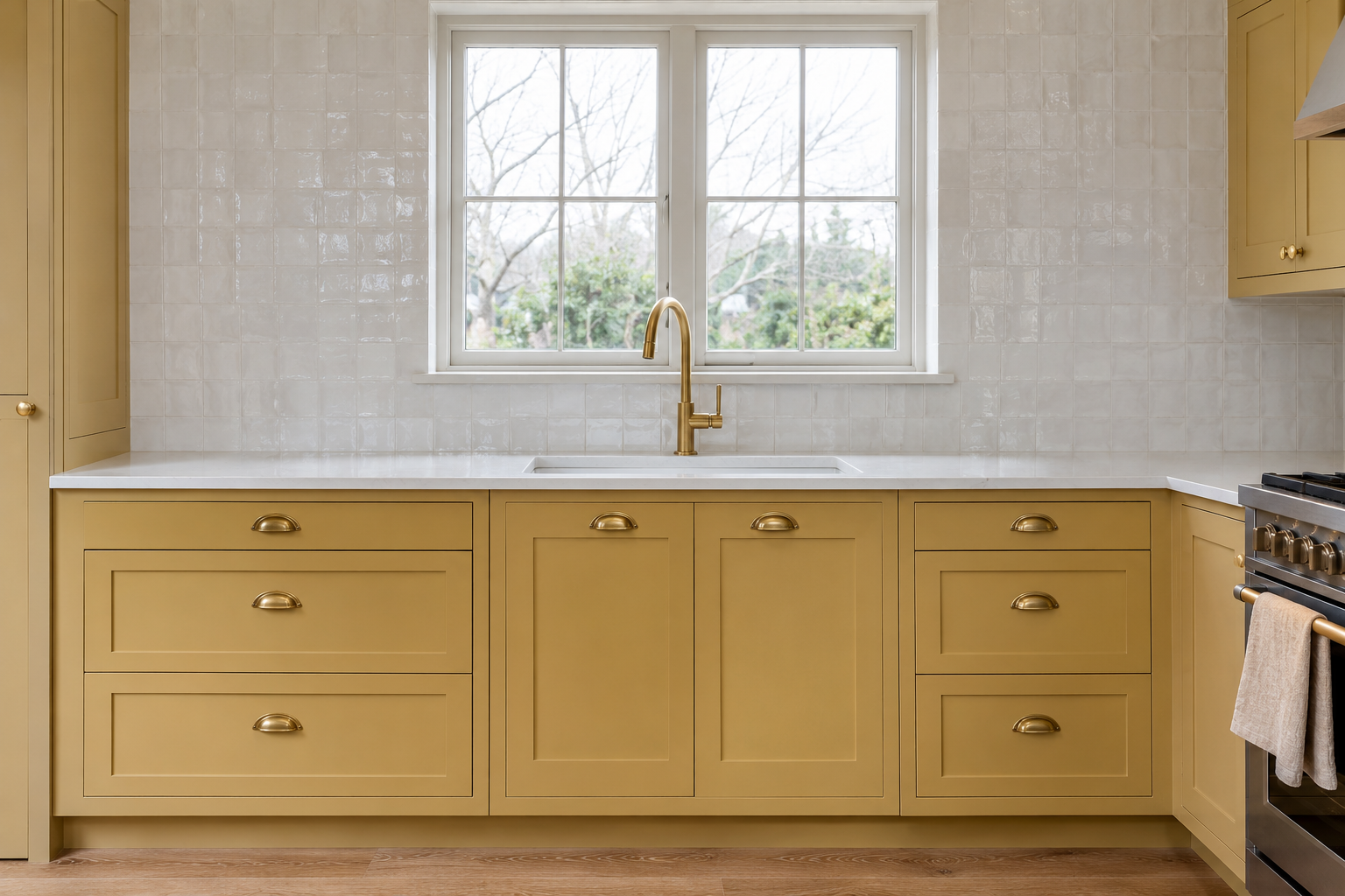
Light from a window facing north is indirect and cool for most of the day, and a cool gray or blue can look flat in it. A muted ochre, a yellow with brown in it, holds its warmth in that light without becoming bright, and it suits white tile and brass.
Paint a large sample board and look at it on the cabinets in daylight and again after dark. Kitchen bulbs at 3000K or warmer can push ochre toward orange, so the evening view matters as much as the daytime one.
Pale Blue-Gray in a Sunny Kitchen
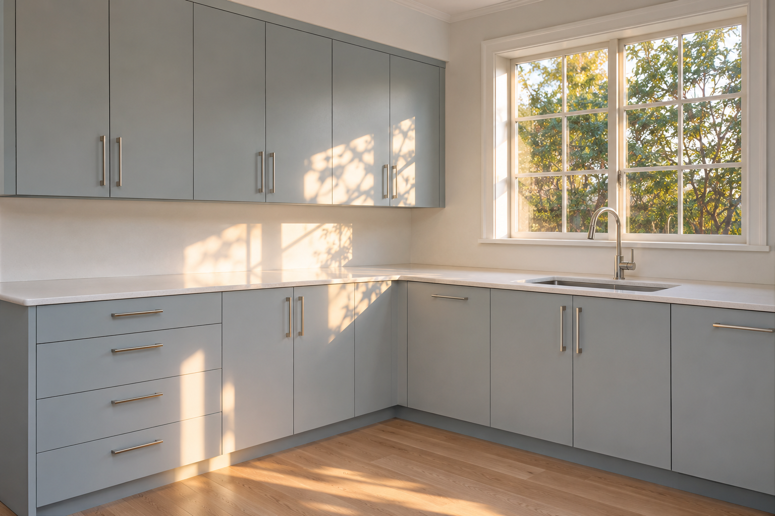
In a kitchen with strong sun from the south or west, warm colors can look hot by late afternoon. A pale blue-gray cools that light, and the patches of sun across the doors look warm against it without turning the whole room yellow.
Polished nickel keeps the cool tone in the hardware. The same color in a dim kitchen facing north can look cold, which makes it the opposite of the ochre kitchen above.
Cobalt in a Narrow Galley
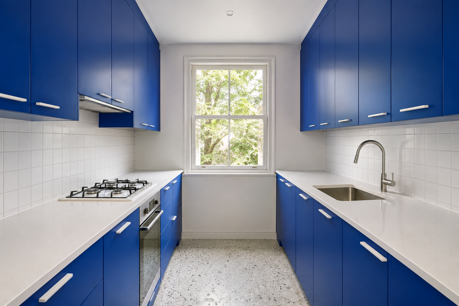
A galley is seen from inside, a few feet from each run, so a strong color there surrounds the cook instead of filling a large wall seen across a room. Cobalt on both runs, with white counters and white tile, turns the narrow room into a lined box with a window at the end.
A small kitchen also means less painted surface, so a strong color is less of a commitment than in a large one. White walls and a white ceiling above the cabinets keep it from closing in.
A Tall Pantry Wall in Its Own Color
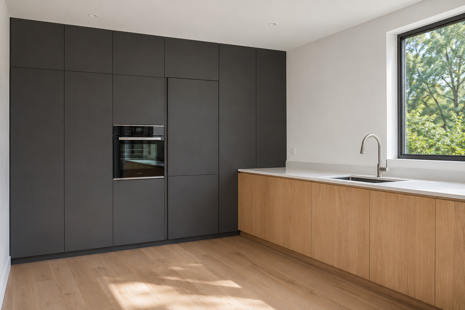
Where the tall cabinets stand together on one wall, a pantry, an oven tower, and a paneled refrigerator, painting that wall alone in charcoal makes it look like one fitted piece of furniture. Pale oak lower runs on the other walls keep the working part of the kitchen light.
It depends on the tall cabinets being together. Spread between windows and lower runs, the same charcoal would break into separate patches.
Lilac Inside the Glass Fronts
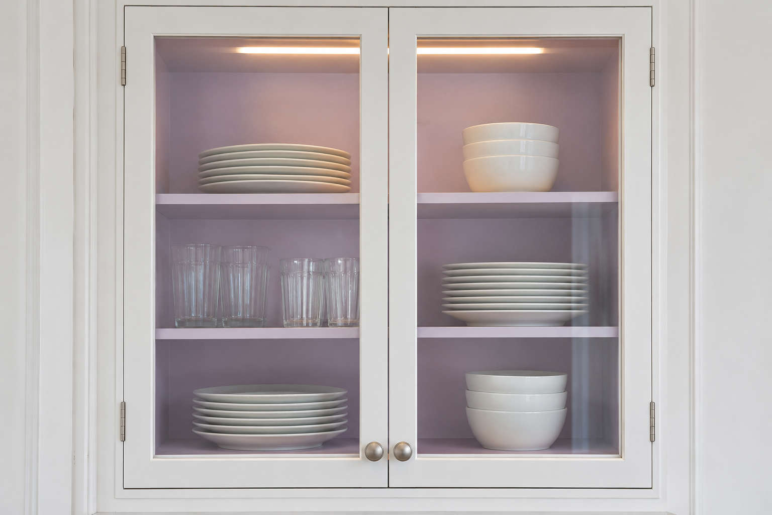
Glass-front cabinets can hold a color inside while the doors stay white. A pale lilac on the back and sides gives white plates and clear glasses a backdrop, and from across the room the color shows only in the panes.
Shelves take the sliding and knocking of dishes, so they need a paint that cures hard. In a deep cabinet, a small light at the top keeps the back from sitting in shadow and the color from turning gray.
Chocolate Brown and a Tile to Match
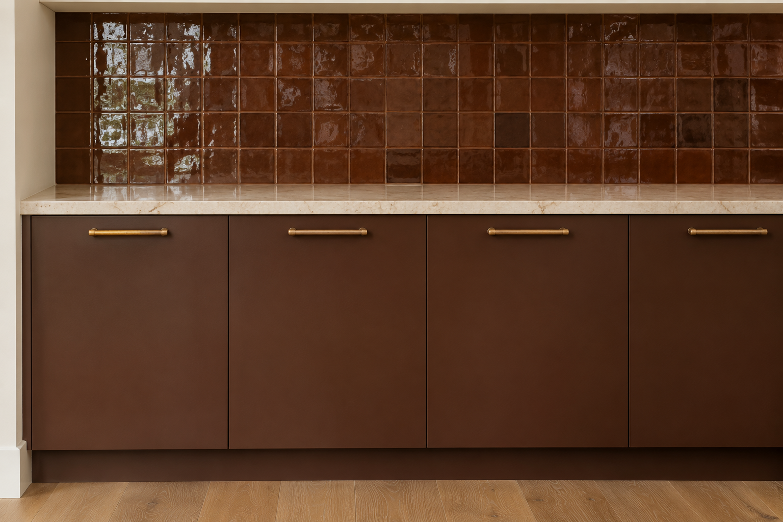
Deep brown cabinets below a glazed brown tile in a close shade make the kitchen one warm, dark color, with the gloss and the variation in the glaze keeping it from going flat. Brown sits between paint and wood, so it works beside an oak floor without competing with it.
Match the paint to the tile, not the other way round. Paint can be mixed to almost any color and a handmade tile can’t, so bring a few tiles home and match the middle tone of the glaze. Grout in the same brown keeps the surface continuous.
Sage Gray Where the Kitchen Opens to a Living Room
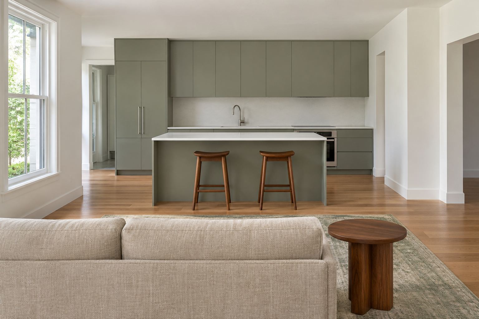
In an open plan, the kitchen is seen from the sofa. A sage gray, a gray with green in it, sits easily beside upholstery and wood, so the cabinets and island look like part of the room’s furnishings instead of a separate kitchen at the far end.
Take the color from something already in the living area, a rug, a sofa fabric, or the walls, and keep it a shade or two different. The two areas then connect without matching, the way paint colors flow from one room to the next.
Warm Gray That Hides Marks
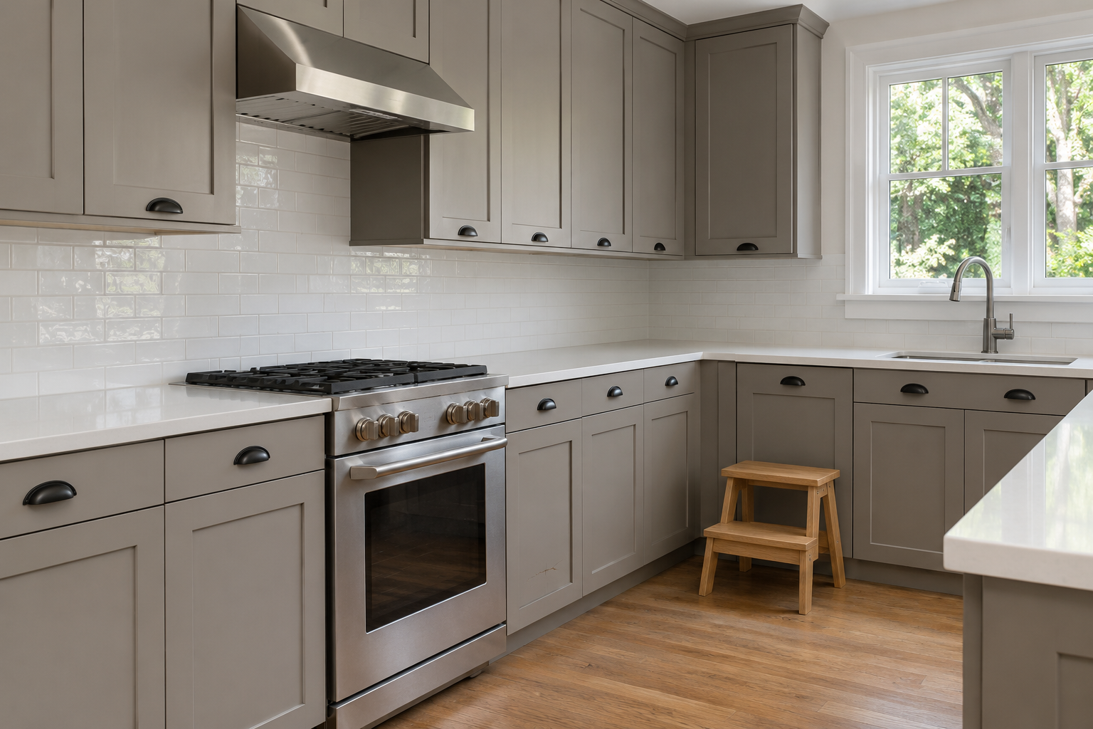
In a kitchen used hard every day, a warm middle gray shows less than white or black. Fingerprints and dust show on dark paint and scuffs show on pale, and a middle tone hides more of both.
A gray with a little brown in it sits easily with oak floors and white counters. The lower doors near the floor take the most knocks from feet, mops, and step stools, so that is where the difference shows first.