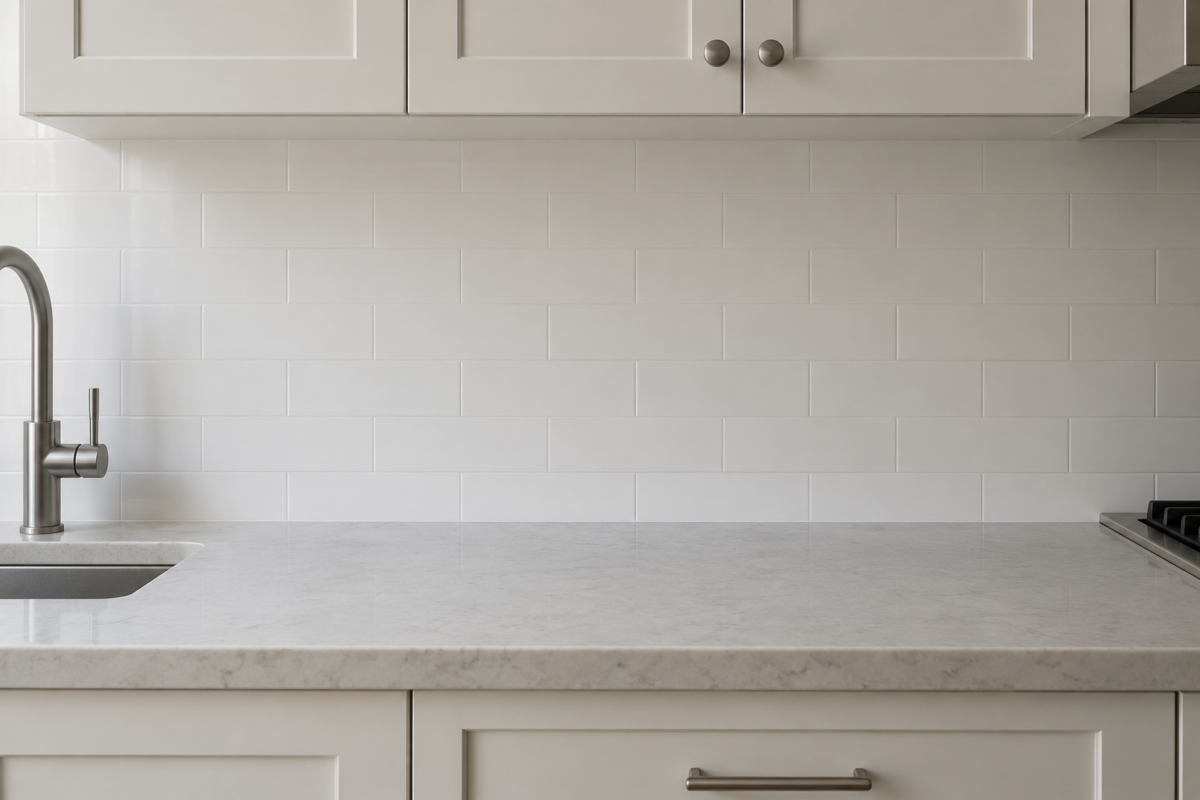
Most of the real decision-making on a kitchen backsplash happens before grout ever comes up. The tile material and pattern get chosen first, then how high the run should go, and grout gets picked last, often in the same five minutes as the installer’s schedule. Treated that way, it looks like a technical afterthought. It isn’t one. On a wall of small or medium-format tile, grout lines make up a real share of what’s actually visible, and their color decides whether the wall reads as one surface or as individually outlined pieces.
There are four real approaches worth knowing before that swatch card shows up: grout that blends into the tile, grout that sits in a practical middle ground, grout that deliberately contrasts, and grout chosen to match rather than contrast. Each produces a genuinely different wall, and the right one depends on the tile itself more than on preference alone.
White Grout Blends the Tile Into One Surface
With white or very pale grout against white or pale tile, the grout lines nearly disappear into the surrounding material, and the wall reads as one continuous plane rather than individual pieces. That effect suits a genuinely minimal look, or tile with real movement, like marble or a marble-look porcelain, where a strong grid would compete with the veining instead of complementing it.
The tradeoff is maintenance. White grout shows grease and daily staining faster than any other option, especially on the wall behind a range, and holds up longest with a real sealing routine rather than none at all.
Gray Grout Is the Practical Middle Ground
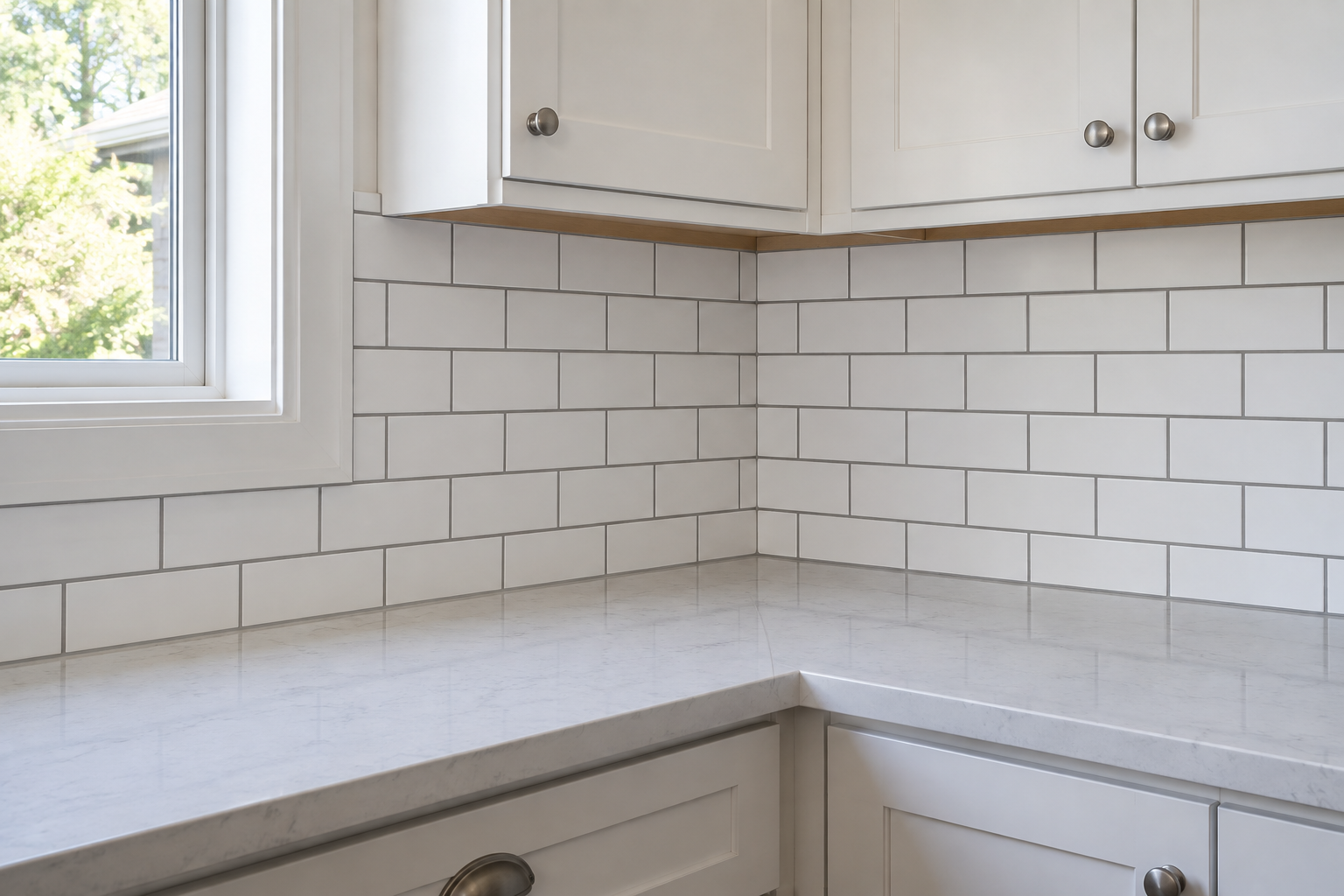
Medium gray grout gives just enough definition to see the tile’s actual shape and layout, without turning the wall into a fully graphic pattern. It’s also the most forgiving option day to day, since gray naturally camouflages the ordinary soiling that shows almost immediately in white grout.
For a kitchen with no strong reason to choose differently, gray is the safer default. Not because it’s the most interesting choice on paper, but because it’s the one least likely to look dated or grubby a year into daily cooking.
Dark Grout Makes the Layout the Point
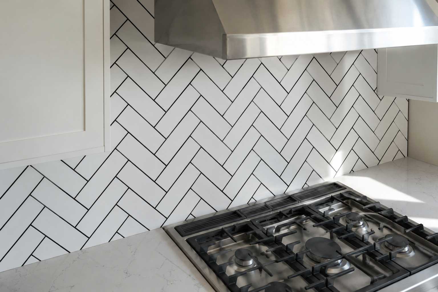
Black or charcoal grout does the opposite of white. It pulls the tile’s actual layout forward as the wall’s real visual feature. A subway pattern reads as a genuine grid. A herringbone layout reads as herringbone, not just texture from across the room.
This works best with plain tile that has no color or movement of its own, since the grout supplies the graphic interest the tile doesn’t. It also resists staining nearly as well as gray. The real tradeoff is scale. Dark grout on already patterned or colored tile can read as busy, since two elements now compete for attention instead of one carrying the wall alone.
Matching Grout Removes the Grid Entirely
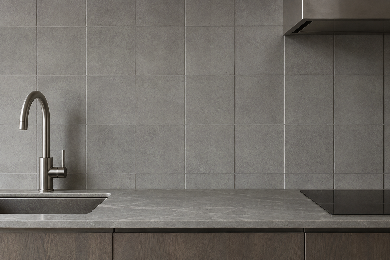
Choosing a grout within a shade or two of the tile color takes the opposite approach from dark grout, minimizing the grid instead of emphasizing it. This works particularly well with large-format tile or slab material, where the goal is a continuous surface rather than a visible pattern, and with any tile that already carries real visual interest, stone movement or handmade texture, that a contrasting grout would interrupt.
It’s a quieter effect than plain white grout specifically because it skips the bright, clean line white grout draws against colored tile. Matching grout on a colored tile reads as one continuous material, not tile framed by a separate grid.
Handmade and Patterned Tile Change the Calculus
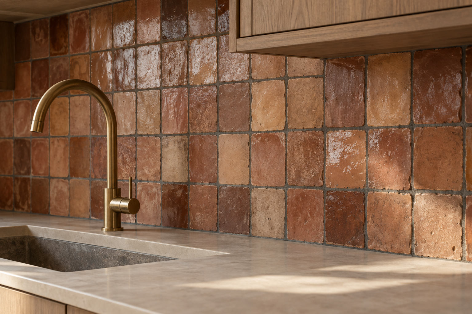
Zellige and other handmade tile can’t hold the tight, straight joints that machine-cut tile allows, since every piece varies slightly in size and edge. The wider, less regular grout lines that handmade tile requires make the grout color decision matter more, not less, since more of it is visible and its irregularity becomes part of the room’s texture.
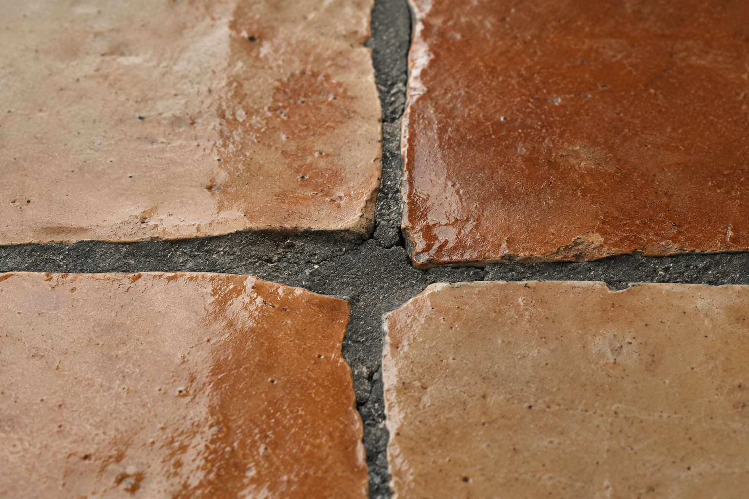
A deep charcoal grout on handmade tile lets that irregularity read as intentional character. A tight white grout line on the same tile would only make the same irregularity look like an installation flaw instead of the material’s real personality.
Frequently Asked Questions
Does grout color affect how easy a backsplash is to clean?
Yes. Light grout shows staining and daily discoloration almost immediately, while gray or a genuinely dark grout hides the same everyday soiling far longer, which matters most directly behind a range or a sink.
Can grout color be changed without replacing the tile?
Yes, in most cases. Existing grout can be stained a darker tone, or in some cases removed and reapplied entirely, without touching the tile underneath. A full regrout is more involved than the original installation, but it’s a real option for a backsplash that already has the right tile and the wrong grout.
Should grout match the cabinet color instead of the tile?
No. Grout is a tile-level decision that sets the backsplash’s own pattern and contrast, and tying it to cabinet color usually fights the wall’s own logic. Cabinet colors also change more often over a kitchen’s life than tile does, so grout chosen to match them dates faster. A shower or tub wall faces the same logic. Match the tile in front of you, not a color decision made elsewhere in the room.