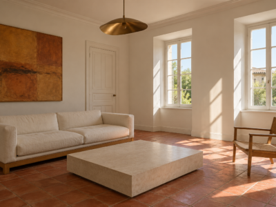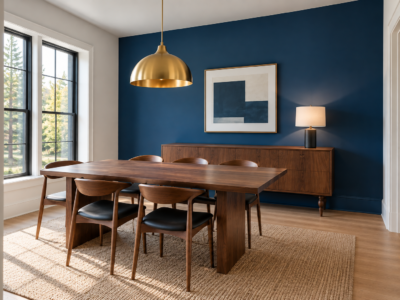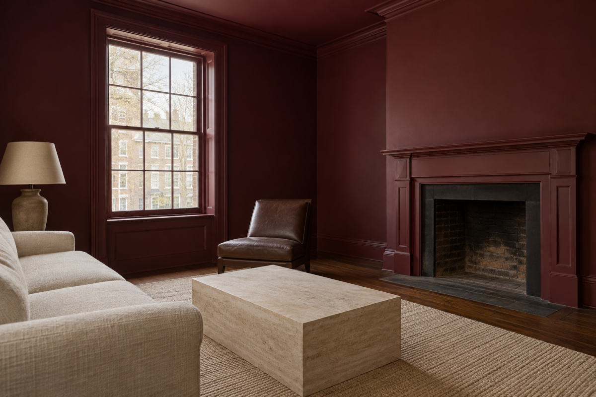
Color drenching means painting the walls, the trim, and the ceiling of a room in one color. With no white baseboard or white ceiling marking where each surface ends, the room is seen as a single volume, and the furniture, the floor, and the window become the things that stand out.
That much is the same in every drenched room. The differences come from how far the color travels. A room has doors, a radiator, cover plates, shelves, and sometimes tile, and each of those can take the color or stay as it was. Each idea here settles one of those questions, in rooms that run from a pale paneled dining room to a snug painted nearly black. They aren’t steps to follow in order, and few rooms would use all of them.
Paint the Trim in a Higher Sheen
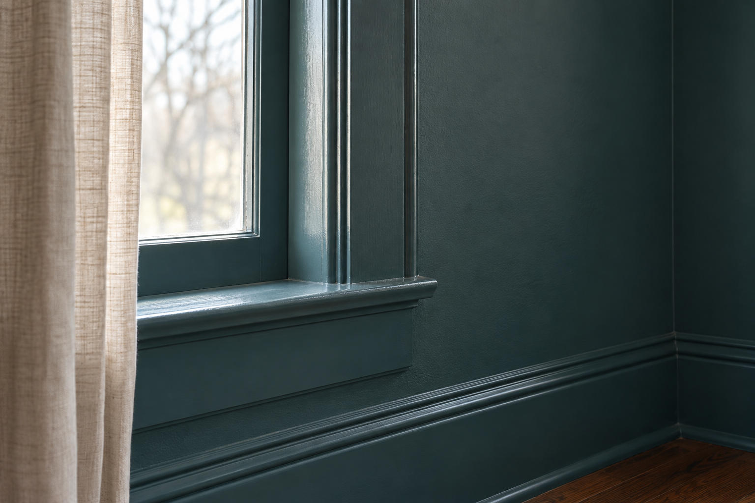
Use one color in two finishes, matte on the walls and ceiling and satin on the baseboards, casings, and doors. Satin reflects more light than matte, so the woodwork catches a bright line along each edge and along the top of the baseboard, and its profile still shows although the color hasn’t changed. In a deep teal the effect is clearest beside a window, where the casing shines and the wall next to it stays flat.
The choice is practical too. Trim gets kicked, bumped by the vacuum, and wiped, and satin stands up to cleaning better than matte. A higher sheen also shows dents and old brush marks more than a flat one, so fill and sand old woodwork before the top coat.
Mix the Ceiling at Half Strength
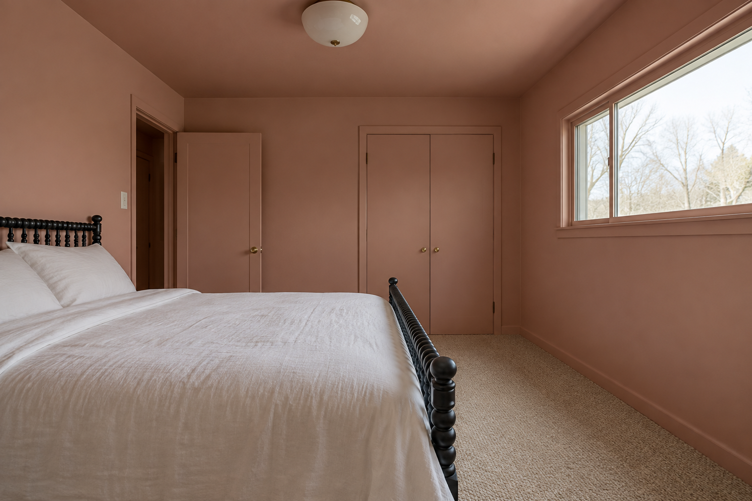
A ceiling gets less direct light than the walls, so the same paint usually looks darker overhead than it does beside the window. In a room with an 8 foot ceiling and one window, a ceiling in the full wall color can look a shade or two heavier than the walls.
Many paint stores will mix a color at half strength, with half the colorant in the same base. On the ceiling, that lighter mix tends to look close to the wall color, and there’s still no visible break at the top of the walls. Results vary from one color to the next, so paint a large sample board and hold it against the ceiling at midday and again by lamplight before ordering. A tall ceiling, or a room lit from two sides, usually needs no adjustment.
Include the Radiator, Vents, and Cover Plates

The small fixed things on a wall are easy to forget, and in a drenched room they show more than they did before. A white radiator on a mustard wall becomes the brightest object in the room, and so does a white cover plate beside the door.
A radiator needs a paint its maker rates for radiators, applied with the heating off and the metal cold. Vent grilles unscrew, and so do switch and outlet covers, which are easier to paint flat on a table than in place. Leave the switches and outlets themselves unpainted, and refit the covers once they’re dry. In the wall color, a cast iron radiator shows as a row of ribs and shadows where there used to be a white block.
Paint the Doors and Their Edges
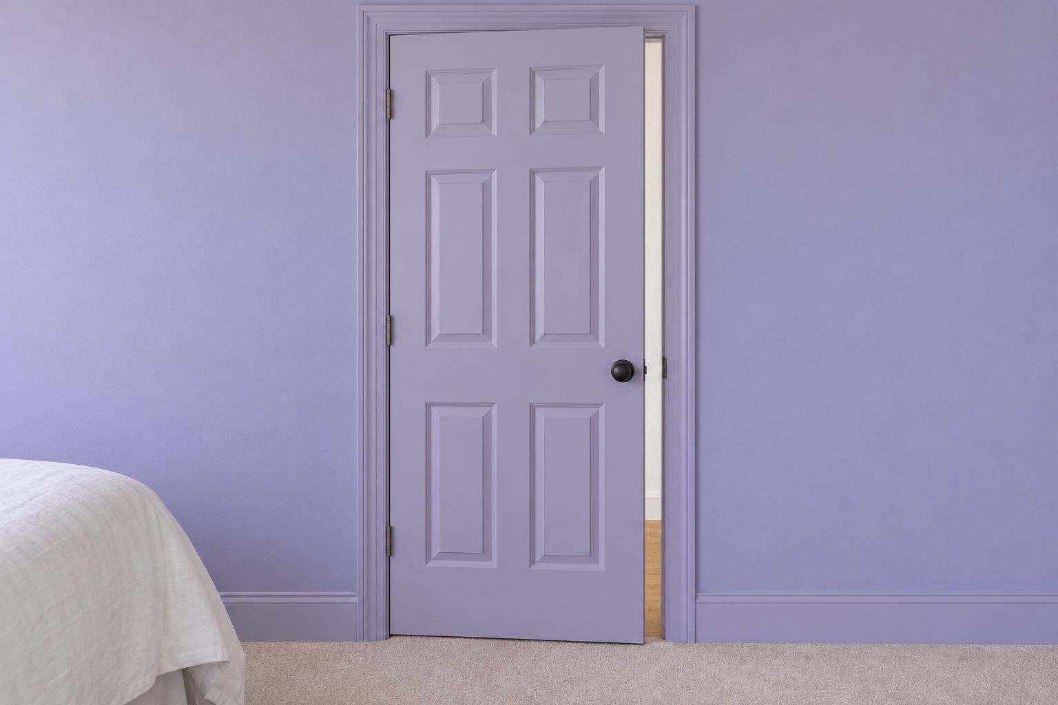
A drench that stops at the door casing leaves a white door in the middle of a colored wall. Painting the door in the wall color, in the same satin as the trim, lets the wall run on without a break. It helps most in a small room, where the door takes up a good share of one wall.
A door has two faces and belongs to two rooms. Each face takes the color of the room it faces when the door is shut. For the edges, painters follow a convention: the latch edge matches the room the door swings into, because that edge points into the room when the door stands open, and the hinge edge matches the other side. In a lilac bedroom off a white hall, with the door opening into the bedroom, the door is lilac on the bedroom face and the latch edge, and white on the hall face and the hinge edge.
Carry the Color Across Built-In Shelves
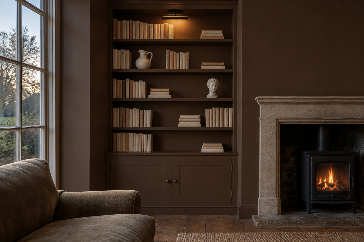
Built-in shelves painted white in a colored room become a white grid, and the grid is noticed before anything on it. Painted in the wall color, back panel, uprights, and shelf edges together, the structure drops back and the objects come forward. In a chocolate brown alcove, cream book spines and a white jug look brighter than they would against white, because the surface behind them is darker than they are.
Shelves carry weight and get scuffed, so use the trim finish on every shelf surface, and give the paint the full curing time on the can before loading them. Paint that feels dry to the touch can still stick to the bottom of a heavy book for some weeks.
Three Depths of One Color
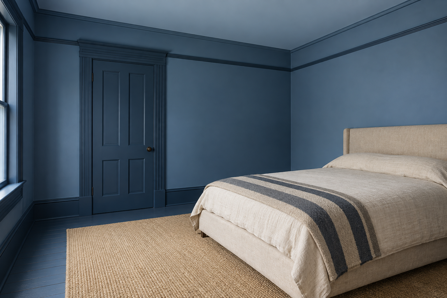
A drench doesn’t have to come from one can. Three versions of the same blue, taken from one paint strip, keep the single-color effect and add some modeling. The middle tone goes on the walls, the darkest on the baseboards, casings, and doors, and the palest on the ceiling.
Darker trim frames each window and door with a deep line, the reverse of white trim, which frames them with a bright one. The pale ceiling keeps the top of the room light. Stay on one strip, where the colors differ in depth and share an undertone. Two blues from different strips, one leaning green and one leaning violet, pull against each other, and neither looks like itself.
A Pale Drench Shows the Shadows
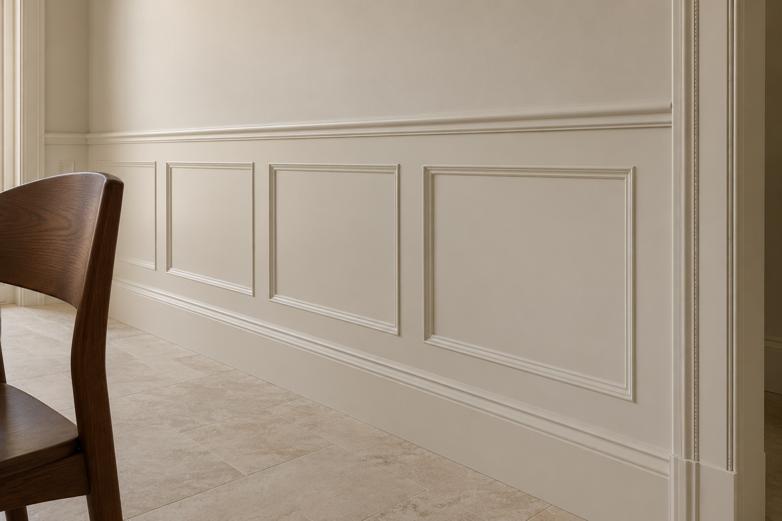
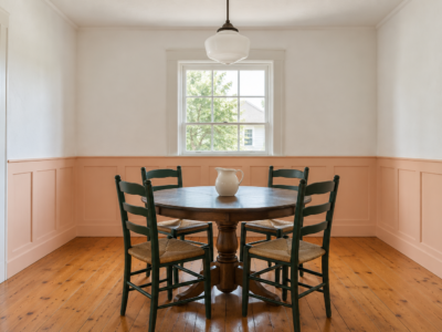
Drenched rooms are usually shown in dark colors, but the method works in pale ones and does something different there. In a pale oat color on walls, paneling, and ceiling, there is no color contrast left, so what the eye picks up is shadow, around each panel molding, along the bead of a door casing, and under a chair rail. The molding looks crisper than it does painted white against a colored wall.
It suits a room with good trim and plenty of daylight, and it’s forgiving, since a pale color shifts less between wall and ceiling than a deep one. In a room with flat walls and no molding, a pale drench can look plain, and the furniture and textiles have to supply the interest.
Go Dark in a Room Used After Sunset
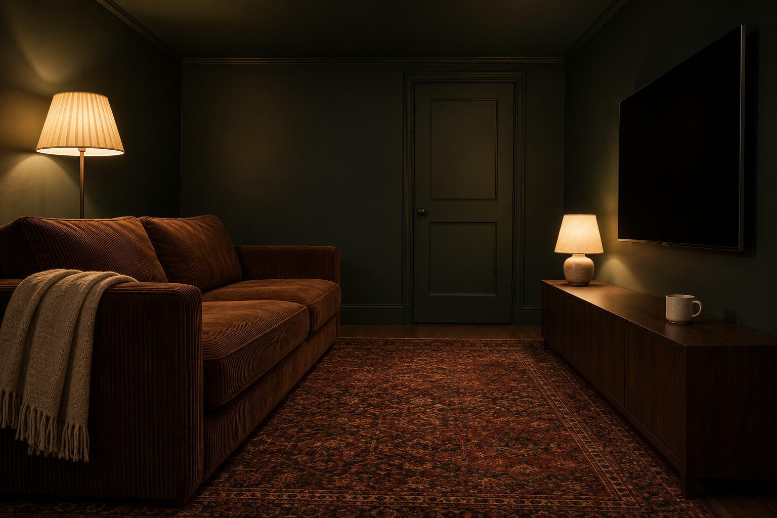
A deep color absorbs much of the daylight that reaches it. That’s a poor trade in a kitchen and a fair one in a room used mostly at night. A television room, a snug, or a dining room lit by lamps doesn’t depend on daylight, and a near-black green on every surface makes the corners and the ceiling line hard to see after dark. What’s lit, a lampshade, a tabletop, a face, stands out against it.
Plan the lighting with the paint. Dark walls reflect little, so one ceiling fixture won’t light the room, and several lamps at different heights will. Very dark matte paint also shows fingermarks as shiny patches, so choose a washable matte for the walls.
Let the Sofa Match the Walls
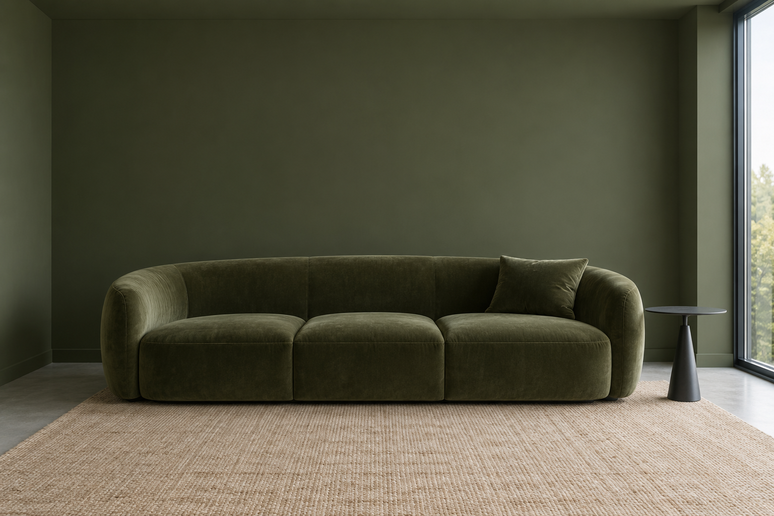
The largest piece of furniture can join the drench. A moss green velvet sofa against a moss green wall keeps its shape but stops standing out as a separate object, and the difference that’s left is texture, since the pile of the velvet catches light and the matte wall doesn’t. The room looks less furnished than it is, which is useful where a big sofa would otherwise dominate.
An exact match between fabric and paint isn’t possible and isn’t needed. Take a fabric swatch to the paint counter and choose the paint to suit it, since paint comes in thousands of colors and the sofa in a handful. Keep the floor, a rug, or a side table in a different material. With everything in one color, the edges of things become harder to judge, which some people enjoy and others find tiring.
A Hallway With Too Many Doors
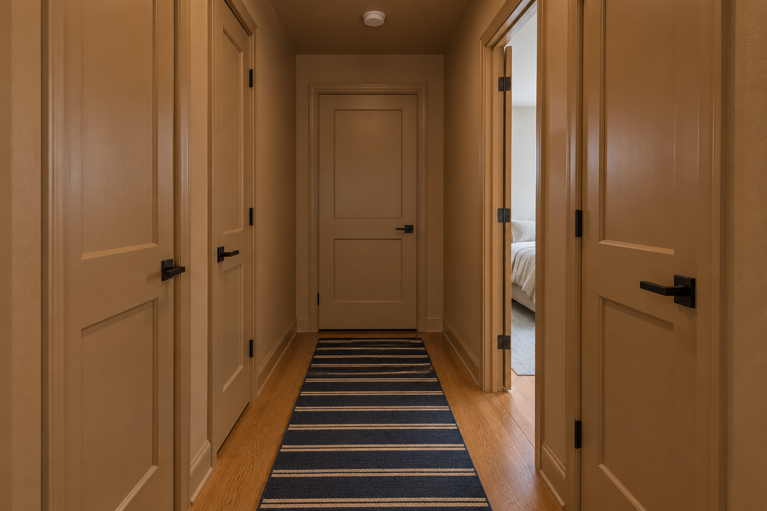
A hallway is mostly doors. In a short upstairs hall, four or five white doors with white casings make a busy pattern of rectangles on a colored wall. With the walls, doors, casings, baseboards, and ceiling in one caramel color, the hall becomes a single surface with handles on it, and the rooms seen through open doors take the attention.
A hallway is also an inexpensive place to try a drench. There’s little wall to cover, no large furniture to move, and in a hall with no window, no daylight to lose. Use satin on the doors and trim here, since hall woodwork takes knocks from bags and laundry baskets.
Match the Paint to the Tile
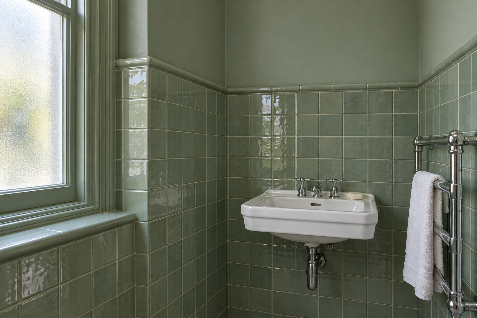
In a bathroom, tile usually covers the lower wall and paint the rest, and white paint above colored tile splits the room in two at the tile line. Take a spare tile to the paint counter and have the wall and ceiling paint matched to it. With celadon green tile to shoulder height and the same green above, the room has one color in two surfaces, glossy and reflective below, soft above.
Glaze varies from tile to tile, so match to one from the middle of the range, and check the sample in the bathroom’s own light. Use a paint made for bathrooms on the walls and ceiling, since steam is hard on ordinary matte. Contrasting grout will still draw its grid across the tiled part, and a grout color close to the tile keeps that surface continuous.