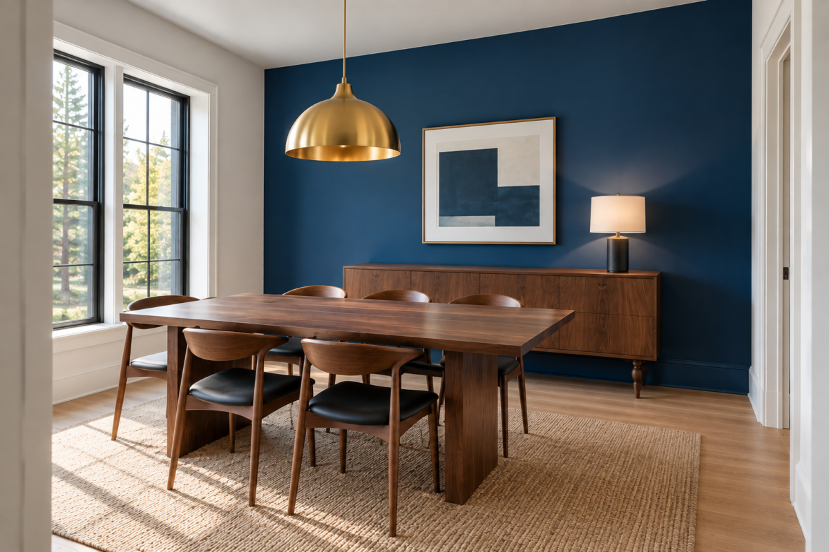
An accent wall used to mean one wall, one paint color, and a hope that it would read as bold. The idea has moved past that. What carries a room’s identity now is which wall gets picked and what covers it, since a confident material can do as much work as a confident color, and the wrong wall undoes either one before the paint goes up.
Nine ideas here treat the accent wall as a material and placement decision, not a swatch choice. Some are texture, not color at all, reclaimed wood, grooved wood paneling, limewash plaster. Others are placement logic that has nothing to do with which hue gets chosen. Pick the reasoning that matches the room, not the wall that happens to have the fewest windows.
Let the Room’s Sightline Choose the Wall, Not the Square Footage
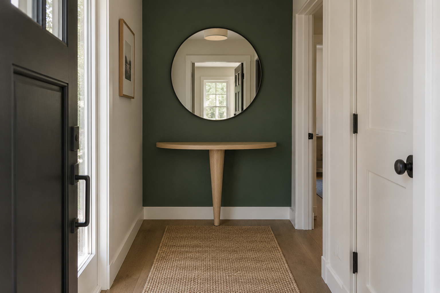
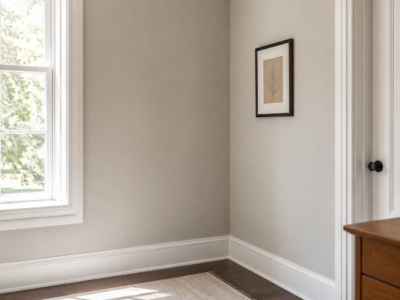
The instinct is to pick the biggest bare wall, but the wall that earns the treatment is the one a person sees first entering the room, not the one with the most square footage. In an entry or hallway, that’s usually the wall directly opposite the front door, the one that’s impossible to avoid looking at before a person has even stepped fully inside.
A narrow side wall running parallel to the walkway rarely earns the same treatment, since it’s seen at an angle in passing, not head-on. Walk the actual entry route before choosing a wall, not the floor plan on paper.
Use Reclaimed Wood Slats for Texture Instead of Color
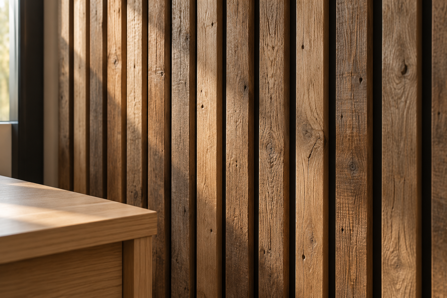
Not every accent wall needs a paint decision at all. Vertical wood slats, salvaged or new-cut to read weathered, carry warmth and real shadow line without a single color choice, and they read as a material upgrade in a way flat paint rarely manages, especially in a home office where a screen faces the wall most of the working day.
Keep the slat spacing consistent and stick to a single wood species. Mixing reclaimed pieces of visibly different tones turns the wall busy instead of textural, which undoes the entire reason for choosing wood over color in the first place.
Wrap the Wall and Ceiling in the Same Color
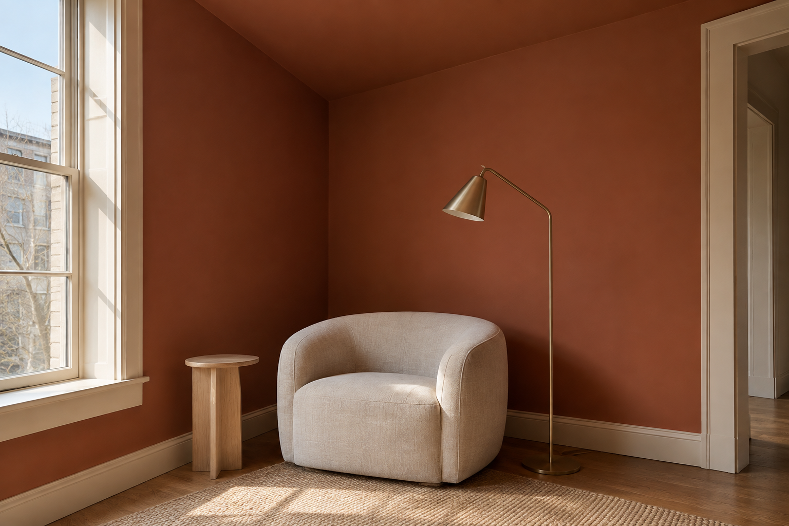
Painting a wall and the ceiling above it the same color, sometimes called color drenching, removes the hard stop where wall meets ceiling and makes a room feel taller and more enveloping, an effect a single painted wall alone never produces. It works especially well in a room with an ordinary, unremarkable ceiling height, since the color does work the architecture isn’t providing.
This asks more commitment than a single wall, since a lighter trim or crown detail has nowhere to hide once the color runs continuously overhead. Choose a color that already convinces before extending it past the wall.
Hang a Mural Wallpaper Where the Room Has No Space for Art
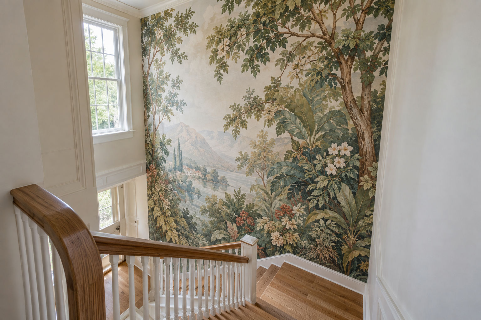
A dining room or stairwell often has one continuous run of wall and nowhere convenient to hang actual art around doorways and sightlines. A mural wallpaper, one continuous scene rather than a repeating print, fills that role directly, functioning as the room’s art instead of a backdrop waiting for some.
A repeating pattern reads as decoration. A true mural, botanical, landscape, or abstract, scaled to the actual wall, reads as one considered image. Measure the wall’s exact dimensions before ordering, since a mural cut short at a doorway looks unfinished in a way a repeating pattern never would.
Run Tongue-and-Groove Paneling Halfway Up a Hardworking Hallway
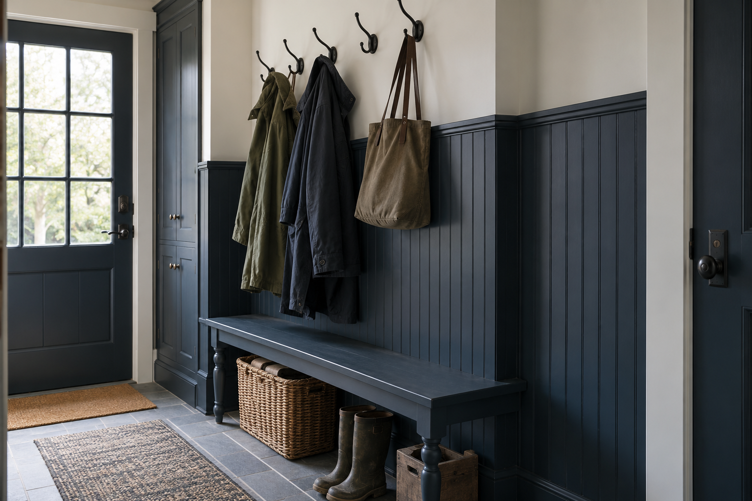
A mudroom or back hallway takes real abuse, bags, coats, a shoulder brushing the wall on the way past, and a painted accent color shows every scuff within a season. Tongue-and-groove paneling run to chair-rail height solves the practical problem while still doing the accent wall’s job, since the material itself, not a color, is the visual statement.
Paint the paneling a single confident tone rather than leaving it as bare wood, which can read unfinished in a hardworking hallway specifically. The plain wall above stays quiet, so the paneling keeps the accent’s full attention below the rail.
Choose a Warm Black Over Flat Paint When You Want Depth
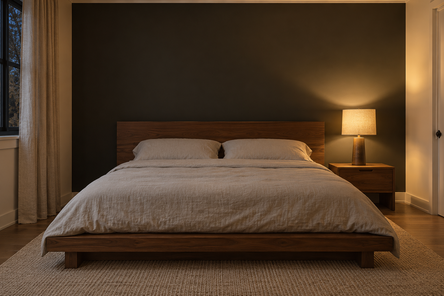
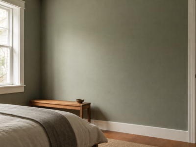
A true flat black wall can read as a void, especially in a room without much natural light. A warm black, one with a hint of brown or green underneath rather than a pure neutral black, keeps the depth without the room disappearing into it, and it reads considered rather than severe behind a bed.
Warm black needs real light nearby to register as color rather than shadow, a bedside lamp or a window close by, so a wall with no adjacent light source at all reads flat instead of rich.
Let Tile Do What Paint Can’t in a Small Bathroom
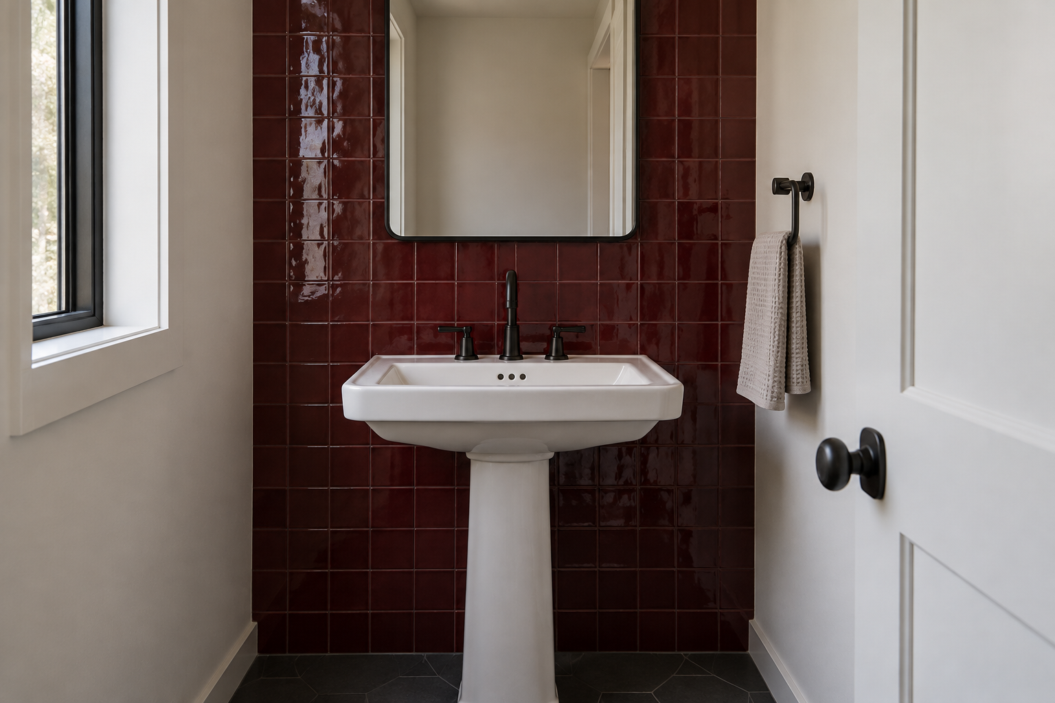
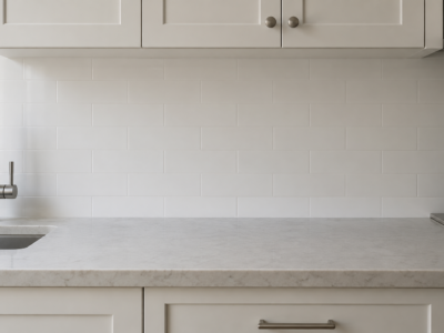
A small bathroom’s one accent wall takes on more moisture exposure than almost any other wall in the house, which makes tile a better material choice than paint, not just a different-looking one. A single wall in glazed tile, usually the one behind the vanity or facing the door, holds up to steam without repainting every few years.
Keep the surrounding walls plain and pale so the tiled wall reads as the room’s one deliberate decision, not one of several competing surfaces in a room too small to support more than one.
Let Plaster Texture Stand In for a Second Color
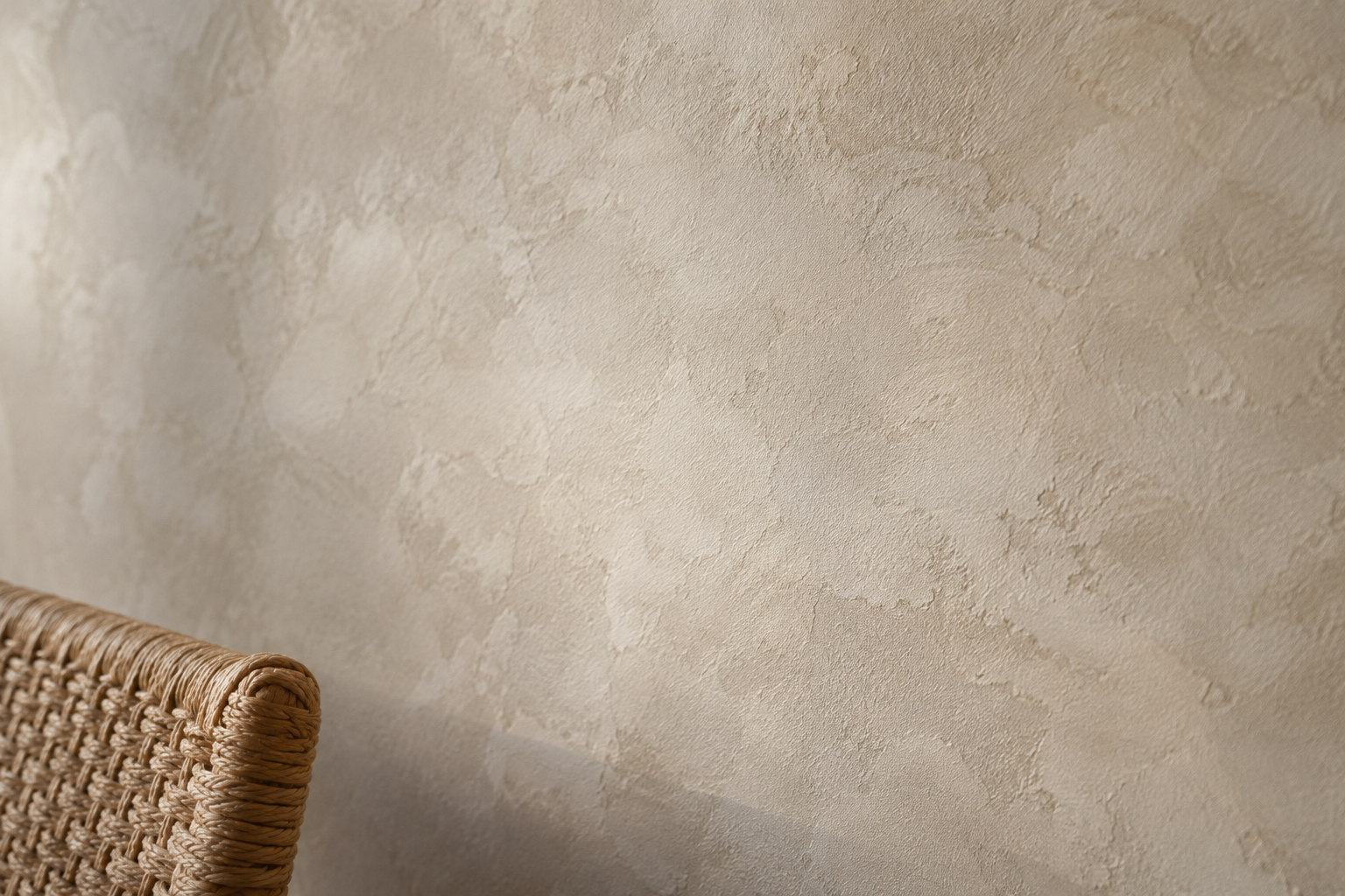
A limewash or textured plaster finish changes how a wall reads through the day without introducing a second color into the room at all, since the texture itself catches light differently morning to evening. It suits a reading nook or sunroom already settled on a neutral palette, where a bold paint color would fight the room’s actual mood.
The texture needs real daylight moving across it to register, so a windowless interior wall gains little from the treatment. Reserve it for a wall that gets real daylight raking across its surface.
Anchor the Accent to a Fireplace or Built-In, Not a Random Wall
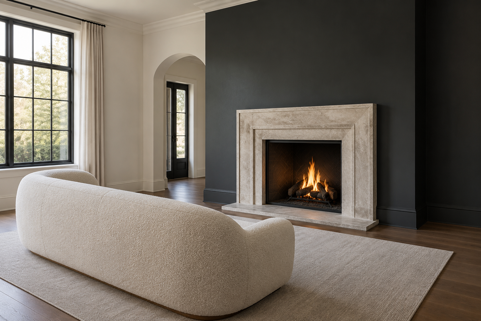
A fireplace wall or a run of built-in shelving already has the room’s attention, so extending the accent treatment to that specific wall reinforces a focal point the room already has instead of creating competition with one. A bold color or material on an unrelated wall elsewhere in the same room fights the fireplace for attention instead of supporting it.
This is the one case where the biggest-wall instinct and the right-wall answer often land in the same place anyway, since a fireplace wall is frequently the room’s largest uninterrupted surface too. Confirm it’s the sightline the room’s furniture already faces before committing.
Frequently Asked Questions
Does an accent wall date a room faster than an all-neutral room?
Not if the color or material comes from the room’s own real light and other materials rather than a passing trend. A confident, well-reasoned wall ages better than a neutral room with no real identity at all, and repainting one wall back to neutral later is a far smaller project than repainting an entire room.
Can a room have more than one accent wall?
Rarely, and usually not on purpose. Two walls competing for attention undoes the reason an accent wall works in the first place, which is that the eye has exactly one place to land. A room with clearly separate zones, an open living and dining space, can support one accent per zone, but not two walls in the same sightline.