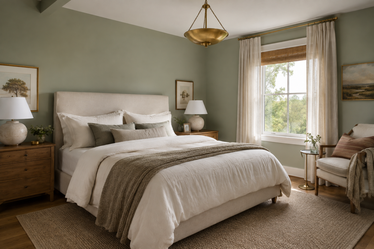
Sage green works in a bedroom because it behaves less like a bold color choice and more like a neutral with a little more personality. Much of the sage family sits close enough to gray that it pairs easily with warm wood, brass, and linen, materials that already show up in a lot of bedrooms, without asking you to rebuild the room around it. That flexibility is also why it shows up in so many different forms: a pale, almost dusty sage can read as quietly as a greige wall, while a deeper, more saturated version becomes the room’s main event.
The seventeen approaches here span that whole range. Some are low-commitment, such as a duvet cover, a set of pillows, or a single painted surface you could repaint in an afternoon if it doesn’t work out. Others ask for more commitment, like a fully painted primary suite, a piece of built-in millwork, or a canopy bed upholstered in the color itself. None of them require doing all of it at once, and a few work well combined. It’s worth starting with whichever one feels lowest-risk for your space, and a single wall is often the simplest place to do that.
Start With a Single Accent Wall
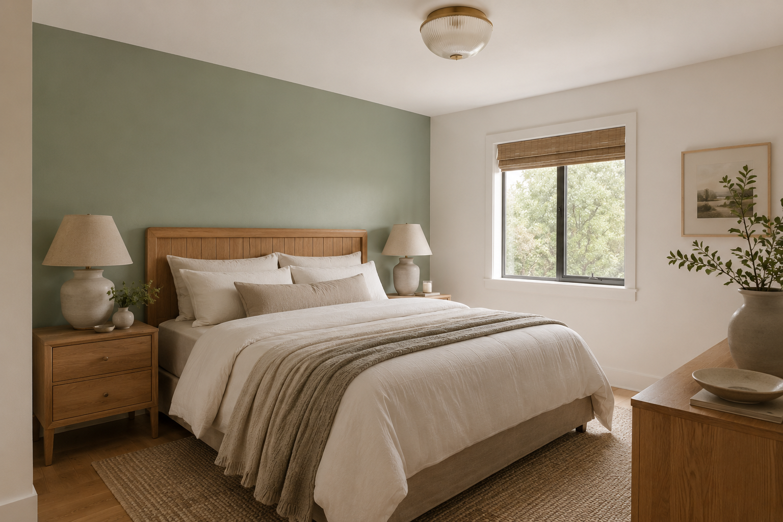
The headboard wall is a natural place to commit to sage, since it becomes the room’s visual anchor the moment you walk in. A gray-based sage tends to read calmer against a white ceiling than a yellow-green one, though the right daylight can make either work well. What matters more than the exact headboard material is warmth. Wood, cane, or warm-toned upholstery all keep the wall from feeling cold, while cool gray or black nearby can flatten the green. Keep the trim off-white instead of stark white, which can make the color look slightly dull by comparison. The real risk is reaching for too dark a version in a room with limited daylight, where it starts to feel heavy instead of calm.
Paint the Ceiling Instead of the Walls
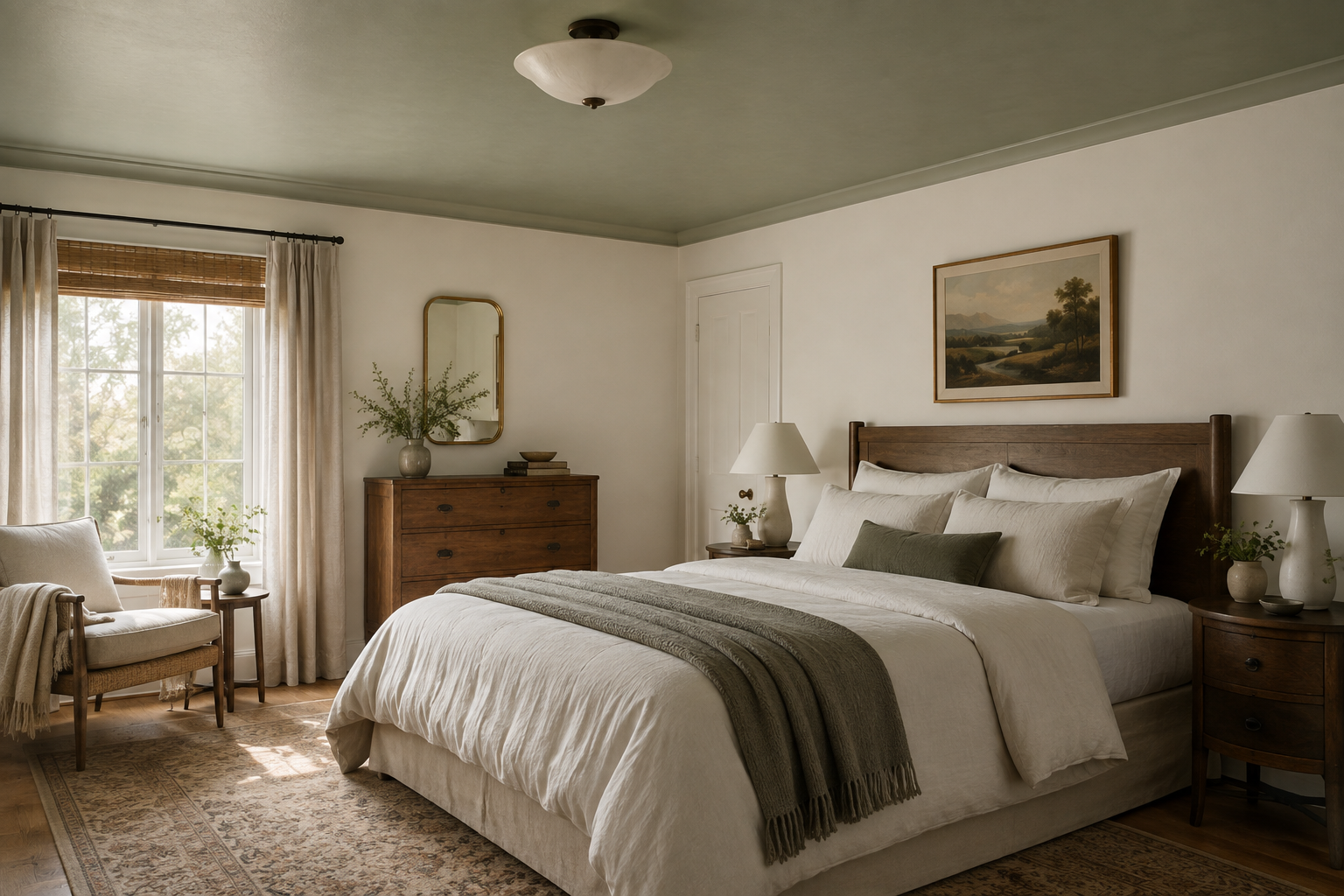
Painting only the ceiling keeps the walls quiet while still giving the room a distinct point of view the moment you look up. It works especially well in a room with crown molding or a ceiling medallion, since the trim gives the color a clean stopping point and keeps the ceiling treatment visually contained. Consider going a shade or two lighter than you would for a full wall treatment: sage overhead often reads darker than the same paint chip suggests, since ceilings typically get less direct light than walls do. Curtains or a bed canopy in a soft neutral keep the look from feeling like a lid on the room.
Let Bedding Carry the Color, Not Paint
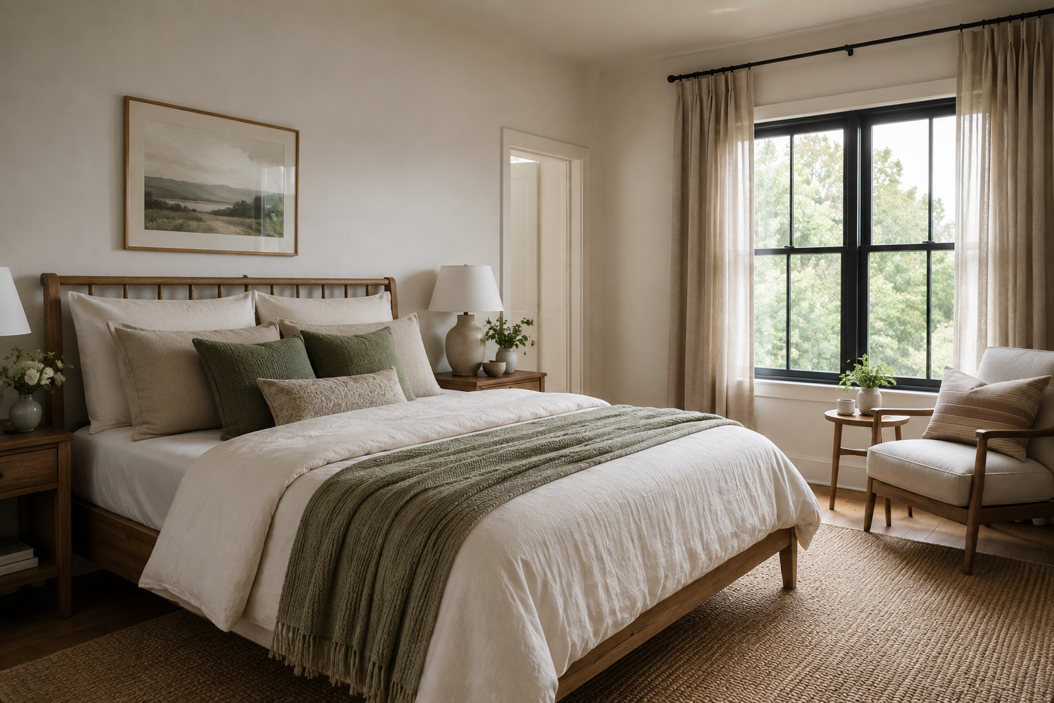
A sage duvet cover or a set of botanical print pillows brings the same mood without touching the walls, which matters if you’re renting or simply not ready to commit to paint. It’s fully reversible, so you can live with the color for a season before deciding whether it belongs on the walls too. Keep the rest of the bedding in warm neutrals. Too much contrast against crisp white can make a single sage piece look like an afterthought instead of an intentional layer. A wool or jute rug underneath does more to ground the look than another patterned textile would.
Choose a Grasscloth Texture Over Flat Paint
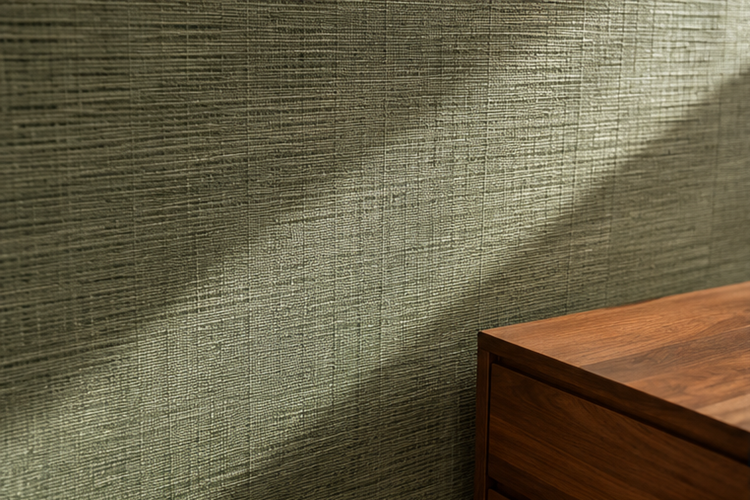
Grasscloth adds a layer flat paint doesn’t have, texture that catches light differently depending on where you stand in the room. A woven sage wallcovering reads more like a natural material and less like a paint decision, softening the color even at a similar depth to what you’d get from a can. It also suits a wall that gets strong afternoon sun, since the texture hides minor color shifts that would show clearly on a flat painted surface. It’s worth knowing going in that grasscloth costs more than paint and is harder to touch up if it’s ever damaged, so it tends to work best somewhere low-traffic, like behind a headboard.
Pair Sage With Warm Brass, Not Cool Chrome
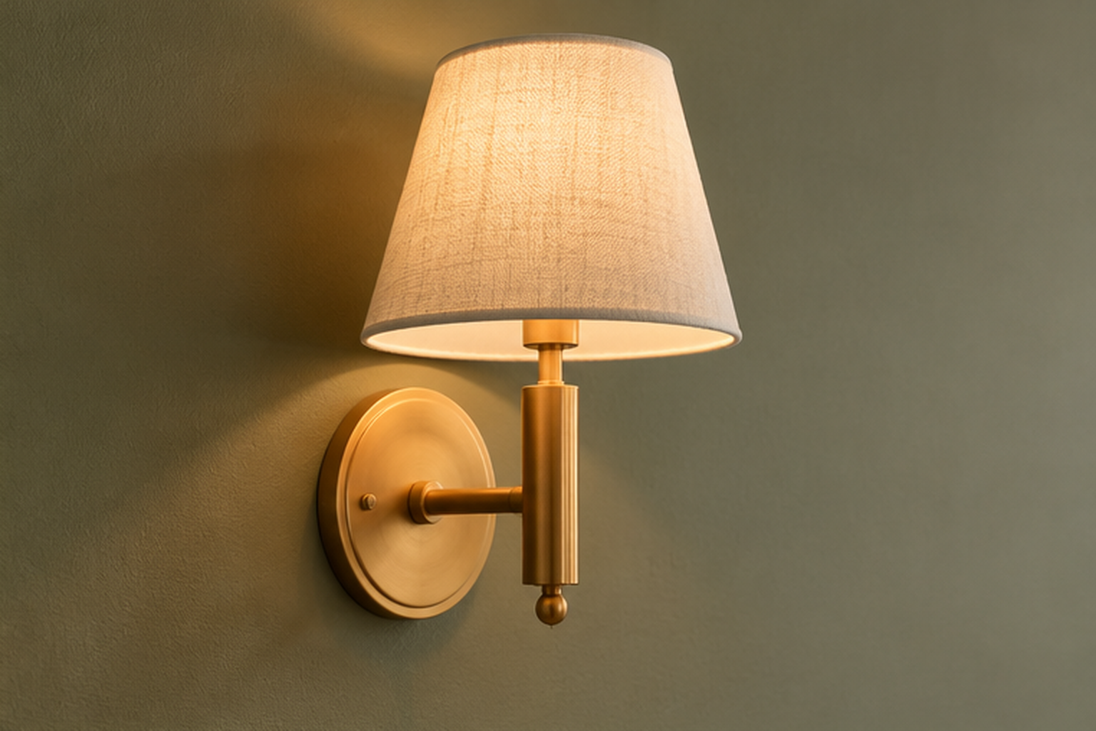
Sage is a muted, slightly warm green, and cool-toned metals can make it look flatter and grayer than it actually is. Brass, especially an unlacquered or antique finish, warms the color back up and adds a bit of shine without introducing a second bright material into the room. This matters most within a few feet of the wall, on door hardware, a sconce, or a lamp base, where the metal and the paint are close enough to visually compete. Chrome and brushed nickel aren’t off the table entirely; they just ask for something else warm nearby, like a wood nightstand or a linen shade, to keep the room from tipping cold.
Ground It With Walnut Furniture
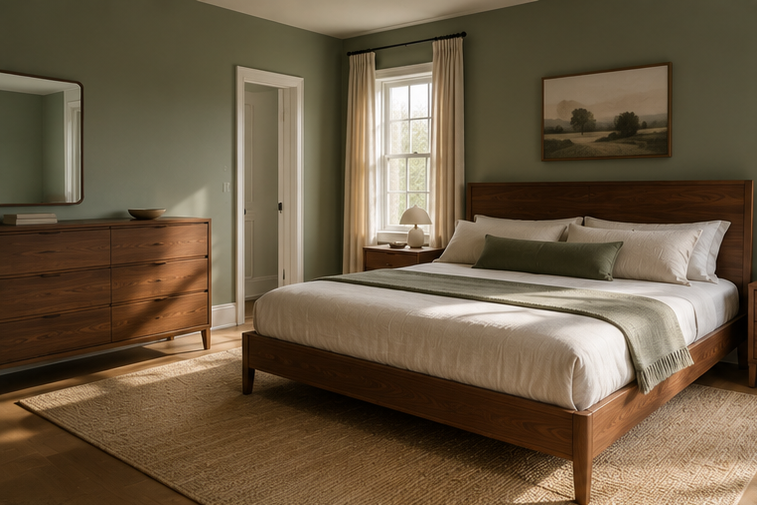
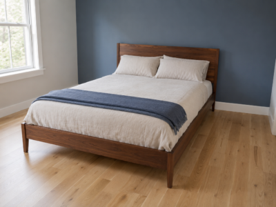
Walnut’s warm, reddish-brown tone sits in clear contrast to sage’s cooler, muted green, which is part of why the pairing feels balanced rather than random. A walnut bed frame or dresser gives the room one clear anchor material instead of a lot of competing wood tones. Oak or a lighter wood can work too, but it reads cooler and typically needs a warmer textile nearby, a wool rug or linen curtains, to avoid feeling washed out next to the green.
Bring In Rattan and Woven Textures
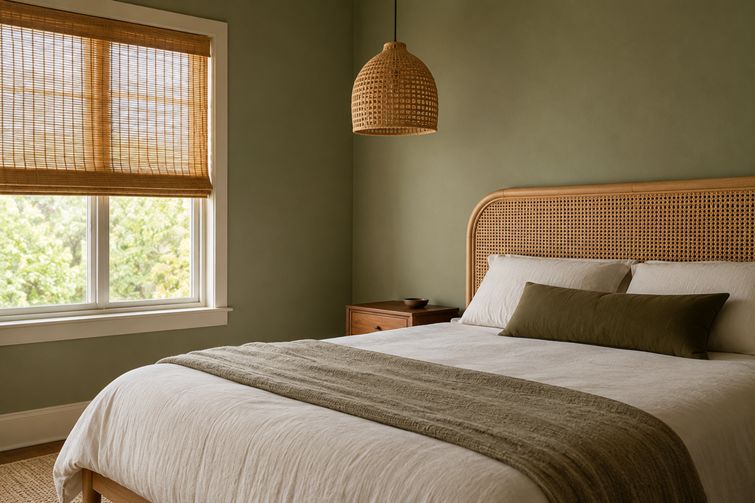
Rattan and other woven materials add texture without adding another color. That’s useful in a room that’s already spending its one bold move on the walls. A rattan headboard, a woven pendant light, or blinds in a similar material all read as natural rather than decorative. They support the sage instead of competing with it. Repeating the texture in two places, not just one, is what makes it feel intentional. A single rattan chair in an otherwise smooth room can look like it wandered in from elsewhere.
Go Deep and Moody in a Primary Suite
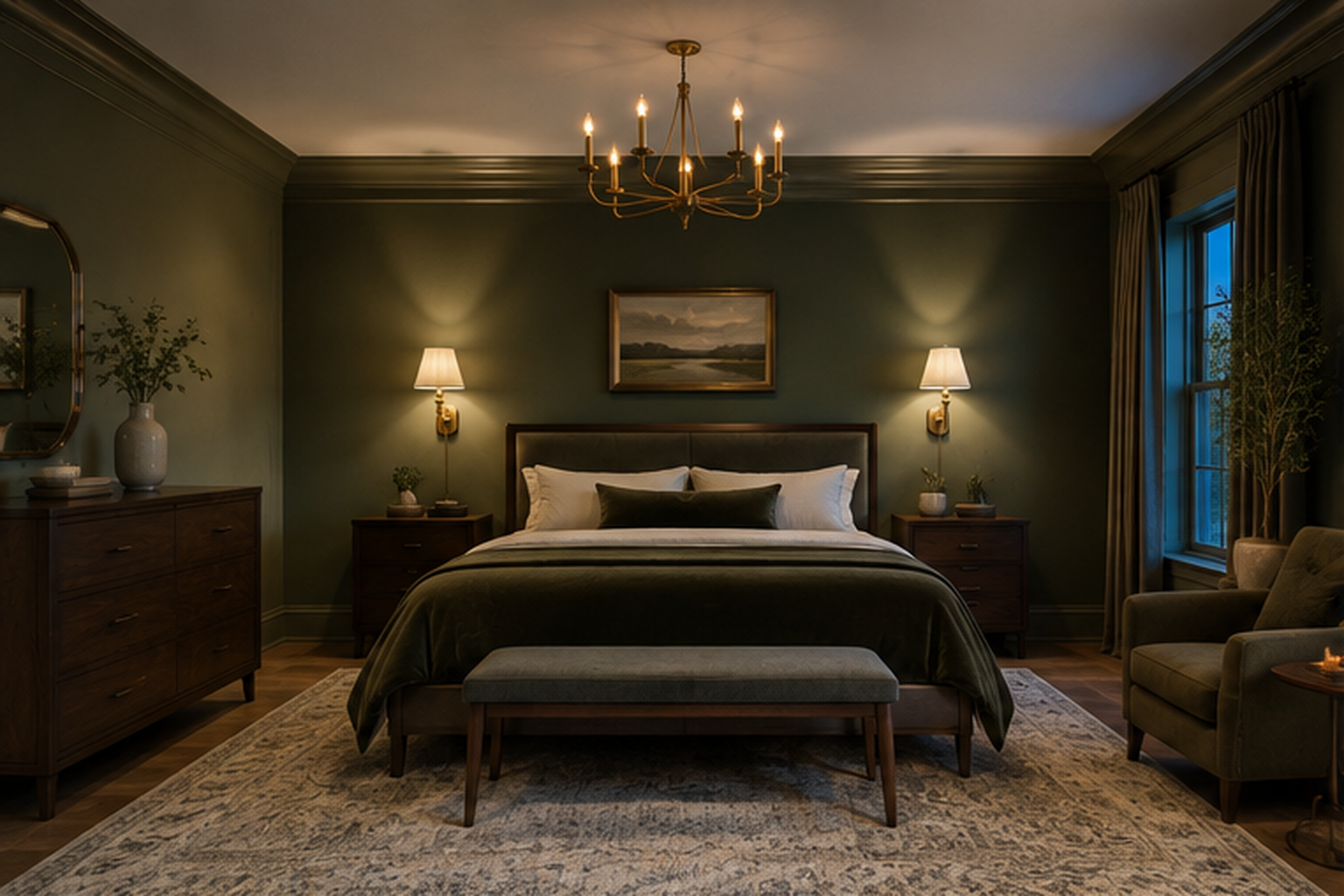
Depth is the whole point here. A sage closer to hunter or moss than the pale end of the family works when a room has enough scale to absorb it without feeling closed in. A primary suite often has an advantage over a smaller bedroom simply by having more square footage and usually more window area. That extra space gives the color room to sit without dominating every sightline. Lean into the depth. Dark wood furniture, a substantial wool rug, and metal finishes in brass or aged bronze all sit comfortably next to a saturated green rather than competing with it. Keep at least one large light source, a big window or a generous overhead fixture. That way the room reads as intentionally dim in the evening, not simply underlit during the day.
Keep It Pale in a Small Bedroom
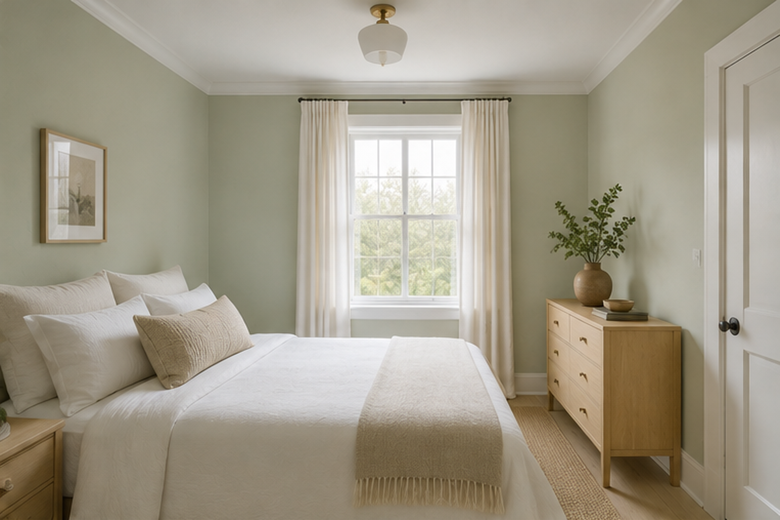
Pale, almost neutral sage behaves differently than the deeper end of the family. Instead of adding weight to a small room, it can make the walls recede slightly, especially when the trim and ceiling stay close to the same value. This works best when natural light is decent. In a genuinely dark room, a very pale green can look washed out rather than soft. Furniture in a similar light tone, light oak or a painted finish, keeps the room from breaking into visual chunks the way dark furniture against pale walls sometimes does. One thing worth planning around is layout. In a small bedroom, the bed usually has to anchor one wall by necessity, not choice, so pick the wall with the fewest doors and windows interrupting it, and let the paint go there.
Split the Wall With a Painted Line
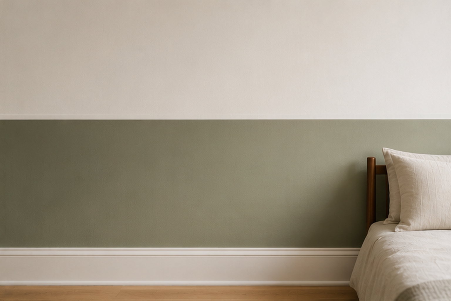
Wainscoting-height paint lines give sage a defined edge instead of covering the whole wall, typically landing about a third of the way up. Measure and mark the line level around the room before taping. Even a slight slope is noticeable at eye level once the two colors meet. Use painter’s tape rated for delicate walls, and run a thin bead of paintable caulk along the tape edge before painting the top color, then peel it back once the sage coat is dry. This seals the tape against bleed-through, which is the most common way this technique goes wrong. The line height is worth adjusting to the room. A lower line, closer to a foot off the floor, reads more like a baseboard detail, while a line at true wainscoting height reads as a more deliberate design choice.
Extend Sage Into a Window Seat or Reading Nook
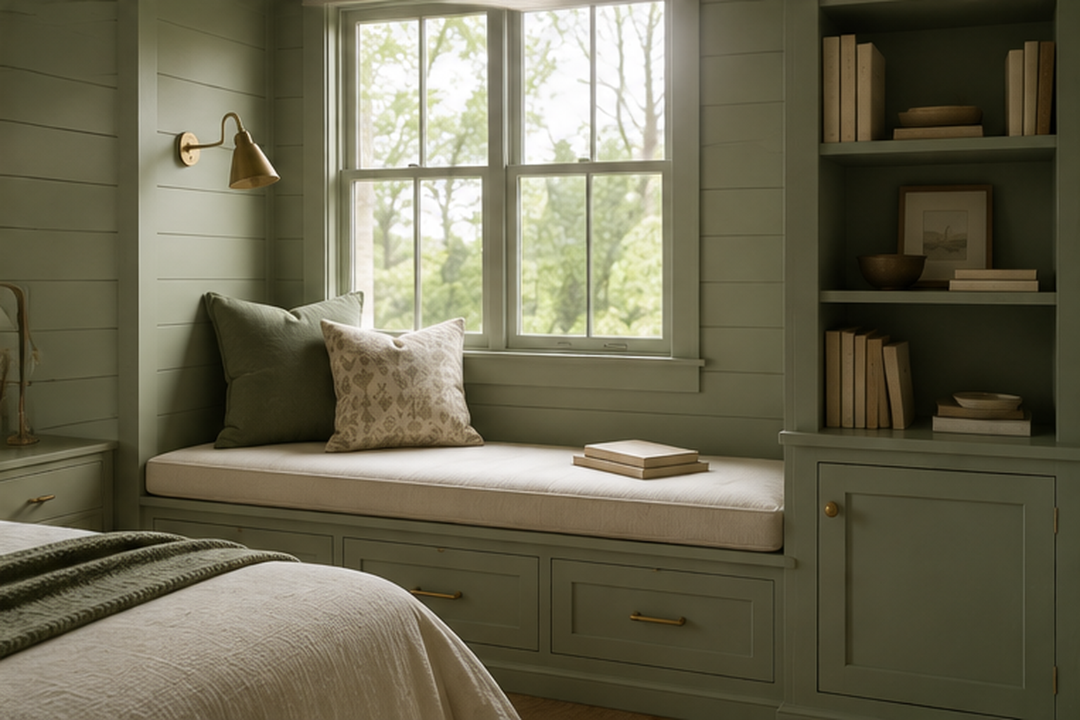
A built-in window seat gives sage somewhere to live beyond the walls, on the seat base, the surrounding shelving, or both. Painting the millwork the same color as an adjacent accent wall ties the nook to the room instead of making it read as a separate project. Cushions in a durable performance fabric hold up better here than the linen that works fine on a bed, since a window seat gets more direct sun and more daily contact. If the seat includes storage underneath, a hinged lid is worth the extra hardware cost over drawers, since it keeps the full depth of the bench usable instead of losing space to drawer slides. Curtains hung just outside the nook’s opening, rather than inside it, keep the seat feeling open instead of boxed in.
Warm It Up With Terracotta Accents
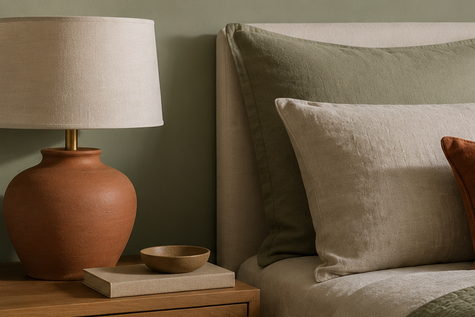
Terracotta is warm in the same way brass is warm, but it adds color instead of shine, which makes it useful once the metal accents are already set. A ceramic vase, a set of pillows, or even a small terracotta lamp base gives the room a second color without introducing a second dominant one. Sage stays the main event. This pairing works especially well against a paler sage, where the contrast has room to show up clearly. Stick to one or two terracotta pieces rather than scattering the color throughout the room, since spreading it too thin makes it read as an accident instead of a choice.
Contrast It With Matte Black Metal
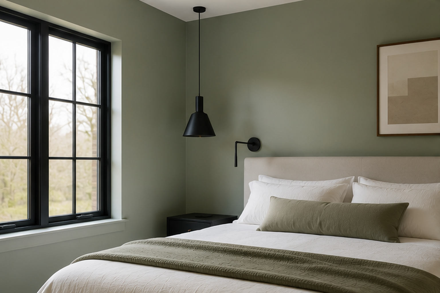
Matte black reads more modern and more graphic against sage than brass does, since the contrast is about value and finish instead of warmth. A black window frame, a black pendant, or black door hardware gives the room a crisper edge, which suits a more contemporary take on the color than the softer, more traditional pairings elsewhere on this list. It’s worth keeping the black to one category of object, lighting or hardware, rather than mixing it into furniture too, so the room doesn’t start to feel like it’s making several different style arguments at once. White bedding keeps the combination from feeling heavy.
Paint the Closet Doors, Not the Walls
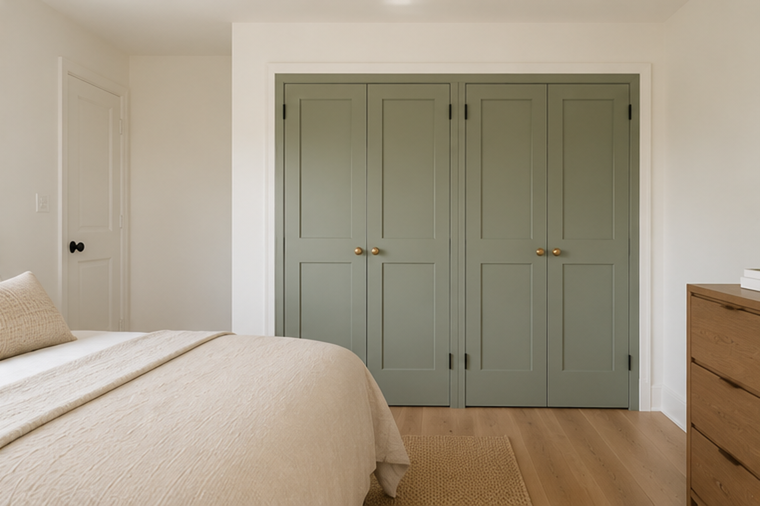
Painting just the closet or wardrobe doors keeps the color commitment small and contained, which suits anyone still deciding whether they want sage on a full wall. It also gives the color a job, marking the storage wall as distinct from the rest of the room, which can help a closet with awkward or mismatched doors read as more considered. Brass or unlacquered pulls tie the doors back to the warm metal accents used elsewhere with sage. This approach works particularly well in a small bedroom where wall space for a full accent is limited but a wardrobe front is already a fixed, sizable surface.
Use It Behind an Upholstered or Canopy Bed
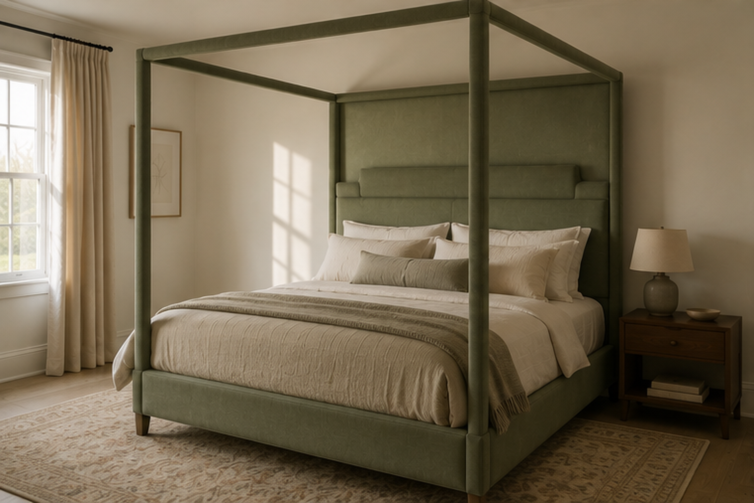
An upholstered headboard or a canopy frame in sage turns the bed itself into the color statement, so the surrounding walls can stay completely neutral. This is a useful option in a rental or a room with walls you can’t paint, since the color moves with the furniture instead of the lease. A canopy frame in particular reads taller than the room’s actual ceiling height suggests, because the eye follows the vertical posts upward. Velvet tends to hold color with more visual depth than a flatter cotton or linen weave, which matters more here than on a duvet, since the headboard is the single largest block of color in the room.
Let a Botanical Print Carry the Color Instead of Paint
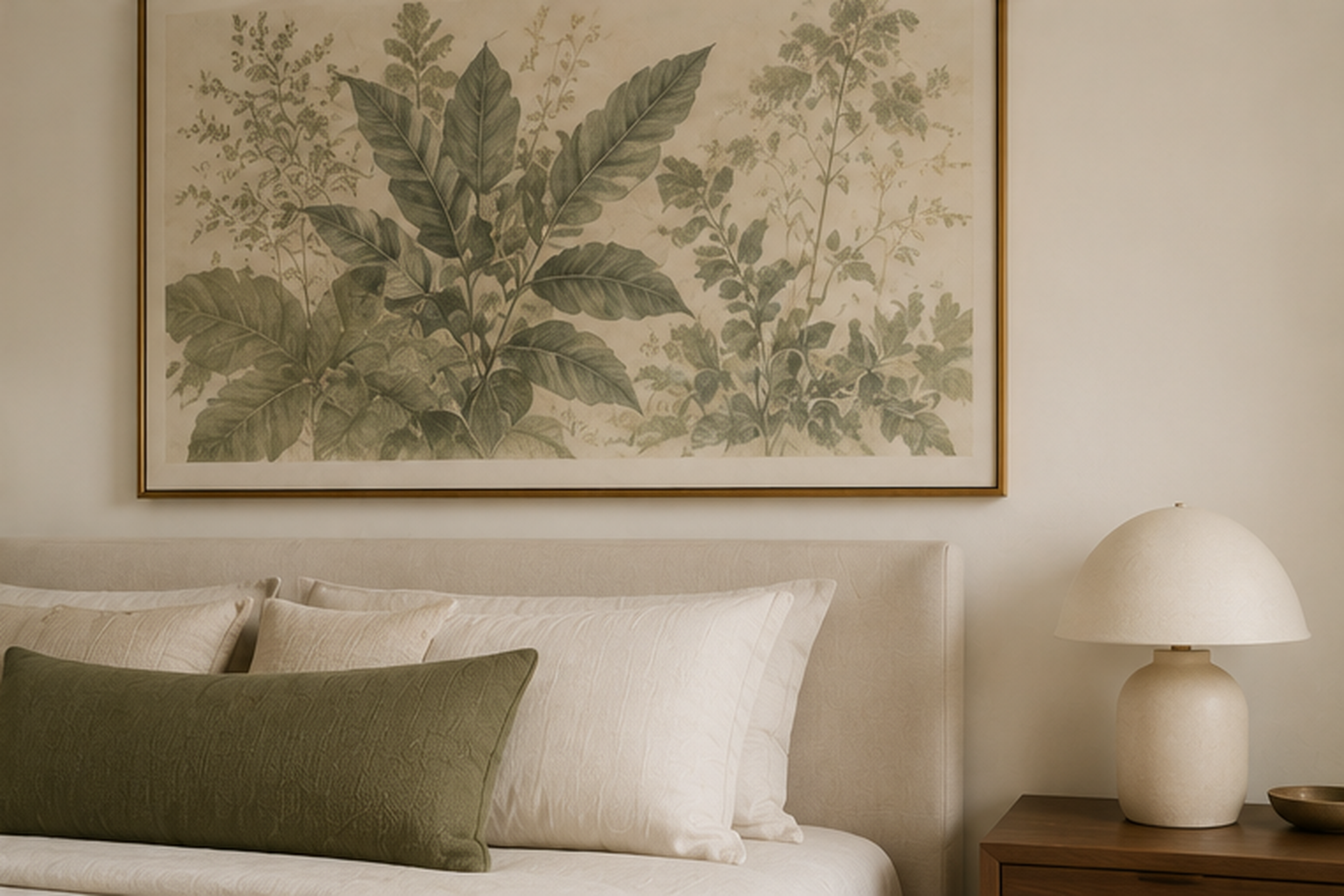
A large botanical print in sage tones gives a plain white wall the same color moment as paint, without touching the wall itself. Scale matters more than usual here. A small framed print reads as decor, while a piece sized closer to the width of the headboard reads as the wall’s main event. Museum glass is worth the upgrade in a bedroom that gets any direct sun, since standard glass can wash out the print’s color over time the same way it would fade a painted wall. This option travels well too, which makes it a reasonable choice for anyone who moves more often than they’d like to repaint.
Loosen Up in a Guest Room With Pattern
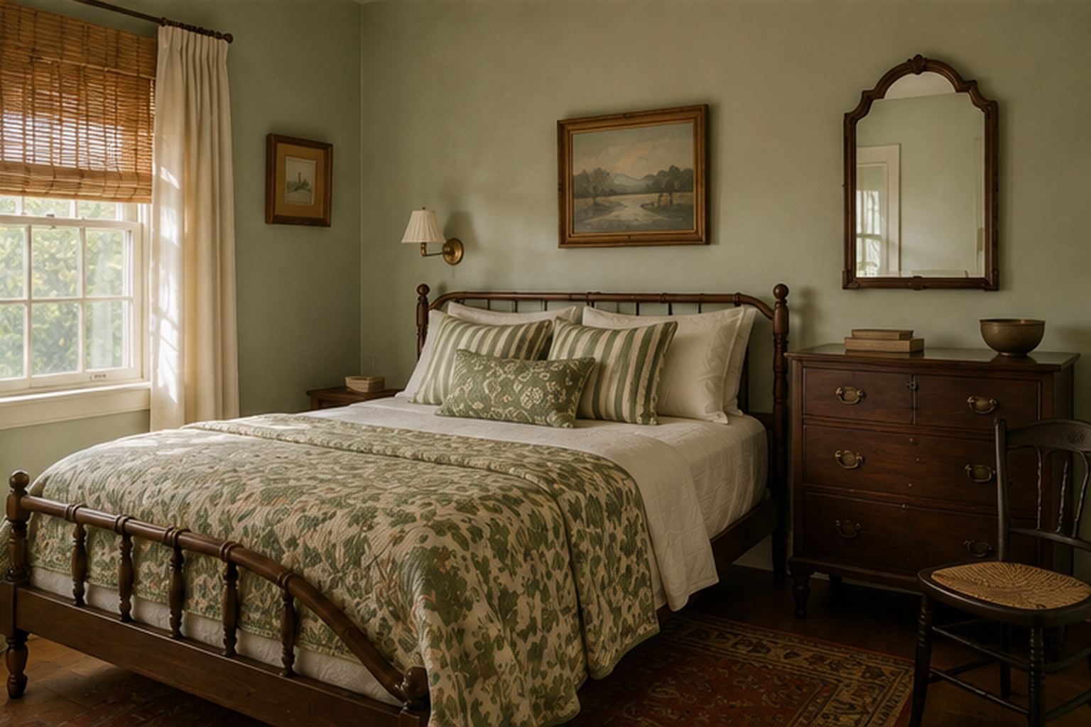
A guest room is the easiest place to take more risks with sage, since it’s not absorbing the same daily wear as a primary bedroom. Pattern is where this idea differs most from the rest of the list. A floral or botanical print quilt, mixed with a solid sage wall or bedding base, works here in a way that might feel busy in a room used every day. Vintage or secondhand furniture suits this pairing particularly well, since a slightly worn dresser or an older cane chair already has the kind of texture and color variation that makes pattern feel collected rather than matched from a single catalog. A guest room also tolerates a shorter shelf life for a design choice, which makes it a low-stakes place to try pattern at all.
Frequently Asked Questions
Does sage green work in a low-light bedroom?
It can, though low light tends to flatten any color, sage included, so the specific shade matters more than usual. A gray-based sage can look more gray than green under weak daylight, while a version with a touch more yellow tends to hold its color better in dim rooms. Artificial light adds another variable, since a cooler LED and a warmer bulb can pull the same sage in different directions, and neither is inherently the better choice. Testing a large sample on the wall in both daytime and evening light is the most reliable way to see how it will behave in your room.
Is sage green a warm or cool color?
It can lean either way, depending on its undertone, the surrounding materials, and the light it’s in, which is part of why it works with so many different palettes. Sage sits in the muted gray-green family, which gives it that flexibility in the first place. Under warm lamplight or next to wood and brass, it reads slightly warm. Under cool daylight or next to chrome and white marble, the same paint can look distinctly cooler. That in-between quality is useful, but it also means the room’s other materials do more work than the paint color alone in deciding which way it tips.
What color bedding works with sage green walls?
Warm neutrals do more for sage walls than crisp white does: oatmeal, warm ivory, or a soft camel keep the room from feeling like two competing color blocks. White bedding isn’t off-limits, but a bright, blue-white tends to make the green look colder than it is, so a warmer, slightly yellowed white works better if you want to stay in that family. A little pattern or a second muted color, terracotta, rust, or a soft brown, keeps the palette from feeling flat, as long as it stays to one or two pieces rather than spreading across every textile in the room.