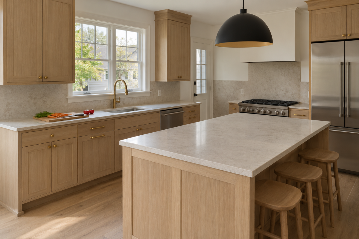
A kitchen gets used before it gets photographed, and most kitchen advice has the order backward. It starts with how a room should look and works backward into whether that look survives someone cooking in it day to day. The better order runs the other way, figuring out what the room has to do first, then letting the decisions that follow read as considered instead of staged.
None of these twelve ideas ask for a full renovation. A backsplash gets pushed to the ceiling. One wall trades cabinets for open shelving. A metal finish repeats across three different fixtures instead of one. Each idea is a specific decision a real kitchen can make on its own, not a full look to copy wholesale.
The twelve here range from a small material swap to a genuine layout choice. Start with whichever one solves an actual problem in your own kitchen.
Let Open Shelving Carry One Wall, Not the Whole Room
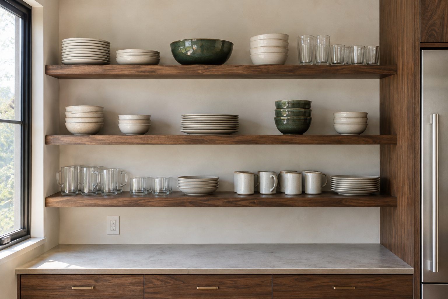
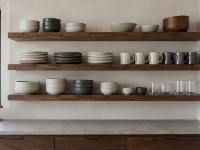
Open shelving fails less often because of the shelving itself and more because of where it gets used. A whole kitchen of open shelves turns into a maintenance project, since every surface stays visible and every gap in the dishware shows. One wall handles it differently. Contained to a single run, open shelving reads as a considered display rather than a storage compromise, and the closed cabinets everywhere else absorb the parts of a kitchen that don’t need to be seen.
Stock it with what gets used weekly, the plates and glasses already in rotation, not a curated set bought for the shelf. A kitchen that stores its real dishware in view reads as lived in, not staged for one, which is the whole point of choosing open shelving in the first place.
Run the Backsplash Tile to the Ceiling
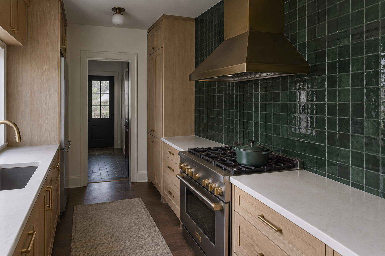
Most backsplash tile stops at the underside of the upper cabinets, a boundary the cabinets set, not a real design decision. Running the same tile past that line, up to the ceiling, especially behind the range where there’s often no cabinet at all, turns a functional splash guard into the room’s real material statement.
This works best in exactly the kind of narrow kitchen that seems like it has the least room for a bold move. A tall tile run draws the eye up rather than across, which does more for a tight galley layout than adding cabinet storage ever could. The circulation space stays exactly as narrow as it was. The room just stops looking like it’s apologizing for it.
Choose One Bold Cabinet Color Instead of Two Neutrals
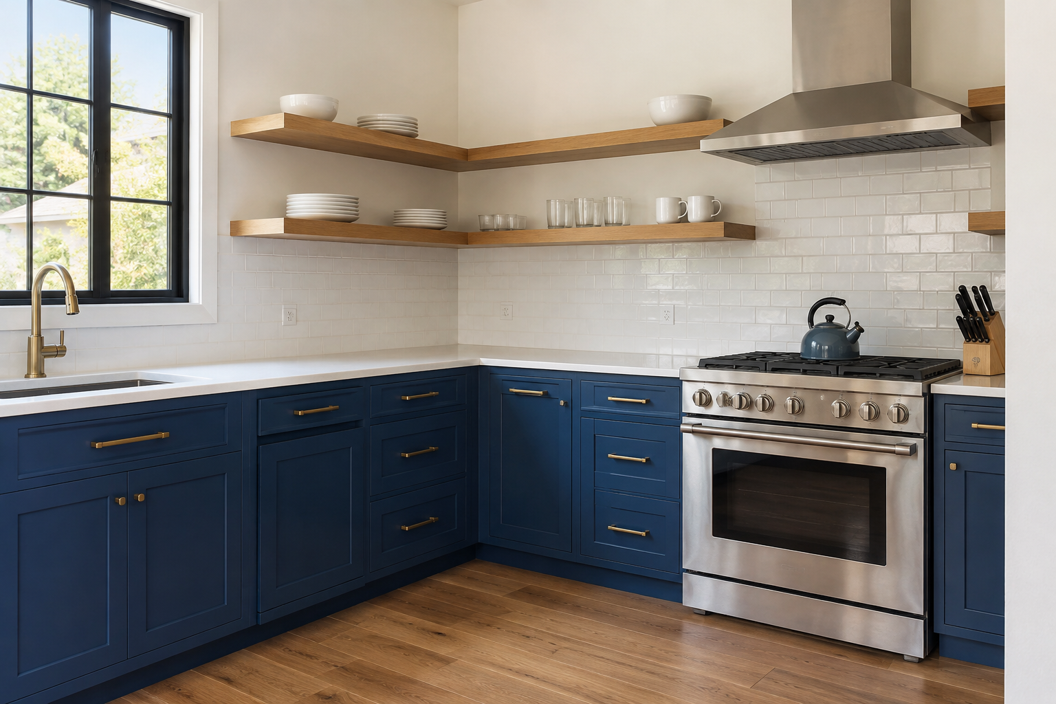
The instinct in a lot of kitchens is to pair two safe neutrals, a white upper and a gray lower, and call the decision made. A single confident color does more work than that pairing ever will, since it gives the room one real point of view instead of two ways of avoiding one.
Cobalt, forest green, or a deep terracotta all hold up on lower cabinetry specifically, since that’s the surface that gets the most daylight and the least direct wear from steam and grease near the range. Keep the upper cabinetry or open shelving in a material that lets the color lead, wood, white plaster, or a pale stone, rather than fighting it with a second strong hue.
Give the Island a Different Material Than the Perimeter Counter
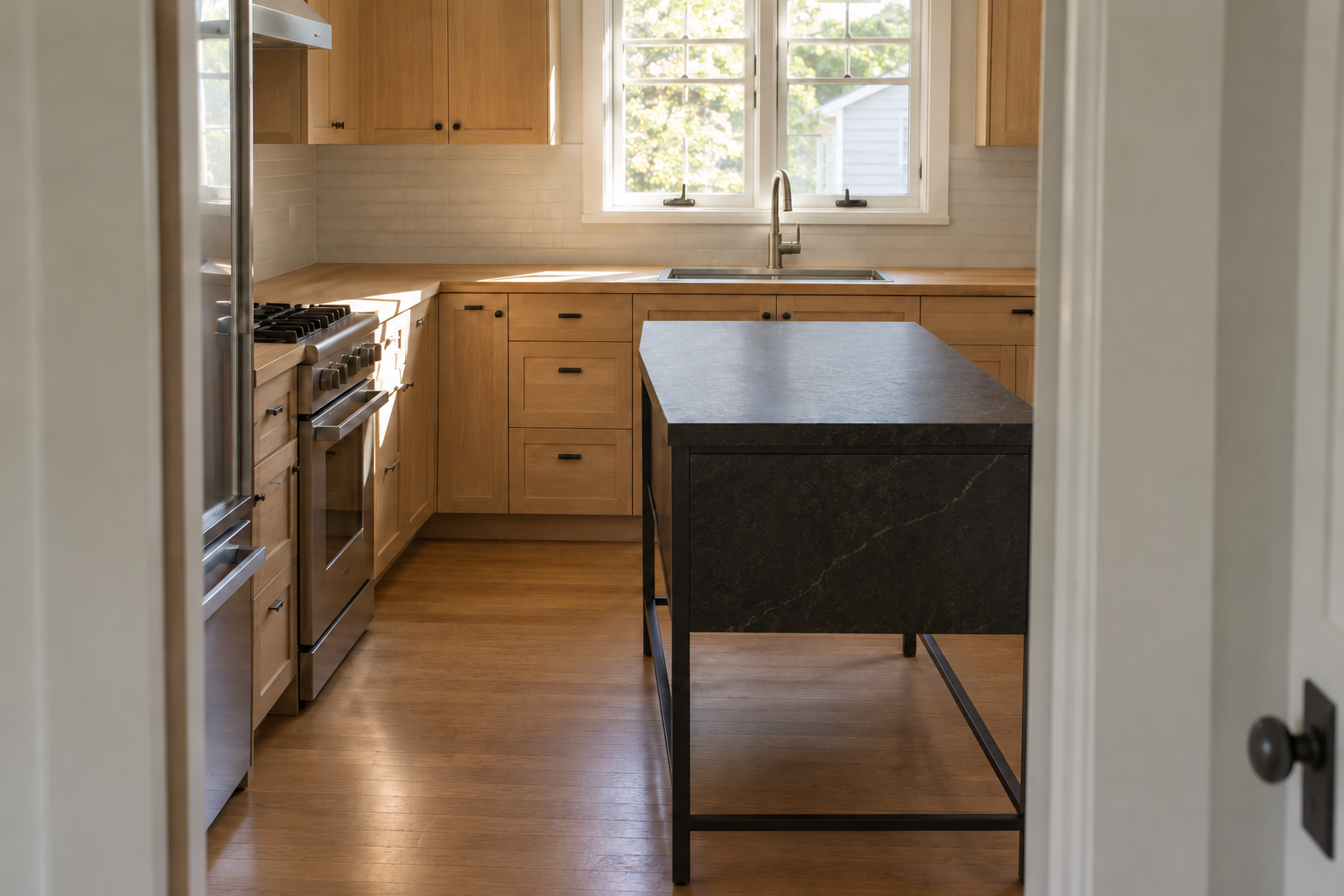
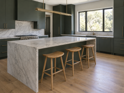
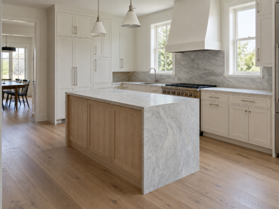
An island that matches the perimeter counter exactly reads as one continuous surface accidentally interrupted by a room. Giving it a different material, a dark soapstone against a pale oak counter, a waterfall marble against painted cabinetry, does the opposite: it tells the eye the island is its own piece of furniture, not just more counter.
This matters even in a smaller kitchen, where the island sits close enough to the perimeter that the walkway between them stays genuinely narrow. The material contrast doesn’t need more space to work. It needs a real decision about which two materials belong in the same room together, not just which two happened to be in stock.
Let the Range Hood Be the Room’s Real Architecture
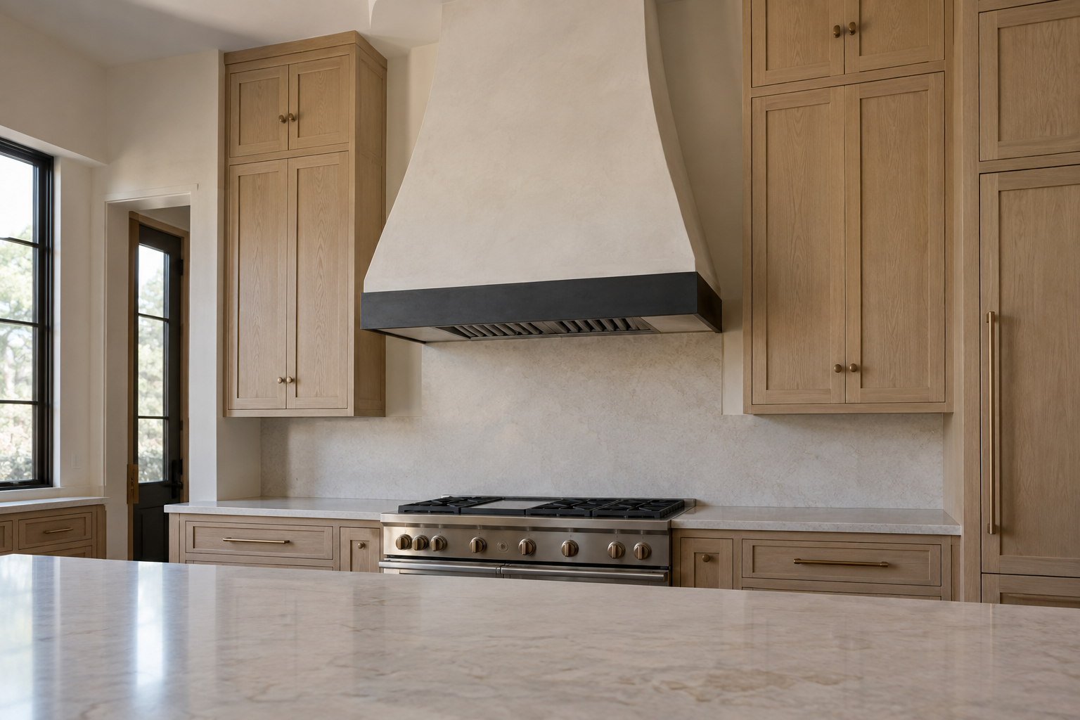
A range hood usually gets treated as a fixture to minimize, boxed into the surrounding cabinetry so it disappears as much as possible. Letting it do the opposite, standing tall in real plaster or a material with genuine presence, gives an ordinary kitchen a piece of architecture most rooms never get.
This doesn’t require a dramatic ceiling height to work. An ordinary kitchen ceiling still has enough room for a hood with real vertical scale, since the hood is doing the job a fireplace does in a living room: giving the eye one obvious place to land the moment you walk in.
Hang Pendants in a Single Line Over the Island
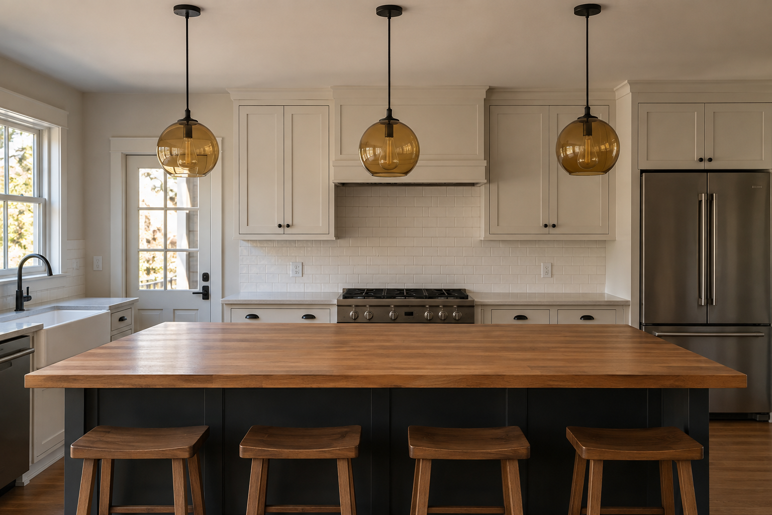
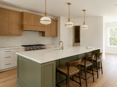
Pendant spacing over an island fails more often from inconsistency than from the wrong fixture choice. Two pendants hung slightly off from each other, or three spaced unevenly, reads as an afterthought no matter how good the individual fixture looks. An even line, measured and matched, solves that before the fixture choice even matters.
For the spacing math itself, see how big a kitchen island needs to be before deciding how many pendants it can hold. Hang the row at a consistent 30 to 36 inches above the island’s surface, close enough to do real task lighting on the counter below without becoming something someone has to duck around.
Mix Open Shelving and Closed Cabinets on Purpose
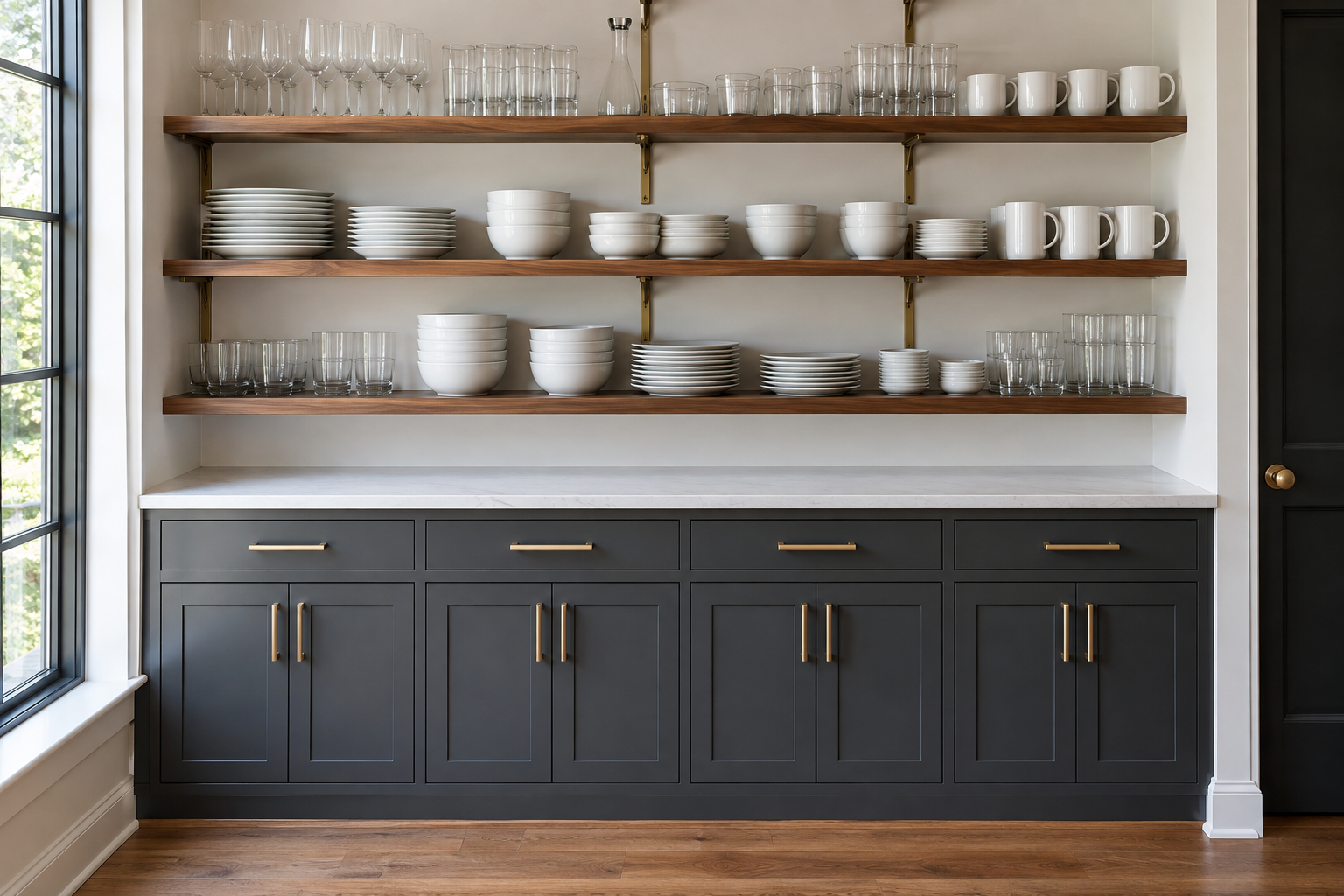
Open shelving and closed cabinets aren’t a choice between one or the other. Used together deliberately, open shelving above and closed cabinetry below, or the reverse, gives a kitchen real storage flexibility without committing the whole room to either extreme. The decision that matters is which one earns the visible spot, not whether to use both.
Assign the split by what needs concealing, not by an even pattern that only looks planned. Everyday glasses and plates work well in the open. Small appliances, backstock, and anything better left out of daily view belong behind a door.
Choose a Stone With Real Movement for the Island Top
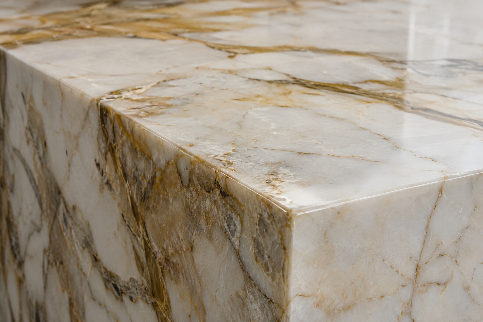
A plain, uniform stone slab reads as a surface. One with real, visible veining reads as a material decision, since the movement itself becomes the room’s focal point without adding a single object. This is worth spending the material budget on where the eye lands first, the island, instead of spreading a modest stone budget evenly across every surface in the kitchen.
Seeing the real slab in person, not a small sample chip, is the only reliable way to know where the strongest veining lands once it’s cut for that specific island. The same slab can read completely differently depending on how it’s oriented, which a supplier decides at the fabrication stage unless you ask to see the layout first.
Let the Floor Material Change at the Kitchen’s Threshold
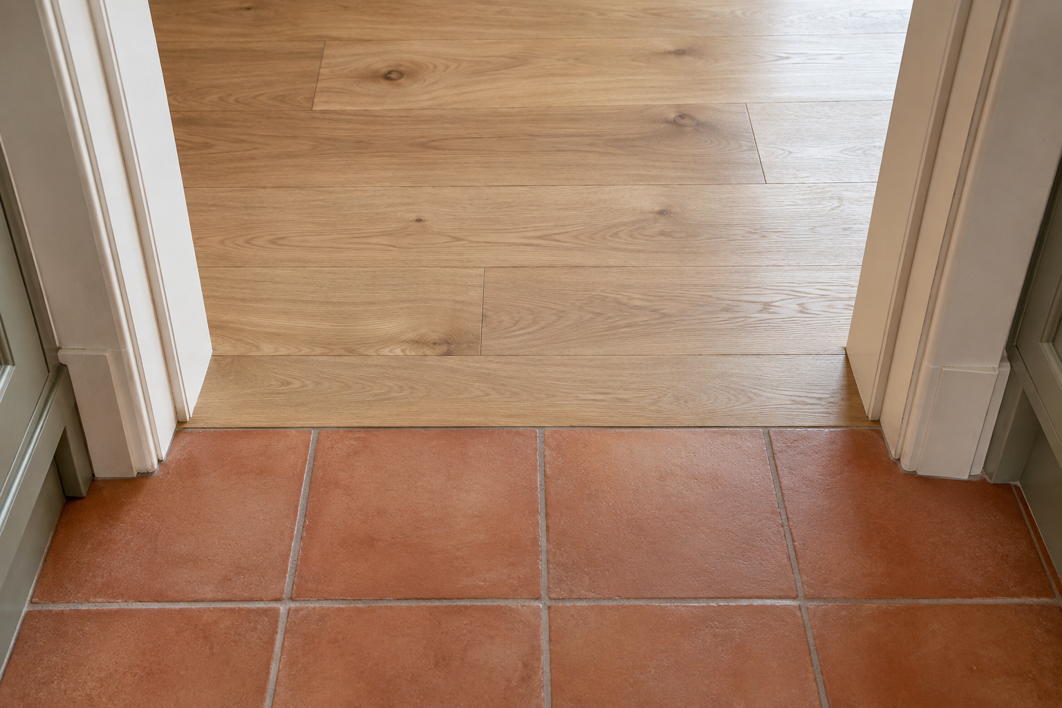
A kitchen floor doesn’t have to match whatever’s in the room next to it. Letting the material change right at the doorway, tile in the kitchen, wood in the room beyond it, marks the transition the way a rug does indoors, without needing a rug to do it.
The floor change has to happen at a real architectural line, the doorway itself, not partway into either room, or the transition reads as an unfinished renovation instead of a deliberate choice. A transition strip at the seam protects both materials from chipping against each other over time, a small detail that’s easy to skip and more expensive to fix once the edge has already started wearing unevenly.
Add a Small Table Where an Island Won’t Fit
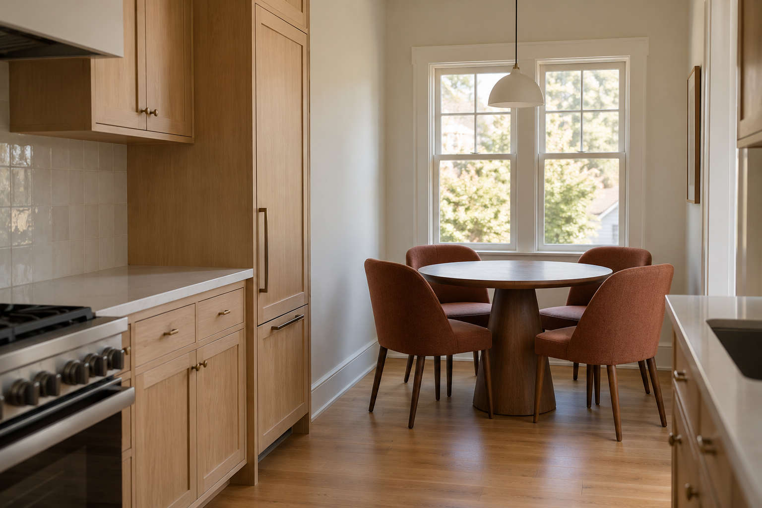
Not every kitchen has the square footage for an island, and treating that as a problem to solve around usually means squeezing in an island too small to be useful anyway. A small table, sized to the room itself and not to whatever an island would have needed, does real work in that same corner: somewhere to sit, somewhere to prep, without pretending the room is bigger than it is.
Scale the chairs to the table, not to what a full dining set would use. Two or three chairs with a slim profile suit a small table better than a matched four-chair set crowding the same footprint an island was never going to fit into anyway.
Repeat One Metal Finish Across Every Fixture
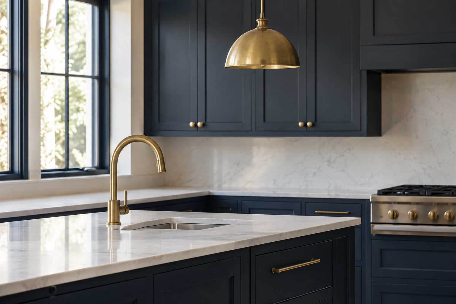
A kitchen with brass on the faucet, chrome on the cabinet pulls, and black on the pendant reads as unplanned even when every individual fixture looks fine on its own. Picking one metal finish and repeating it across the faucet, the hardware, and the lighting gives the room a quiet through-line that costs nothing extra to execute, since it’s a specification decision, not a design one.
The same logic that ties furniture eras together in a mixed room applies here to fixtures instead.
Let a Window Replace the Cabinet Above the Sink
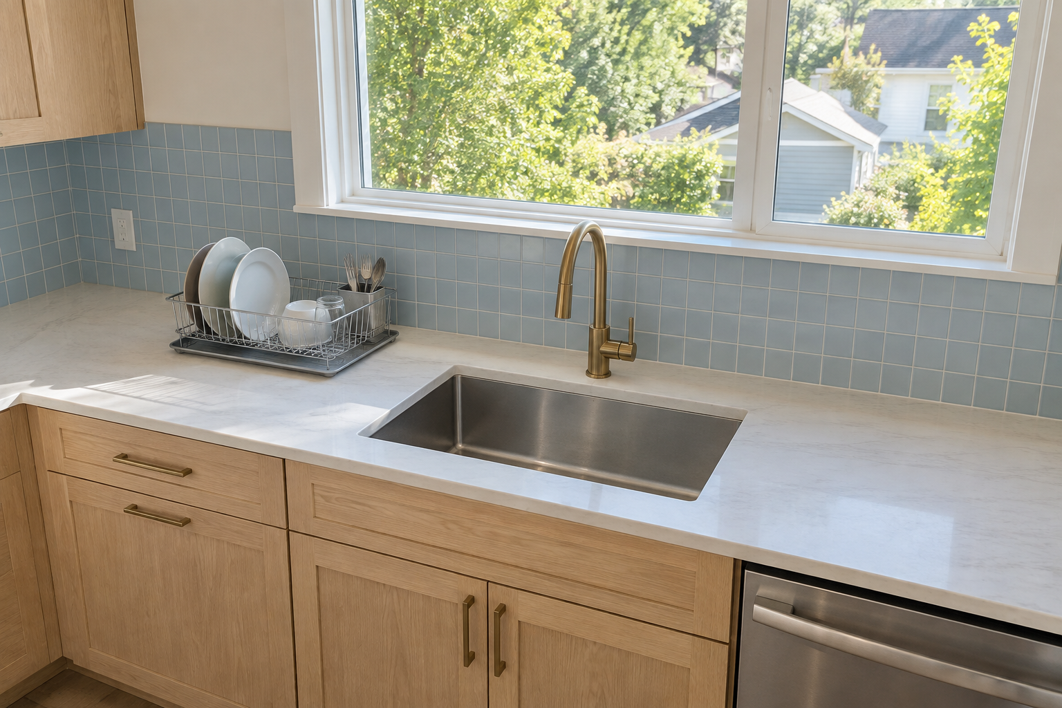
The cabinet above a kitchen sink is one of the least useful storage spots in the room, deep enough to be awkward to reach and usually holding whatever didn’t fit anywhere else. A window in its place does more for the room than that cabinet ever did, giving the sink actual daylight and a view instead of a door someone has to duck under.
The window doesn’t need to be perfectly centered over the sink to work. An older house often has the window wherever the original architecture put it, slightly off from dead center, and that’s a fine place to leave it, not a problem to correct.
This works most easily on an exterior wall where the plumbing already runs up from below rather than through the wall itself, since that’s the real constraint that decides whether a window can replace the cabinet without a larger renovation behind it.
Frequently Asked Questions
Do all twelve of these ideas need to happen at once?
No. Most of these work as individual decisions, not a full renovation plan. Picking the one or two that solve a real problem in your own kitchen, a bold cabinet color, a repeated metal finish, does more than trying to apply all twelve at once.
What’s the easiest idea on this list to start with?
Repeating one metal finish across the faucet, hardware, and lighting. It’s a specification change rather than a construction one, and it doesn’t require replacing anything that isn’t already due for an update.