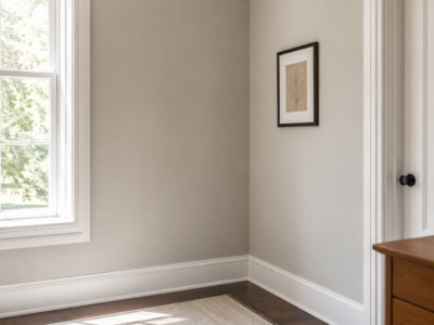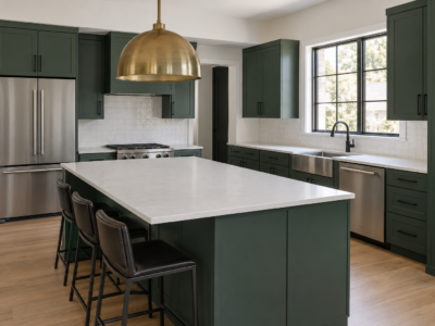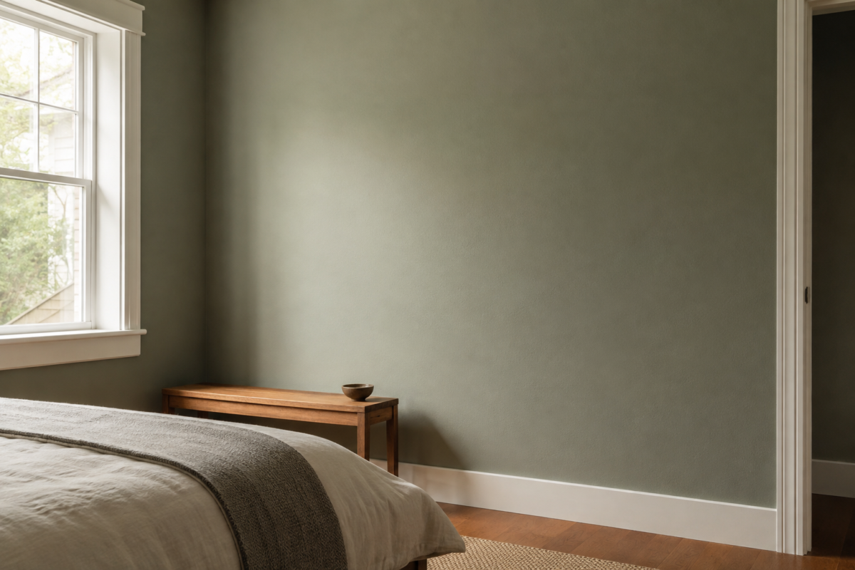
Green paint is unusually easy to get wrong in one specific way. The chip looks nothing like the wall. A color that read as a soft, gray-based sage in the store can turn distinctly yellow-green once it’s covering four walls in your own light, or a green that looked warm and inviting on a two-inch swatch can read cool and flat at that scale.
Undertone is almost always the reason. Every green paint carries a secondary color underneath the green itself, usually gray, yellow, or blue, and that undertone does more to determine how the color behaves in a room than the name on the can does. Two paints can both be called sage and still land completely differently once they’re on a wall.
This isn’t about picking the right green. It’s about being able to tell, before you buy a gallon, roughly how a given green is going to behave: whether it will read warm or cool, what it’s going to look like next to your existing wood tones and metal finishes, and why it might not match the chip at all.
What Undertone Actually Means in a Green
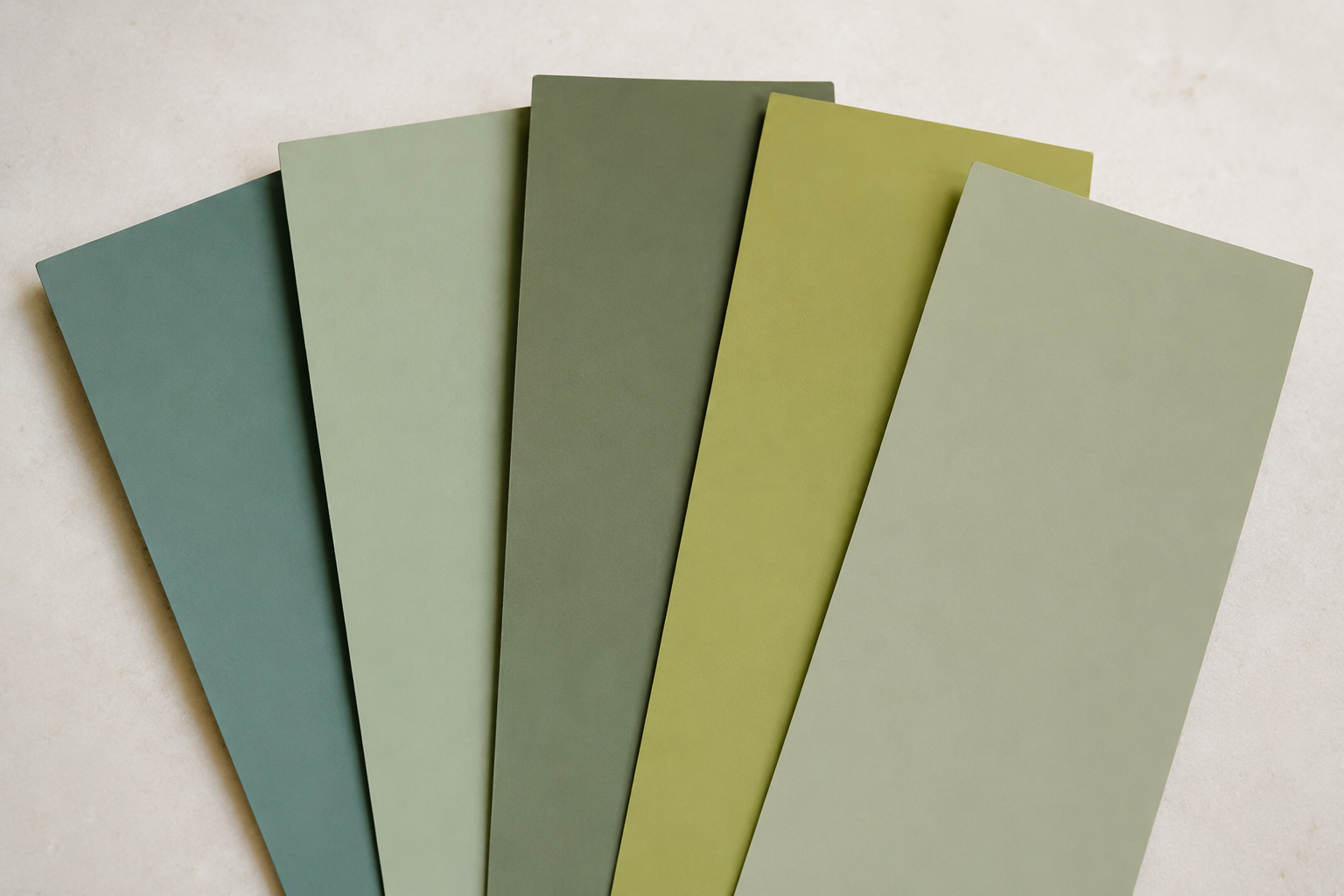
Every green paint is a mix of a base green plus a secondary color running underneath it. That secondary color is the undertone, and it’s usually gray, yellow, or blue. A gray-based green reads calmer and closer to a true neutral. A yellow-based green skews warmer and can drift toward olive or moss in the wrong light. A blue-based green pulls cooler and can start to look almost teal at a large scale, even when the can just says green. The base color name tells you very little on its own. Two paints labeled sage from two different brands can have completely different undertones, and behave completely differently once they’re on a wall.
Why the Chip Looks Different Than the Wall
A paint chip is small, flat, and usually viewed under bright, even store lighting. A wall is neither small nor flat. It catches shadow, reflects nearby colors, and shifts with whatever light is in the room at a given hour. Scale changes color perception on its own, since the same color reads more saturated across a full wall than it does on a two-inch square, simply because your eye has more surface area to register it against. None of this means the chip is wrong. It means a chip alone isn’t enough information to predict how a green will behave in your specific room.
How to Tell If a Green Is Warm or Cool
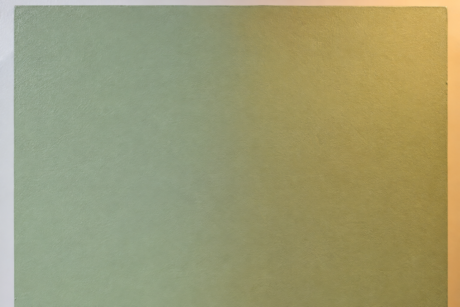
The fastest real test is comparing the chip to a true, neutral gray under the same light, rather than judging it in isolation. Warm greens will look slightly more yellow or golden next to that gray. Cool greens will look slightly more blue or minty by comparison. It’s also worth looking at the chip under two different light sources, ideally daylight and a warm incandescent or LED bulb, since undertone often becomes more obvious under artificial light than it does in a well-lit store. A green that reads neutral in daylight and distinctly yellow under a warm bulb is telling you something real about its undertone, not just about the bulb.
What the Color Name Is (and Isn’t) Telling You
Paint brands are not consistent with each other, but there are some rough patterns worth knowing. Names built around sage or moss usually signal a gray-to-yellow-based green. Hunter and forest usually run deeper and often carry more blue than sage-family names suggest. Olive is reliably yellow-based, sometimes aggressively so. None of this replaces looking at the paint directly, but it’s a reasonable starting filter when you’re narrowing down which chips are even worth pulling in the first place.
How Undertone Changes What It Pairs With
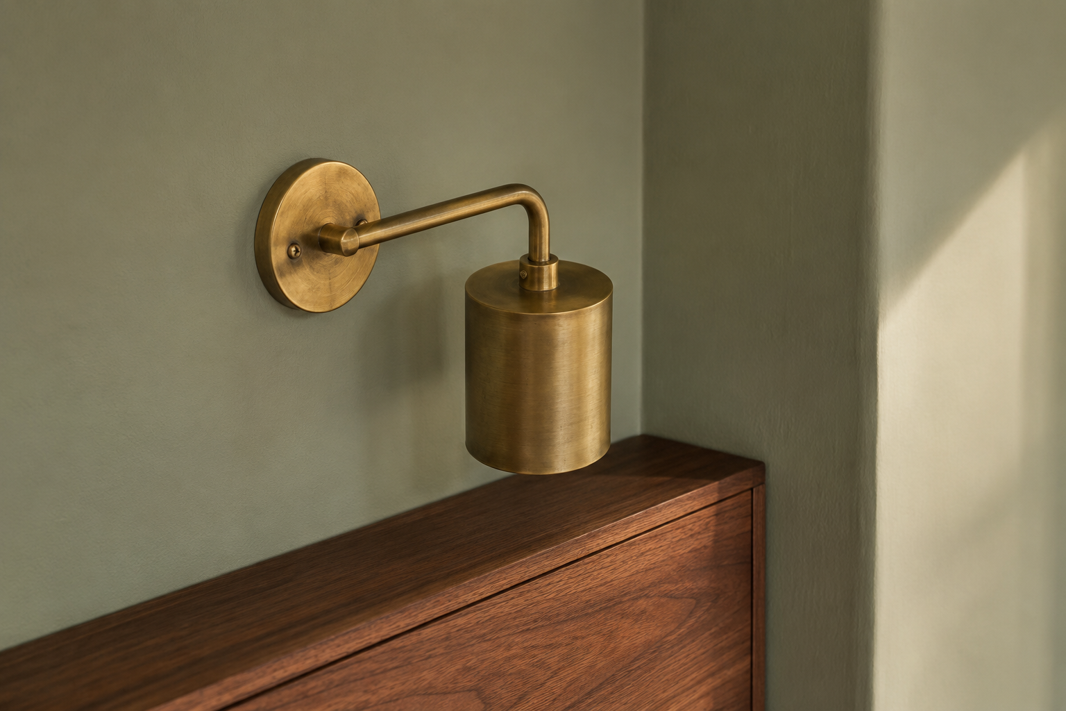
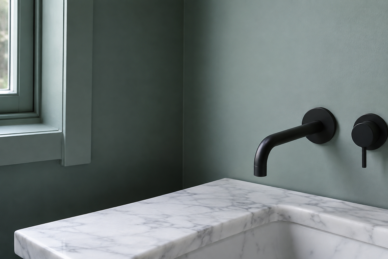
Undertone is also what decides which materials a green pairs well with, not just what it looks like on its own. A warm, yellow-or-gray-based green sits comfortably next to warm wood tones and brass, the same pairing logic covered in 17 Sage Green Bedroom Ideas for a Calm, Collected Look, where cooler metals like chrome tend to make a warm green look flatter and grayer than it is. A cooler, blue-based green behaves differently: it can sit comfortably next to cooler materials like chrome, black metal, or white marble, and a warm wood tone nearby can start to look slightly at odds with it instead of complementary. Neither pairing is wrong. The point is that undertone, not the word green, is what predicts the pairing.
A Simple Test Before You Commit
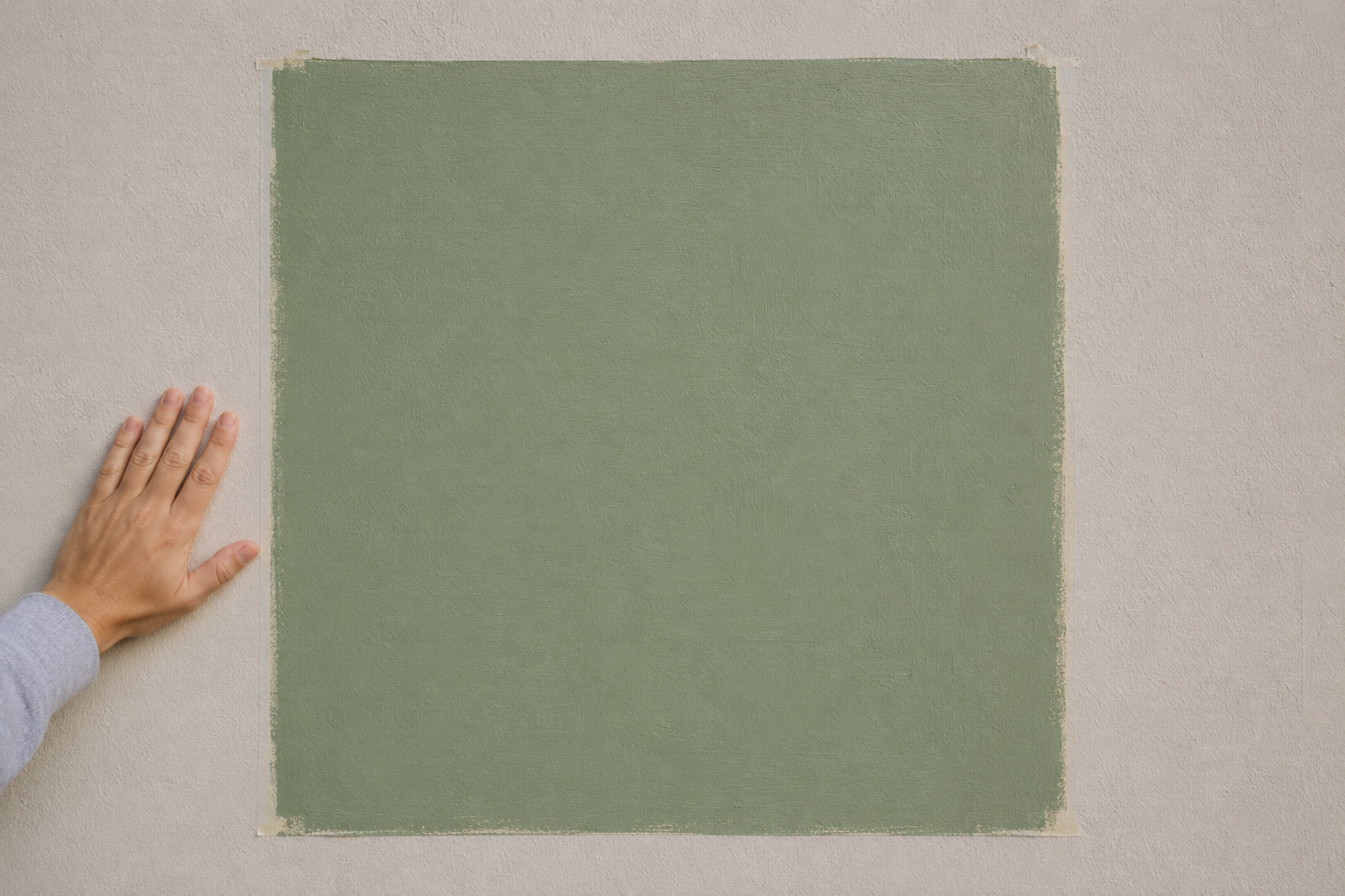
Buy a sample, and paint a section at least two feet square rather than a small swatch, since undertone becomes more visible at scale. Put it on the wall it’s going on, not a scrap of poster board propped against a different wall, and look at it across a full day: morning light, midday, and evening lamp light all shift how the undertone reads. If the color still looks like what you wanted after all three, it’s a safe commitment. If it shifts more than you expected in any one of them, that’s useful information before a full gallon goes on the wall, not after.
Undertone is the part of a green paint that’s genuinely hard to judge from a chip alone, and it’s worth the extra half hour of testing before committing a whole room to it. A gray-based green and a yellow-based green can both be called sage, and behave nothing alike once they’re on the wall.
Frequently Asked Questions
Does a green paint’s undertone change under LED light?
It can, and often does. Most LED bulbs run cooler than incandescent light, which tends to pull a green’s undertone toward blue or gray rather than warming it up. A warm-bulb LED, often labeled soft white or listed around 2700K, behaves closer to incandescent light and is less likely to shift a warm green’s undertone toward cool. If a room is lit mostly by LED, it’s worth testing the sample under that exact bulb rather than assuming daylight behavior will hold after dark.
What’s the safest green undertone for a room with little natural light?
A gray-based green is usually the safer choice in a dim room. It behaves closer to a true neutral, and it’s less likely to shift into an unexpected yellow or blue cast when there isn’t much daylight to balance it. A strongly yellow-based or blue-based green can read more dramatically different in low light than the chip suggested, since there’s less natural light correcting the undertone toward how it looked in the store.