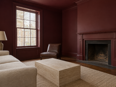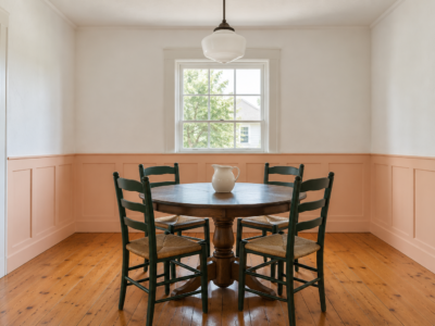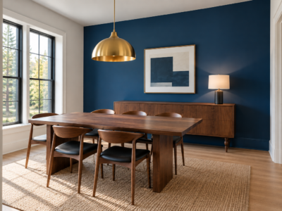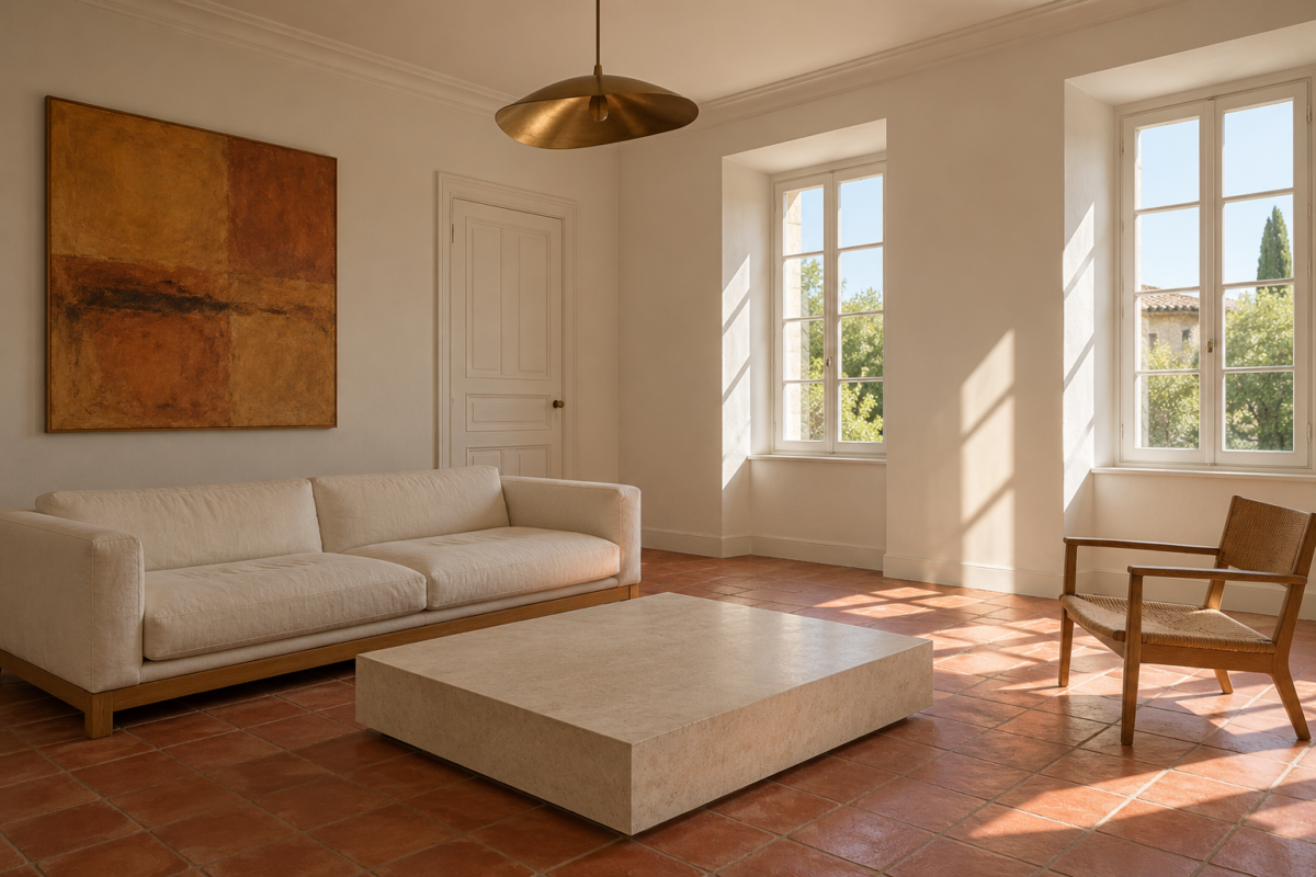
A white paint chip under a store’s lights and the same white across four walls at home can look like two different colors. On the wall, the paint takes on whatever the room gives it: blue from a north window, yellow from a warm bulb, a green cast from a lawn outside, a pink one from a terracotta floor. That’s how a white that looked clean in the store turns gray, cream, or faintly minty once the room is finished.
Choosing one comes down to reading two things together, the paint’s undertone and the light and materials it will sit in. This guide goes in that order, then settles the trim and ceiling, and ends with a sample test that leaves no surprises for the whole room.
Look at the Undertone Before the Name
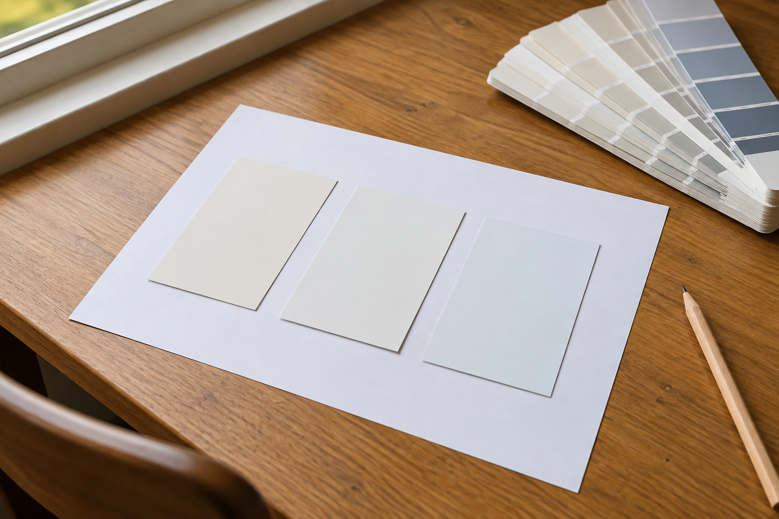
Every white is tinted slightly. Warm whites lean yellow, red, or pink and look creamy. Cool whites lean blue, green, or gray and look crisp, sometimes stark. A few sit close to neutral, with very little tint either way. Names don’t help much, since “Linen,” “Chalk,” and “Cotton” could each belong to any of the three.
Hold the chip against a sheet of plain printer paper. Most copy paper is brightened to a clean, slightly bluish white, and beside it a warm white looks noticeably yellow while a cool one looks gray or faintly blue. Lay several whites on the same sheet and the differences that were invisible one chip at a time become easy to see. The same method works for any color, and reading the undertone of a green walks through it in more detail.
Let the Window Direction Narrow It Down
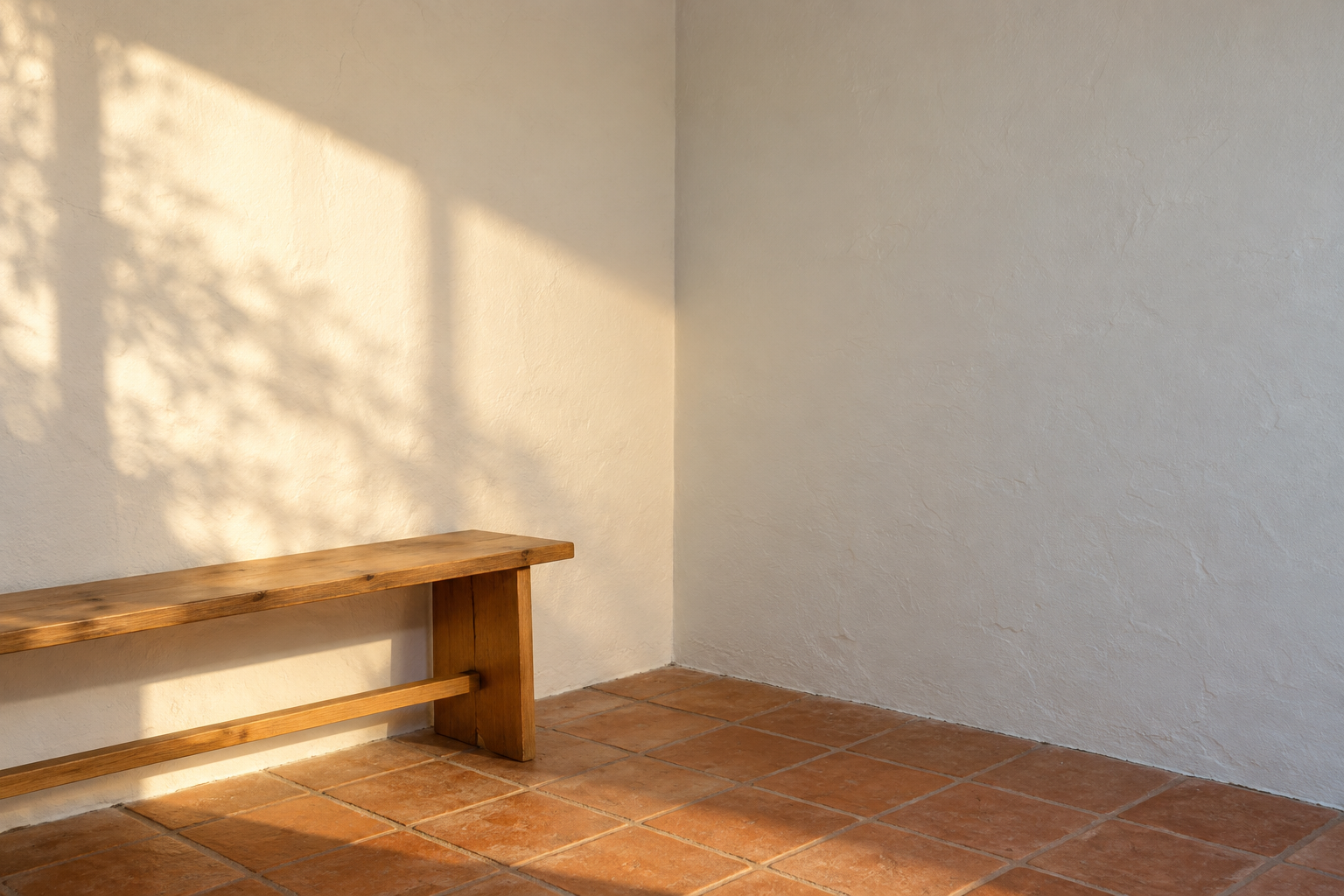
In the Northern Hemisphere, north-facing rooms get indirect, cooler light all day. Cool whites tend to go gray and flat there, so a warm or neutral white usually holds up better. South-facing rooms get strong, warm sun for much of the day, which can push a very warm white toward yellow, so a neutral or slightly cool white stays cleaner. East-facing rooms are bright and warm in the morning and cooler by afternoon, and west-facing rooms are the reverse, so choose for the time of day the room gets used most. South of the equator, swap north and south.
Evening light counts as much as daylight in rooms used at night. Under warm bulbs around 2700K, warm whites drift further toward cream, which suits a living room or bedroom. In a kitchen or bathroom lit with cooler bulbs, a cool white can look clinical after dark, and a neutral one is the safer choice.
Read the LRV on the Back of the Chip
Most chips, or the manufacturer’s website, list a light reflectance value, or LRV. It runs from 0 for black to 100 for a theoretical perfect white, and most paints sold as whites fall roughly between 80 and 95. The number describes how much light the paint bounces back, which isn’t the same as how white it looks.
At the top of the range, a white can glare on a large wall that takes direct sun, and one a few points lower looks softer. The opposite hope, that the brightest white will light up a dim room, usually disappoints. Paint can only reflect the light that reaches it, so in a room with little daylight any white looks grayer, and a warmer white with a slightly lower LRV often looks better there than a stark one.
Match the White to What Stays
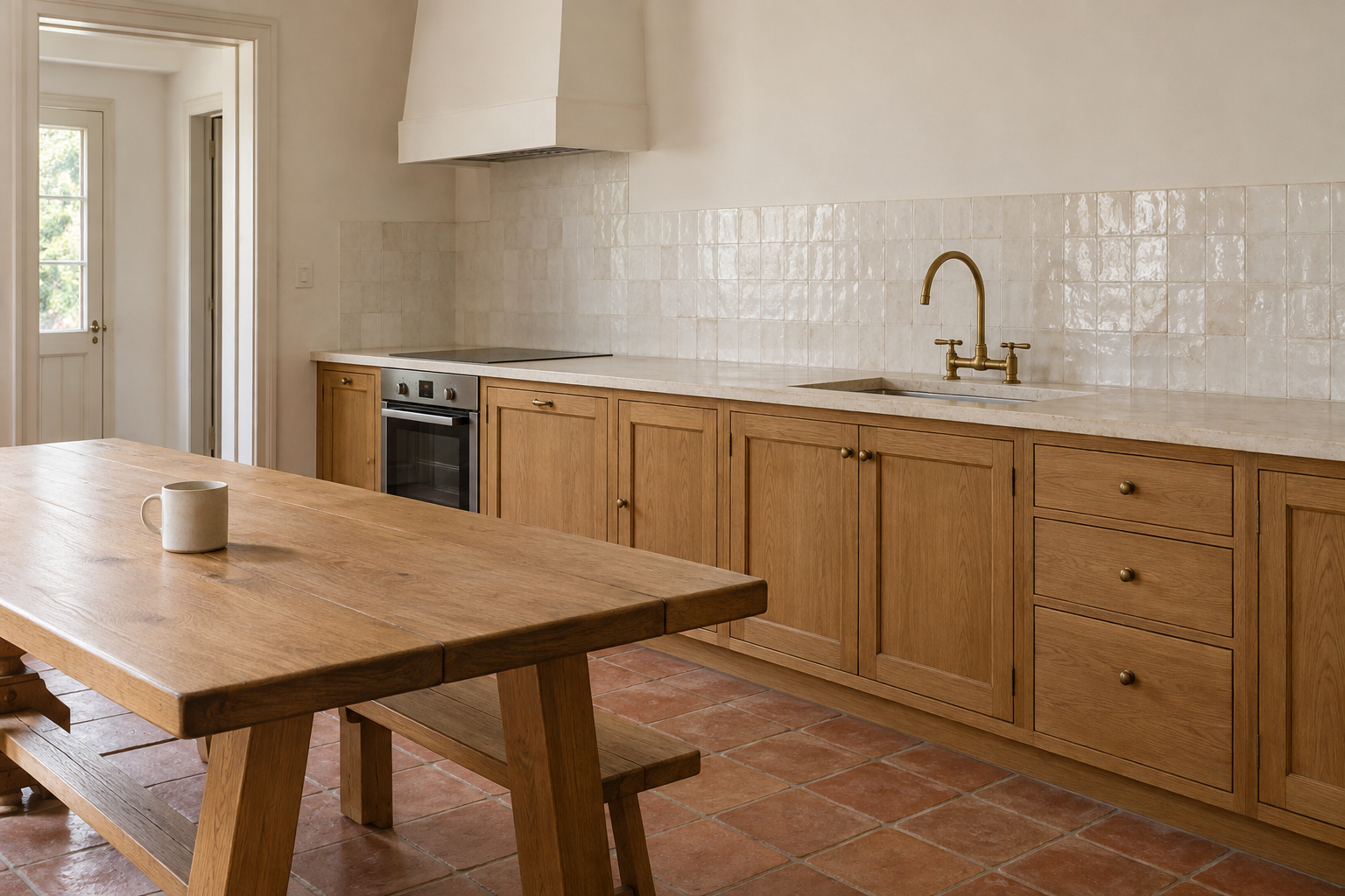
Paint is the easiest thing in a room to change, so choose it against what won’t change: the floor, countertops, tile, a large sofa, the kitchen cabinets. A creamy white beside a cool white quartz or marble counter makes the stone look blue and the wall look dingy. A stark cool white next to warm oak floors or terracotta tile can make them look orange. Hold each chip against each fixed material, in the room itself, before narrowing the list.
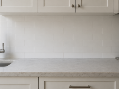
Tubs, sinks, and existing tile count too. Bathroom fixtures are often a bright, cool white, and a warm wall right beside them looks yellow by comparison. A white backsplash with its grout is its own white, and the wall above it has to sit comfortably next to both.
Decide Whether the Trim Matches the Walls
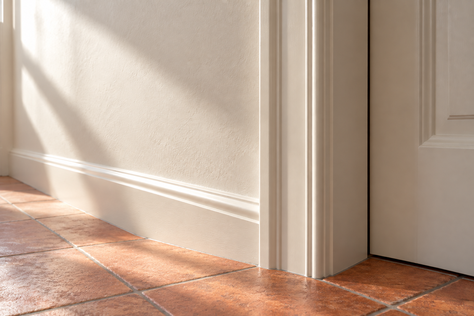
The simplest answer is the same white everywhere, with trim in a higher sheen than the walls. Satin or semigloss on trim wipes clean and catches a thin line of light along each edge, which outlines the woodwork without adding a second color. The difference between sheens does most of the work.
If the trim should stand apart, choose a second white from the same undertone family, a little brighter or a little deeper. Two whites with different undertones side by side, such as a creamy wall and a bluish trim, make each look wrong, the wall faintly dirty and the trim cold. Ceilings are usually painted in a flat finish, which hides roller marks and small flaws, in the wall white or one slightly lighter.
Carry One White Through Rooms You See Together
Where one room opens into another, or a hallway runs past several doorways, the whites meet at the edges. Two whites that each looked right on their own can look mismatched at a doorway, where the difference shows as a hard line down the casing. In an open plan, or anywhere several rooms are seen at once, one white on every wall is the easier path, with each room’s character coming from its floors, furniture, and fabrics.
If the rooms face very different directions, choose the white for the darkest of them, since it’s the one most likely to go gray. It will look a little warmer in the sunnier rooms, which is rarely a problem. Where rooms are closed off from each other by doors, each can have its own white without the clash showing.
Test Large Samples on More Than One Wall
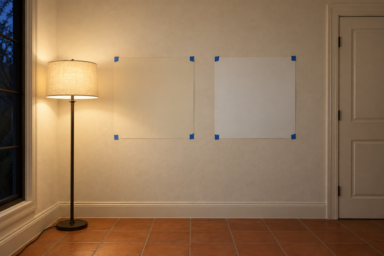
A chip the size of a stamp can’t show how a white behaves across a whole wall. Paint samples at least about 2 feet square, with two coats, on poster board, peel-and-stick sample sheets, or the wall itself. Put one on the brightest wall and one on the darkest, and keep them away from existing white trim, which throws the comparison off.
Look at them in the morning, in the middle of the afternoon, and at night with the room’s own lamps on. The white that looks right at all three times is the one to buy. If two are still close after a few days, choose the one that looks better at the time of day the room gets the most use. In a living room or bedroom, that’s usually the evening.
Frequently Asked Questions
Why does white paint look gray on my walls?
Usually because the wall doesn’t get much direct light. White reflects what reaches it, so a shaded wall or a north-facing room turns any white toward gray, and cool whites get there faster. A warmer white, or one with a slightly lower LRV, tends to look softer and less dingy in low light.
Why has my white trim turned yellow?
Oil-based (alkyd) paints yellow with age, and the effect is strongest where they get little daylight, such as behind doors and inside closets. Water-based acrylic paints yellow much less. Repainting yellowed oil trim in acrylic needs a bonding primer first, since acrylic doesn’t grip well on old oil paint.
Is there a white that works in every room?
Not one that looks the same everywhere, since every white shifts with the light. The most forgiving are near-neutral whites with a small warm lean and an LRV in the mid to high 80s. They go neither yellow in sun nor very gray in shade, which is why they’re a common choice for painting a whole house one color.