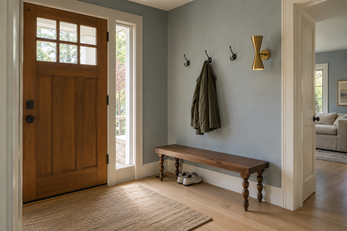
The entry is the one room in a house every single visitor sees, and it usually gets the least actual thought. Most advice defaults to the same fix. A console table, a round mirror above it, done. That pairing works well enough that it has stopped reading as a decision at all, which is exactly the problem. It’s the default that gets reached for automatically, not necessarily the right call for a specific hallway, landing, or foyer, and it rarely gets weighed against what that particular space actually needs.
The twelve ideas here are genuine alternatives to that pairing, or real additions to it, each solving something specific about how an entry actually gets used: where shoes go, what a visitor sees first, how a narrow hallway avoids feeling like an afterthought. None of them require a console and a mirror to work.
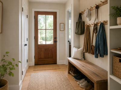
Replace the Console With a Bench You Can Actually Sit On
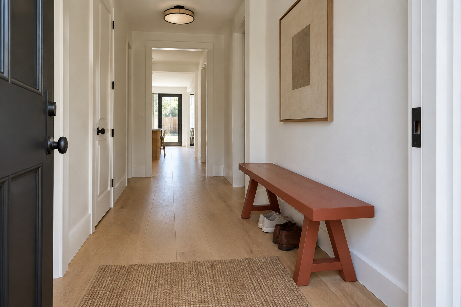
A console table holds keys and mail. A bench does that and also solves the actual physical task an entry exists for, putting shoes on and taking them off, without anyone bending over a low table to do it. A confidently painted bench, not a boxy upholstered storage box, reads as a real furniture decision rather than a functional afterthought.
Keep a trestle or turned-leg base rather than a solid box underneath. Shoes tucked beneath a bench with visible legs read as tidy. The same shoes under a solid-fronted box read as hidden clutter waiting to spill out, since the box hides the mess without actually solving it, and the door still has to open before anyone can see that.
Let One Oversized Piece of Art Carry the Whole Wall
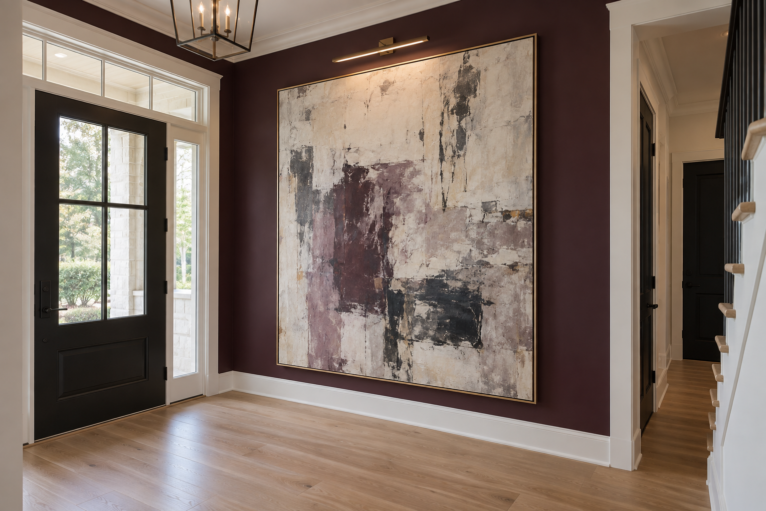
A round mirror above a console does two things at once, reflecting light back into the room and giving the eye a visual anchor. A single, genuinely large art piece does the second job alone, and does it with more personality than a mirror ever will, since a mirror’s real content is whatever happens to be reflected in it, not a considered image. Scaled close to the wall’s actual height, it becomes the entry’s one visual statement instead of a supporting player next to furniture.
This only works when the piece is actually large. A standard-size framed print in the same spot reads as an afterthought, the exact problem this idea is trying to solve, and it usually ends up looking like art that was meant for a different wall and never found one.
Wallpaper Just the Entry, Not the Hallway Beyond It
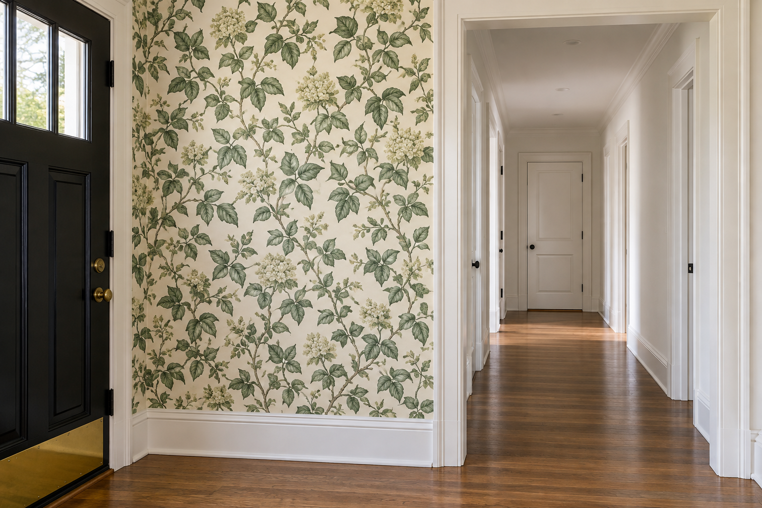
Wallpapering an entire hallway is a real commitment, cost and installation both. Containing a bold pattern to just the entry zone, stopping cleanly at a door casing or another architectural line where the hallway proper begins, gets the same visual impact for a fraction of the material and turns the entry into its own defined space rather than the start of a longer hallway.
The stop point matters more than the pattern. A boundary that follows an actual architectural line, not an arbitrary point on a blank wall, reads as intentional rather than like the paper simply ran out.
Hang Hooks Where There’s No Closet to Hide Them In
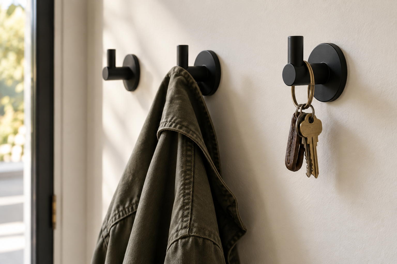
An entry without a coat closet usually gets a console with a drawer nobody uses for coats, since coats don’t fold into drawers. Hooks solve the actual problem in plain sight instead of pretending it doesn’t exist. A current, dimensional hook form, mounted at a height that clears a hung coat’s hem, pairs well with the same closed storage that works elsewhere in a small entry when there’s room for both.
Three hooks, spaced for a coat, a bag, and a second coat, cover most households without turning the wall into a row of a dozen hooks nobody fills.
Change the Floor Material at the Threshold, Not the Property Line
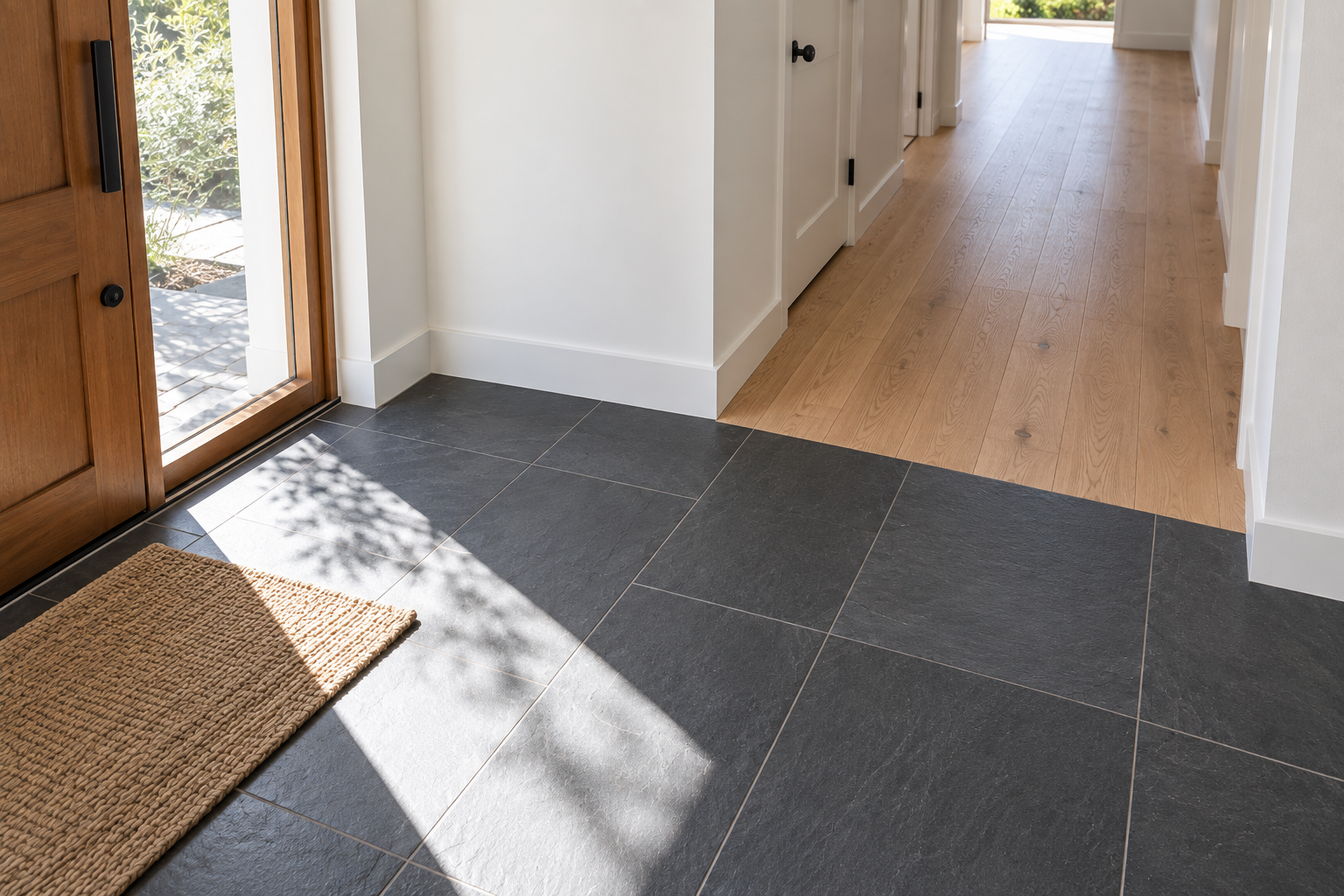
Most entries either match the flooring straight through from the front door or draw a hard line exactly at the threshold. A third option: let the harder-wearing material, tile or stone, run a few feet past the door itself before transitioning to the home’s main flooring. That extra few feet takes the real wear, wet shoes and grit, that the door alone can’t stop.
This costs more than a change exactly at the door, since it uses more of the harder material, but it protects flooring that would otherwise show wear in a widening ring around the entry within a year. Let the transition land on a natural stopping point, a closet edge or the first turn in the hallway, rather than an arbitrary measurement, so the seam reads as a considered boundary rather than a line drawn wherever the tile happened to run out.
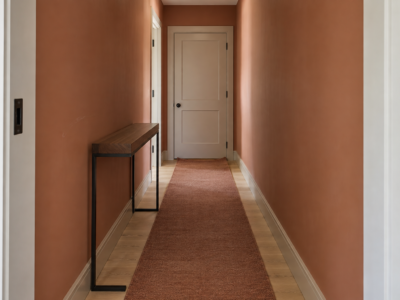
Let a Runner Set the Path Instead of Just Adding Pattern
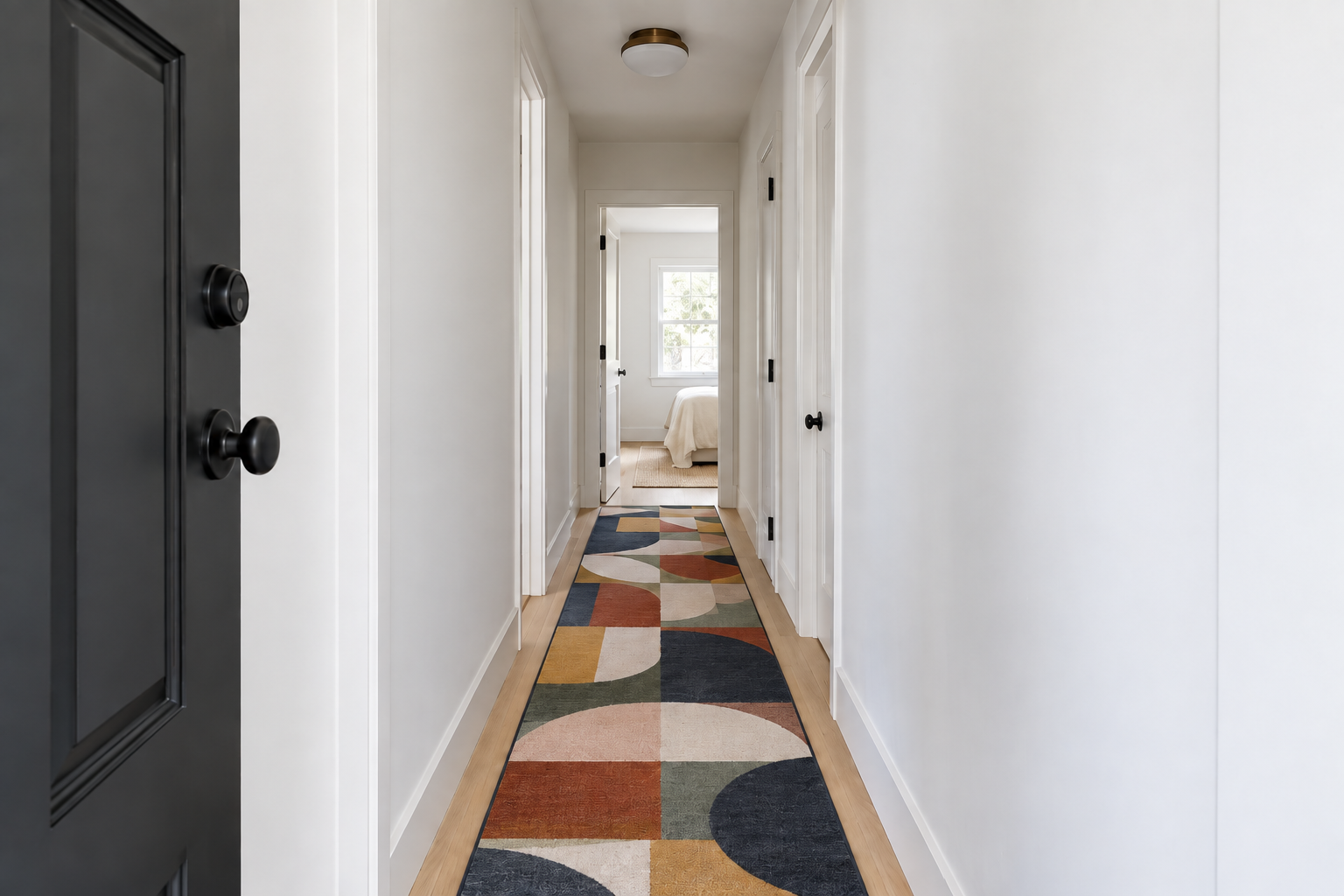
A runner in a narrow entry usually gets chosen for color alone. Treating it as a path instead, with edges that actually run parallel to the walls rather than an odd size centered loosely in the space, changes what the rug is doing. It’s not decoration laid over a hallway anymore, it’s the hallway’s own defined route.
A bold, genuinely graphic pattern earns its place here more than a subtle texture would, since the runner’s job in a narrow space is to read clearly at a glance, not reward close inspection. Leave a consistent margin of exposed floor on both sides, usually several inches, so the runner reads as a placed object rather than wall-to-wall carpet that happened to stop short.
Use a Narrow Shelf When There’s No Room for a Console
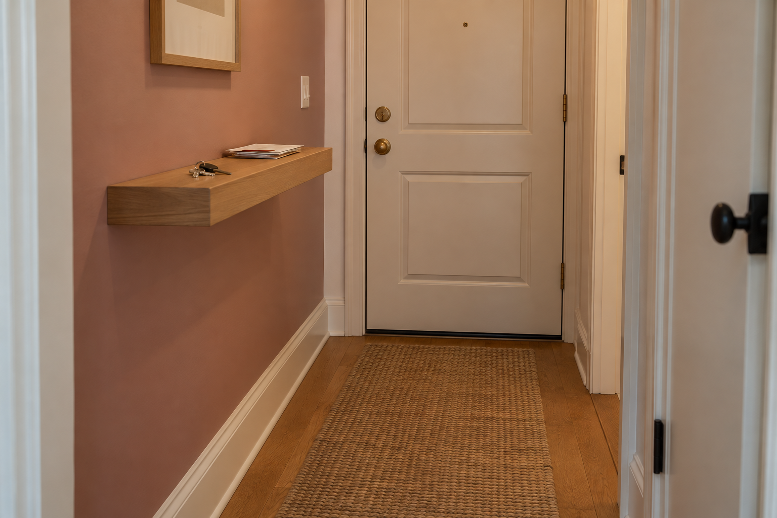
A small apartment landing often can’t fit a console table at all without blocking the door’s swing or narrowing an already tight walkway. A floating shelf, mounted without a visible bracket, takes zero floor footprint while still giving keys and mail somewhere to land. The same size math that rules out a console is exactly why the shelf works instead.
Keep it narrow, under 8 inches deep is safest in a genuinely tight landing, and mount it at a height that clears the door swing rather than centering it purely by eye. A shelf mounted too low collects the same clutter a console would, so treat the height as a functional decision first and a visual one second.
Paint the Closet Door Like It’s Part of the Room
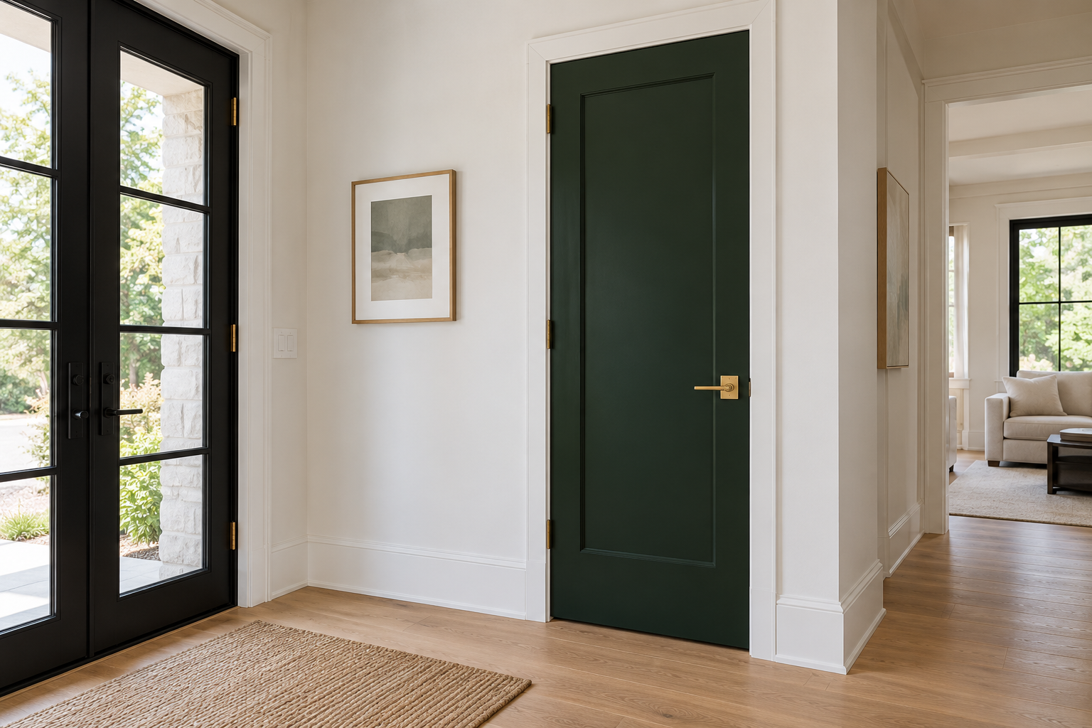
A coat closet door usually stays whatever white the builder chose, treated as infrastructure rather than a surface anyone would actually design. A confident color on that door, paired with a current hardware finish, turns an overlooked fixture into one of the entry’s actual decisions.
This works because the door is already there and already the right size and shape for a color statement. No new furniture, no wall treatment, just a different decision about a surface that was going to be painted eventually anyway.
Let a Visible Staircase Be the Entry’s Real Focal Point
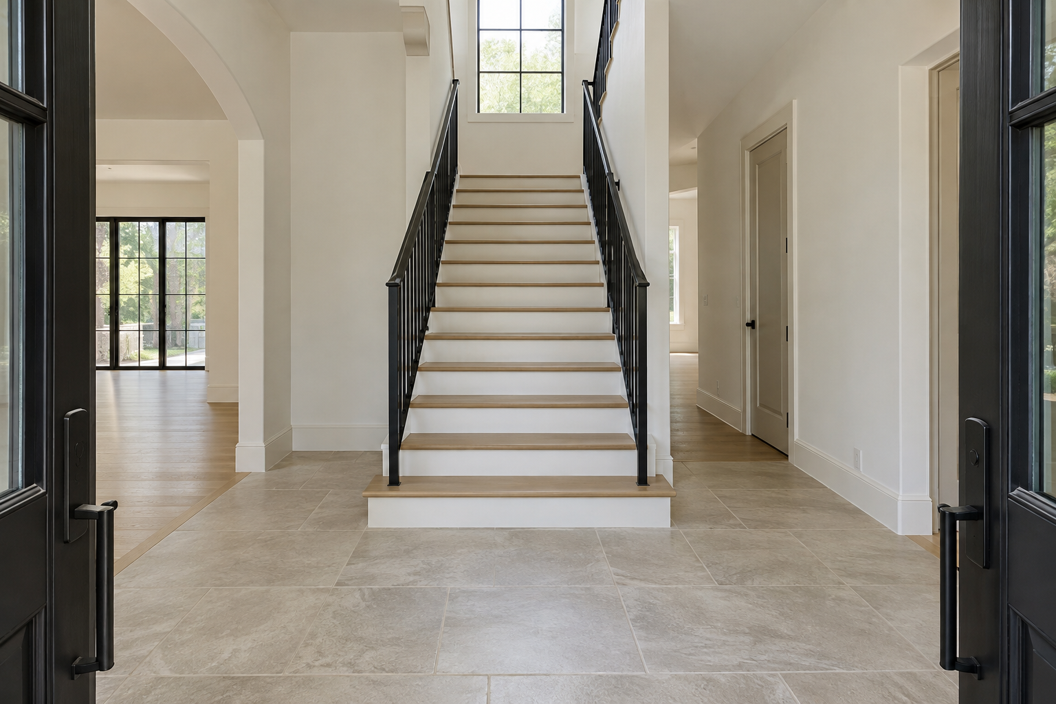
Not every entry has a straight sightline to a staircase, but the ones that do rarely take advantage of it. Adding a console or a bench in that sightline gives the eye somewhere to stop short, when the architecture itself, real stair treads and railing, was already doing the entry’s real visual work.
Keep the space between the door and the base of the stairs genuinely clear. The idea depends on an uninterrupted view, and a single piece of furniture in the wrong spot undoes it completely. If storage is genuinely needed, push it to the side of the sightline rather than the center, since the goal is an unbroken view of the stair, not an empty room.
Skip the Rug When the Floor Underneath Is Worth Showing
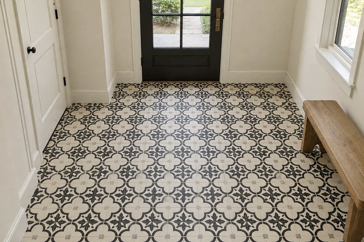
A rug in an entry usually shows up by default, the same way a console does. When the actual floor, a patterned cement tile or a stone with real character, is strong enough to be the room’s own decision, adding a rug on top of it hides the thing worth showing. Leaving it bare is the more confident choice, not a step someone forgot, and it also removes one more surface that has to survive wet shoes and daily foot traffic.
This only holds up when the floor pattern is genuinely strong. A plain tile left bare reads as unfinished, while a graphic one left bare reads as intentional, and the difference comes down entirely to whether the pattern gives the eye a reason to look down at all.
Paint the Inside of the Front Door a Color With Real Presence
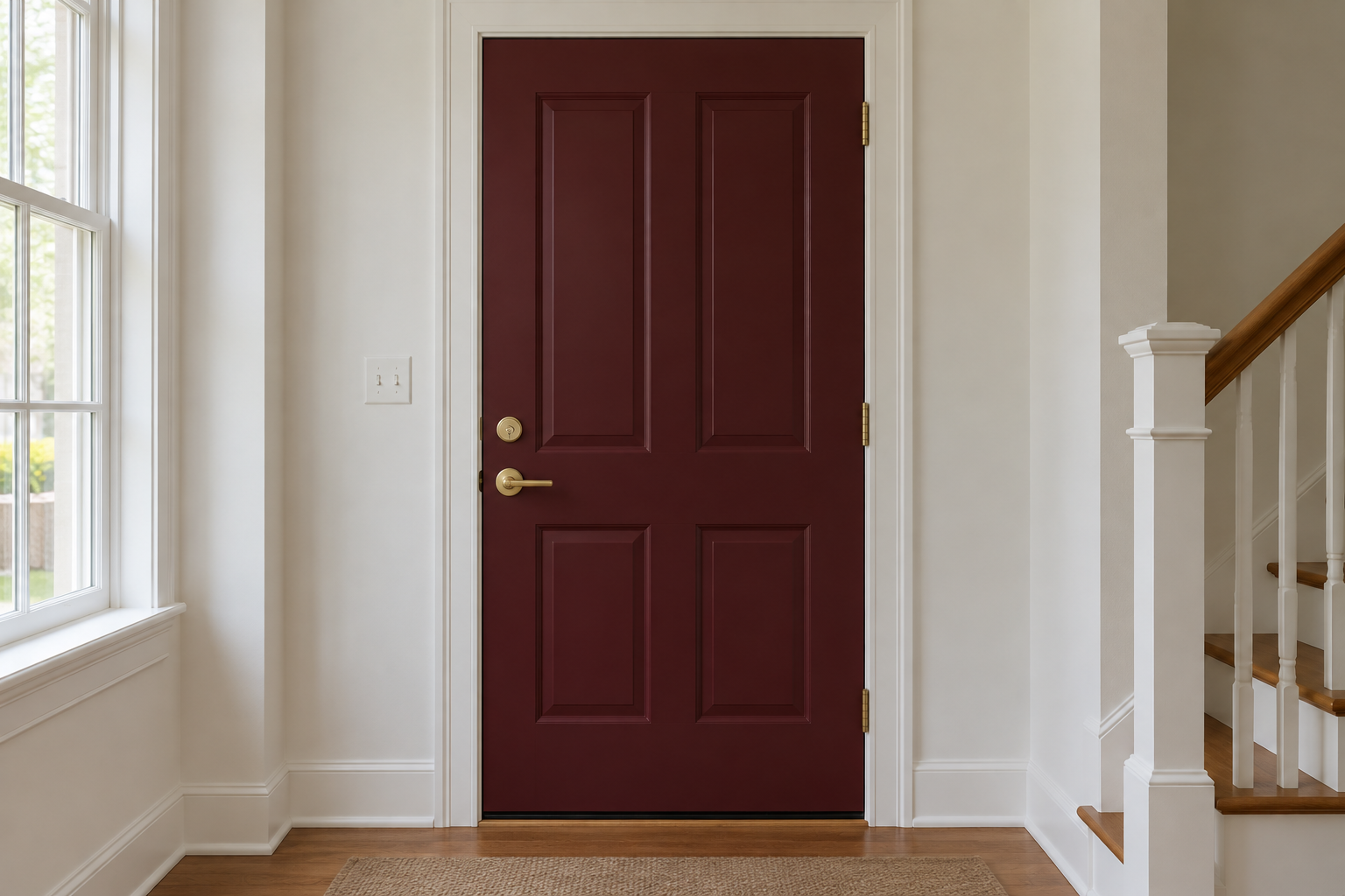
The outside of a front door gets all the color attention. The inside almost never does, even though it’s the first vertical surface a person entering the house actually faces. A confident color there, framed by the room’s ordinary white trim, gives the entry a real moment without touching a single wall.
This works because the contrast does the work. A muted or pale color on the door reads as an accident of leftover paint, while a genuinely saturated one against plain trim reads as a decision someone actually made, on purpose, about the one surface every arriving guest faces before they even step inside.
Borrow Light for a Windowless Entry Instead of Fighting the Dark
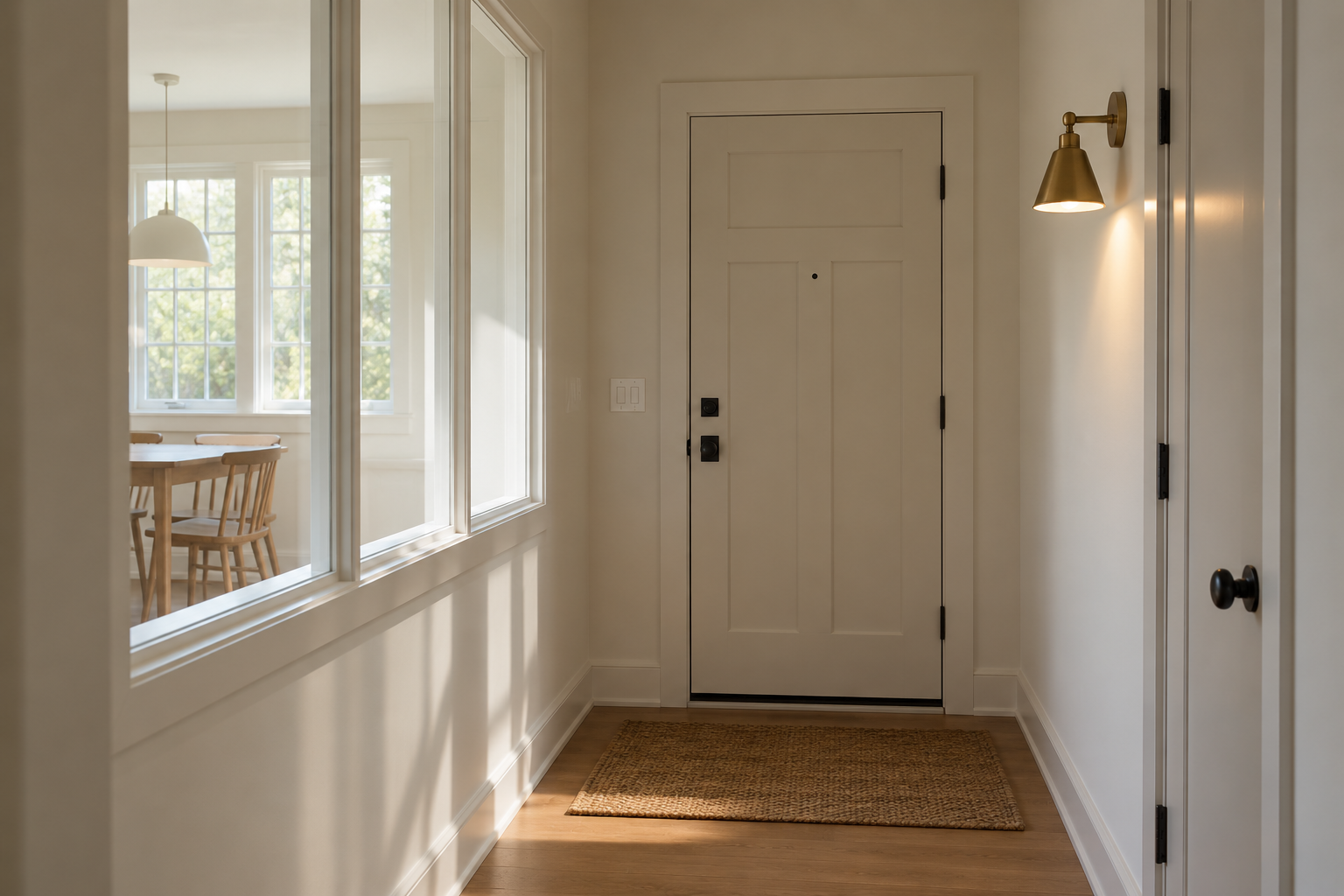
An entry with no window of its own usually gets treated as a lighting problem to solve with fixtures alone. An interior glass panel set into the wall shared with a daylit room solves a different, more useful problem. It lets real daylight cross into a space that would otherwise depend entirely on artificial light during the day, changing not just how bright the entry is but what time of day it feels like when someone actually walks into it.
This requires a wall that can genuinely support the change, structural and otherwise, so it’s a bigger undertaking than most ideas here. Where it’s possible, it changes a windowless entry from a space to get through quickly into one that actually feels like part of the house.
Frequently Asked Questions
Does an entryway need both a place to sit and a place to hang coats?
Not necessarily, though the two solve different problems well together where there’s room. A bench alone still handles shoes. Hooks alone still handle coats. In a genuinely narrow entry, picking one over trying to fit both usually looks more considered than cramming in a compromise version of each.
Is it a problem if the entry doesn’t match the style of the rest of the house?
Not on its own. An entry is seen in isolation more than almost any other room, arrived at from outside rather than walked through from an adjoining space, so it can carry a bolder color or pattern decision than the room right next to it without feeling disconnected. What matters more is whether the entry’s own decisions are consistent with each other, not whether they echo the living room.