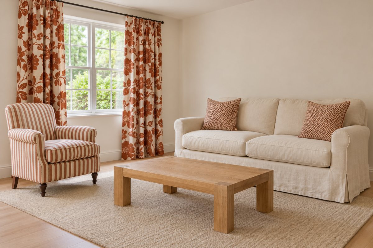
Two patterns look busy together when the eye can’t tell where one ends and the other begins. A floral cushion on a floral sofa of the same size and color turns into one blur, while the same cushion on a striped chair stands out. Mixing patterns well is mostly a matter of keeping each one easy to pick out.
The eye separates patterns by size, by color, by the kind of shape they repeat, and by the space around them. Each section below takes one of those, and the last one is about when to stop adding.
Give Each Pattern a Different Scale
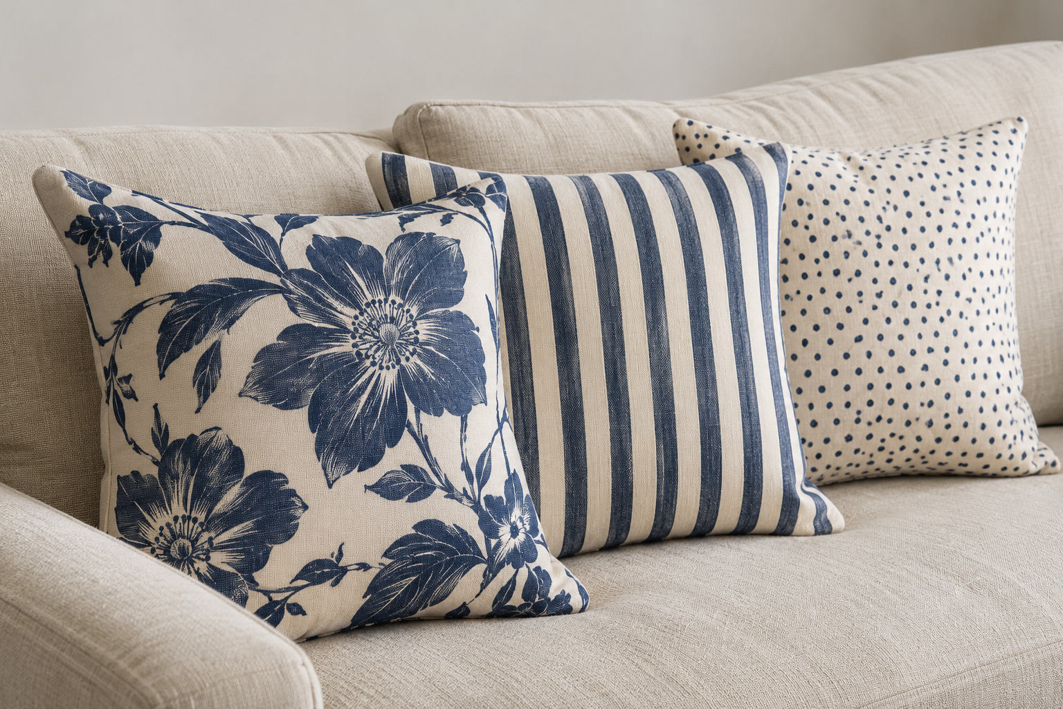
Two patterns of the same size compete. Put a large floral, a medium stripe, and a small dot side by side and each one has its own level. The floral is seen from across the room, the stripe at a few steps, and the dot only up close. That spread of sizes is what lets three patterns share a sofa.
Use the largest pattern on the largest surface, such as curtains, a rug, or a wallpaper, where it has room for its full repeat. A large print on a small cushion shows only a fragment, and the fragment may not look like a pattern at all. Small patterns hold up on small things and look almost solid on a large surface seen from far away.
Let One Color Run Through All of Them
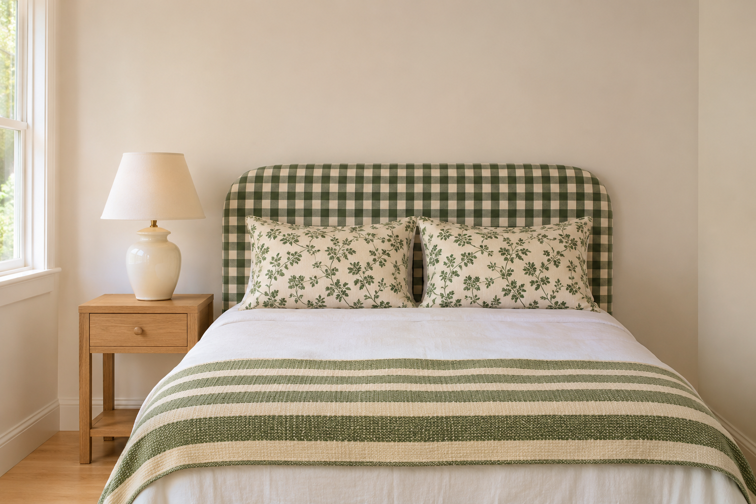
A color shared by every pattern ties them together, even when their shapes have nothing in common. A green check, a green floral, and a green stripe on one bed look like a set, because the eye follows the green from one to the next. The other colors can vary as long as that one repeats.
Keep the contrast within each pattern roughly similar, too. A soft, low-contrast floral next to a sharp black and white stripe can look like two rooms, even in the same colors. A neutral ground, cream or white, in every pattern helps, and the 60-30-10 split gives a way to decide how much of the shared color the room carries.
Pair a Curve With a Straight Line
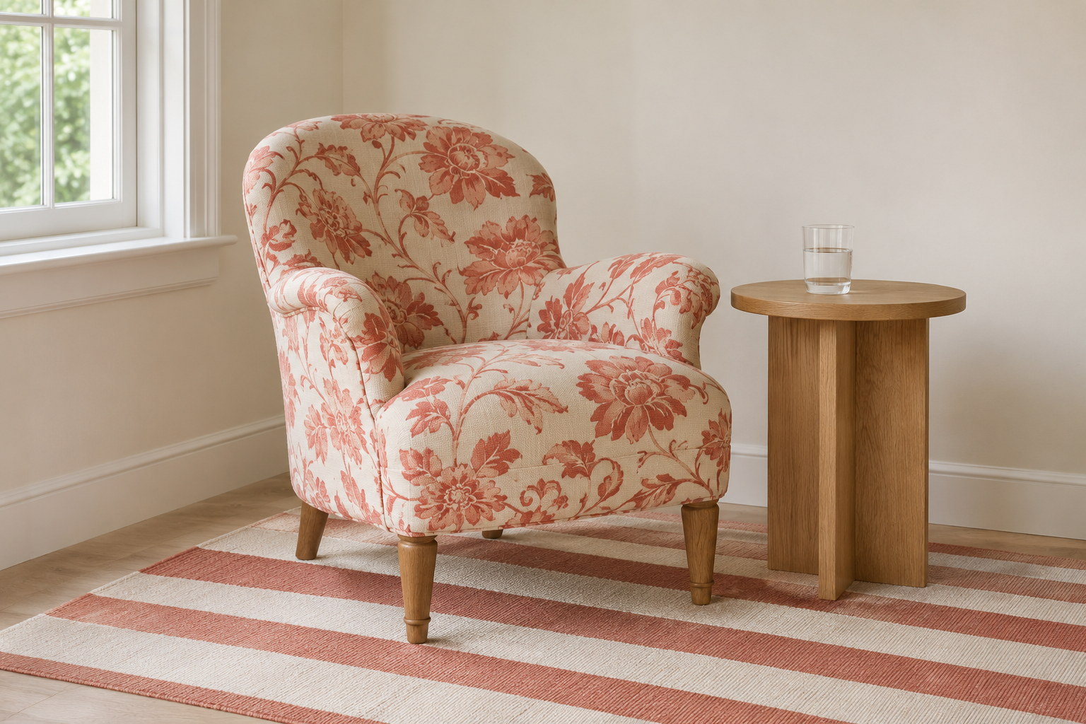
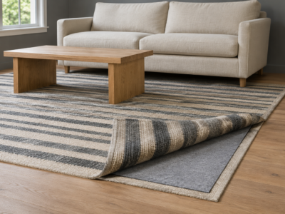
Florals, paisleys, and organic prints are made of curves. Stripes, checks, plaids, and most geometrics are made of straight lines. Pairing one of each, like a floral armchair on a striped rug, makes the two easy to tell apart even when they share a color and a size.
Two florals together can work if they differ a lot in scale, and two stripes can work if one is much wider. Within a pair, the stronger the difference in one quality, the more they can share in the others.
Spread the Patterns Around the Room
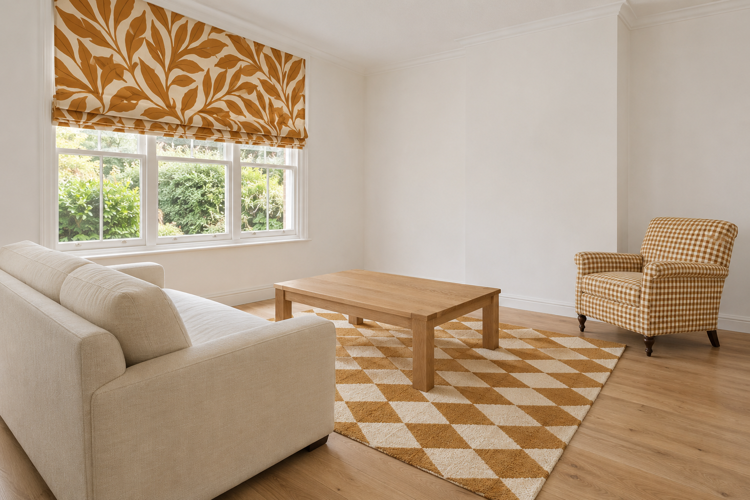
Patterns grouped in one corner make that corner heavy and leave the rest of the room bare. Placing them at different heights and on different sides, one at the window, one on the floor, one on a chair across the room, carries the eye around the whole room.
A cushion that repeats the curtain’s pattern on the other side of the room links the two, and a rug ties the patterns above it to the floor. Avoid stacking every pattern on the sofa, where cushions, a throw, and upholstery all land in the same few square feet.
Leave Plain Surfaces Between Them
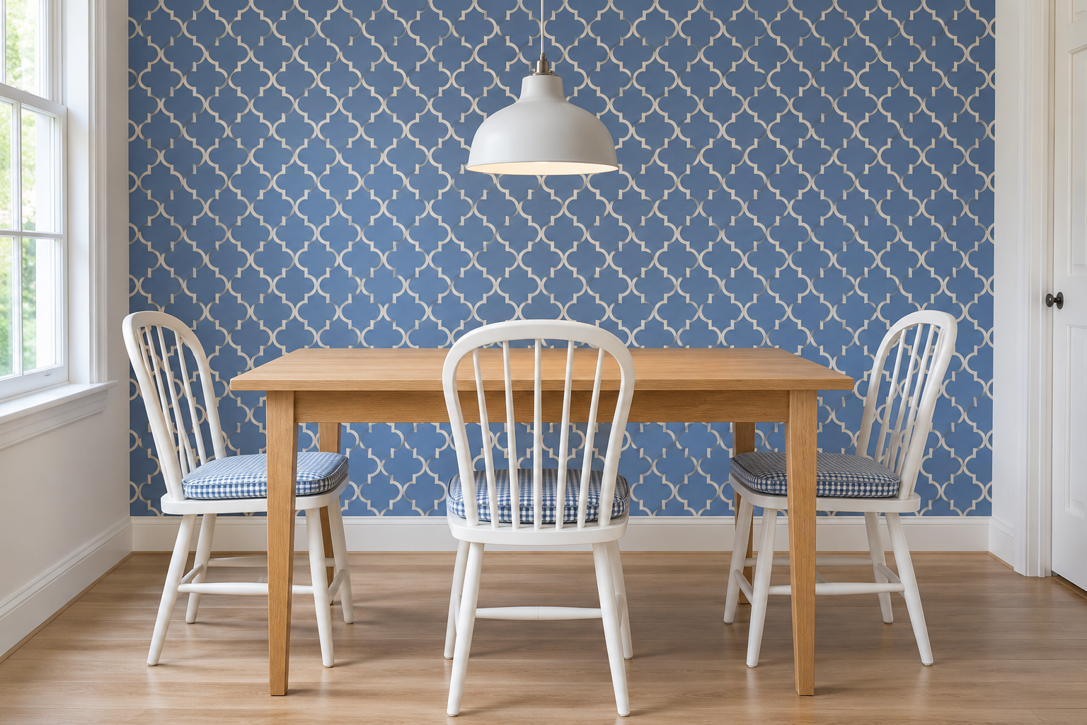
Patterns need somewhere for the eye to rest. Plain walls, a solid sofa, a bare wood table, or a linen curtain in one color give the space between them that keeps each pattern distinct. A dining room with patterned wallpaper and patterned seat pads works because a plain oak table and white chairs sit between the two.
Texture can stand in for pattern on those plain surfaces. A nubby wool, a linen weave, or a grained wood keeps a plain surface from looking flat without adding another pattern to keep track of. For cushions in particular, how many to use and how to arrange them matters as much as their prints.
How Many Patterns a Room Can Hold
Three patterns, in three scales, sharing a color, is a reliable place to start. Beyond that the number depends on the room: a large room with plenty of plain wall can hold five or six, and a small room with a busy wallpaper may hold two.
A simple test helps. Stand in the doorway and try to name each pattern in the room. If one blurs into another, or one can’t be found without looking for it, that is the one to change or remove. The same test works when mixing furniture styles, where more pieces can work as long as each can still be picked out.