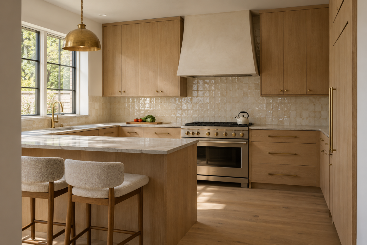
Most backsplash advice treats the wall behind the range as a problem already solved once tile goes up. The real decision is not whether to tile, it is which material, which pattern, and which grout, and that decision does more to define a kitchen than almost anything else in the room. A stone slab reads differently than glazed subway tile. A pale grout reads differently than a dark one on the exact same tile. None of that shows up in a generic photo caption.
The fifteen ideas here are specific material and pattern decisions, not a moodboard. Some cost real money, a continuous stone slab, a handmade zellige. Others cost nothing beyond asking an installer to lay tile a different way. Each one comes with what it actually asks of the kitchen around it, not just what it looks like in a photo.
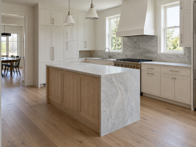
Let a Full Slab Take the Wall in One Piece
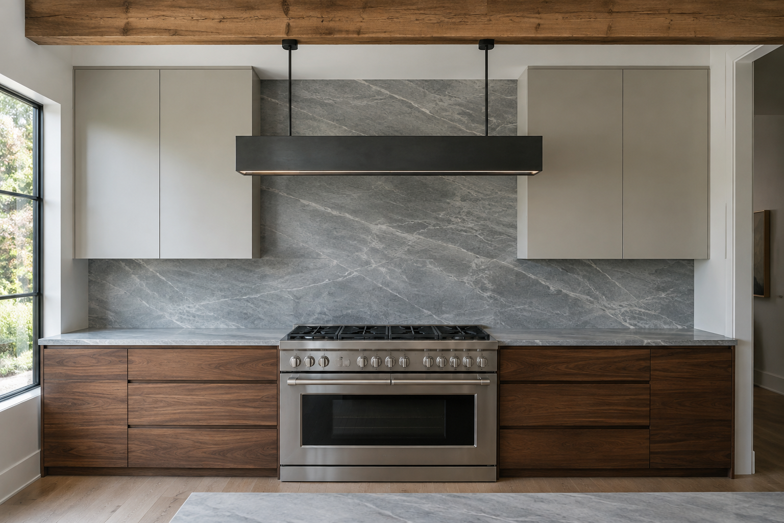
A tiled backsplash always has grout lines running through it, however fine. A single slab of quartzite or marble behind the range removes them completely, so the wall reads as one continuous surface with the same veining moving across it uninterrupted. That continuity matters most in a kitchen with strong architecture already, an exposed beam or an interesting window, since the wall stops competing with the room around it.
Slab costs more per square foot than tile and needs a professional template and install, so treat it as the choice for a kitchen already spending on stone elsewhere, on the island or the counters themselves. It is not the cheaper route, and it is not the easier one. It is the quieter one.
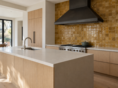
Choose a Handmade Tile for the Imperfection
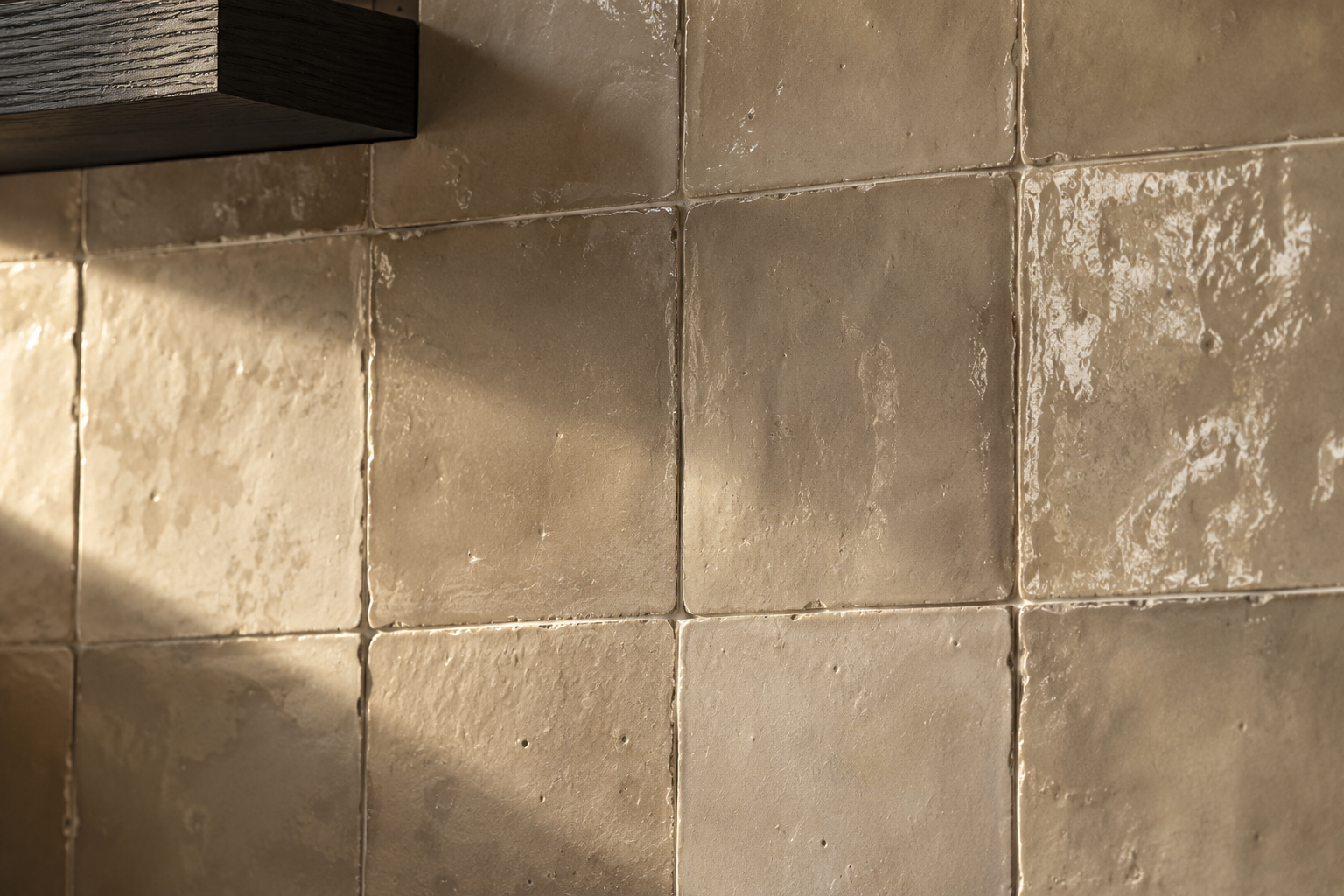
Machine-pressed tile is flat and perfectly uniform, edge to edge. Handmade tile, most often the small glazed squares grouped loosely under “zellige,” is not, and that variation is the entire appeal. Each piece differs slightly in thickness, glaze pooling, and edge line, so the finished wall catches light unevenly and reads as made by hand rather than manufactured to spec.
That variation shows up most clearly in raking side light from a window, not overhead light. The real tradeoff is grout width: handmade tile needs wider, more forgiving joints than a machine-cut tile does, so the grout itself becomes part of the visible texture rather than something to hide. See how grout color changes what a wall like this reads as once the tile choice is made.
Turn Classic Subway Tile Vertical
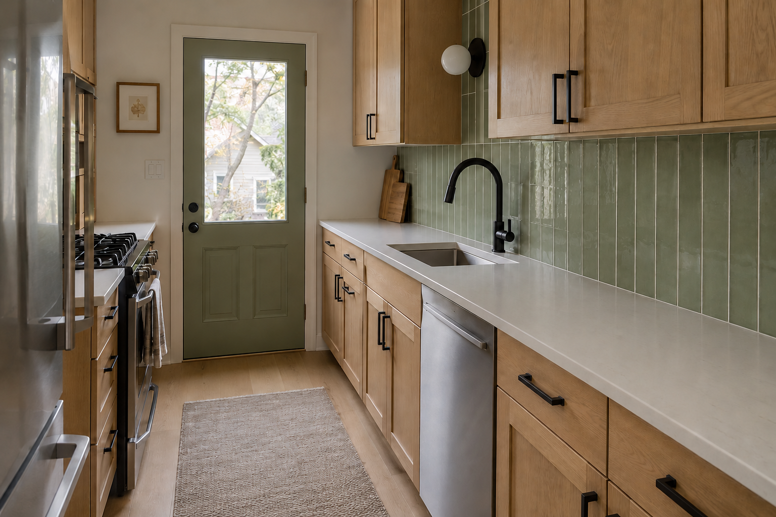
Subway tile laid in the standard offset brick pattern is common enough that it barely registers as a decision anymore. Stacking the same tile vertically, straight joint over straight joint instead of staggered, changes that without changing the tile itself. The vertical lines draw the eye up toward the cabinets rather than sideways across the counter, which reads taller in a kitchen with an ordinary or low ceiling.
It is a layout decision, not a material one, so it costs nothing extra beyond telling the installer to set it that way. The one real requirement is a wall free of major interruptions, since a vertical grid shows an uneven course far more obviously than a staggered pattern would.
Make the Backsplash the Kitchen’s One Bold Color
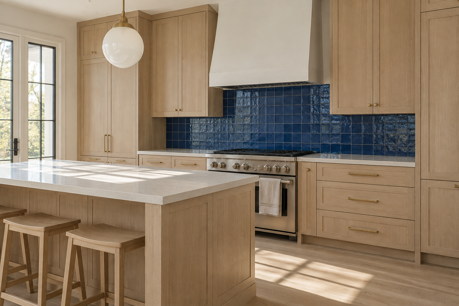
Most kitchens put their boldest color decision on the cabinets and leave the backsplash to a safe, supporting white. Reversing that, a confidently glazed colored tile against quiet cabinetry, gives the room one clear focal point instead of two decisions competing for attention. Cobalt, emerald, and deep burgundy glazed tile all hold their color well under kitchen lighting, since a glaze reflects light rather than absorbing it the way a painted wall does.
Keep the cabinetry and countertop quiet when the backsplash is doing this much work. A bold tile paired with an equally bold cabinet color usually reads as two loud decisions rather than one confident one.
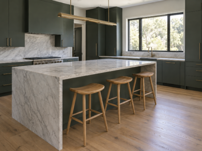
Run the Counter Material Straight Up the Wall
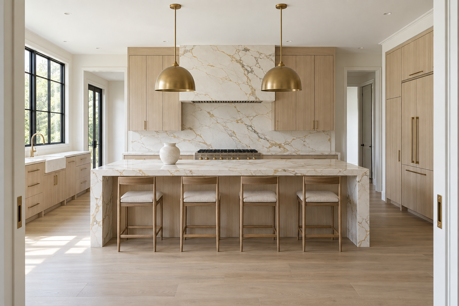
When a countertop is a slab with real veining, worth showing more of, continuing that same stone from the counter straight up the wall does something a separate backsplash material never could. The seam where counter becomes wall nearly disappears, and the veining keeps moving instead of stopping and restarting in a different material.
This only works when the counter is genuinely expressive, a marble or quartzite with real movement, not a flat, uniform quartz. A characterless counter gains nothing from being repeated up the wall. It just becomes more of the same flat surface, twice.
Save the Mosaic for Just Behind the Range
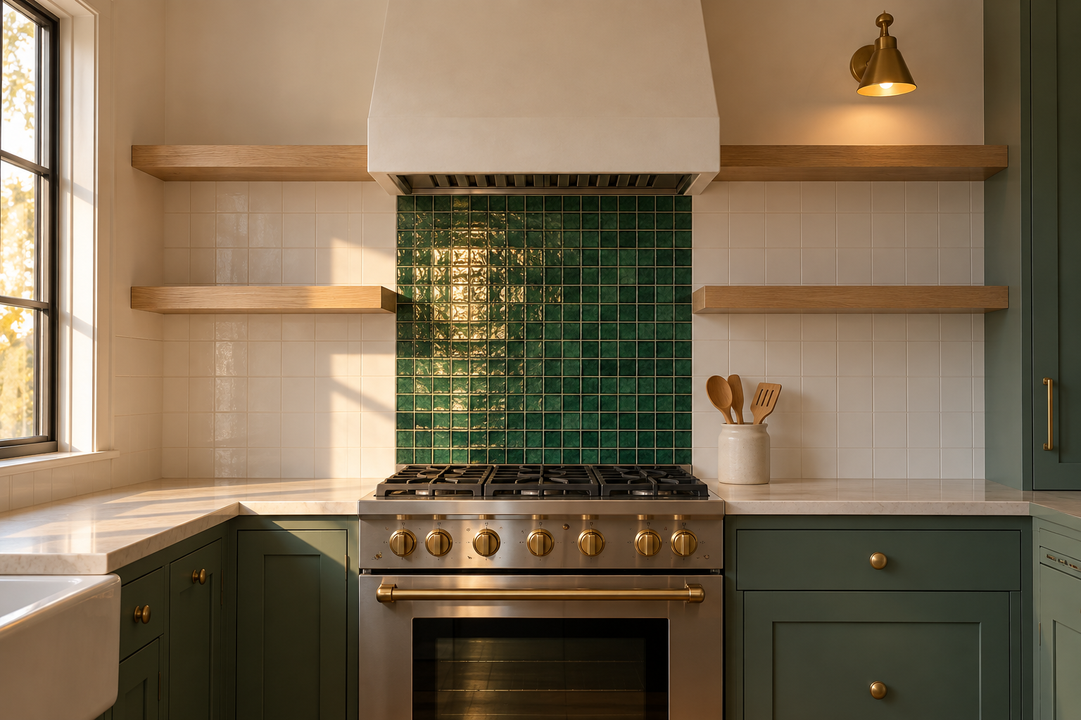
A mosaic across an entire backsplash wall turns busy fast, since the pattern repeats at a small scale over a large area. Containing it to one zone, directly behind the range, keeps the mosaic as a genuine focal moment instead of wallpaper. The surrounding wall runs in a plain field tile, so the mosaic reads as a considered insert rather than the kitchen’s whole personality.
Glass mosaic in a deep color catches range-hood task lighting in a way flat tile does not. Keep the zone roughly the width of the range itself. Wider than that, it stops reading as an accent and starts reading as an unfinished decision about where to stop.
Choose a Pattern Tile That Reads From Across the Room
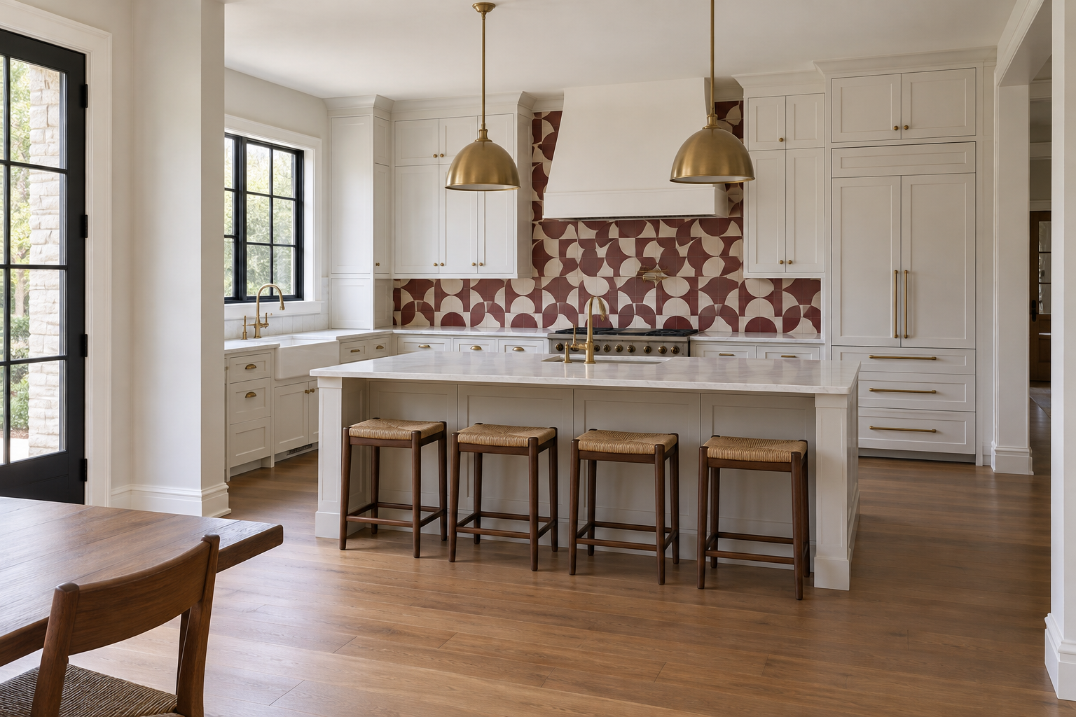
Subtle decorative details, a scalloped edge, a slight color shift, mostly get lost from normal kitchen sightlines. A genuine pattern tile, in a repeat large enough to register from the doorway rather than only up close, does not have that problem. A cement-look tile in a bold two-color geometric reads clearly from across an open kitchen or into an adjoining dining space, which a subtler texture never will.
Match the scale of the pattern to the wall: a large repeat for a full-height run, a smaller one for a narrow strip. Everywhere else in the kitchen, cabinetry, counters, hardware, should stay plain enough that the pattern stays the one thing doing visual work.
Let Dark Grout Do the Pattern Work
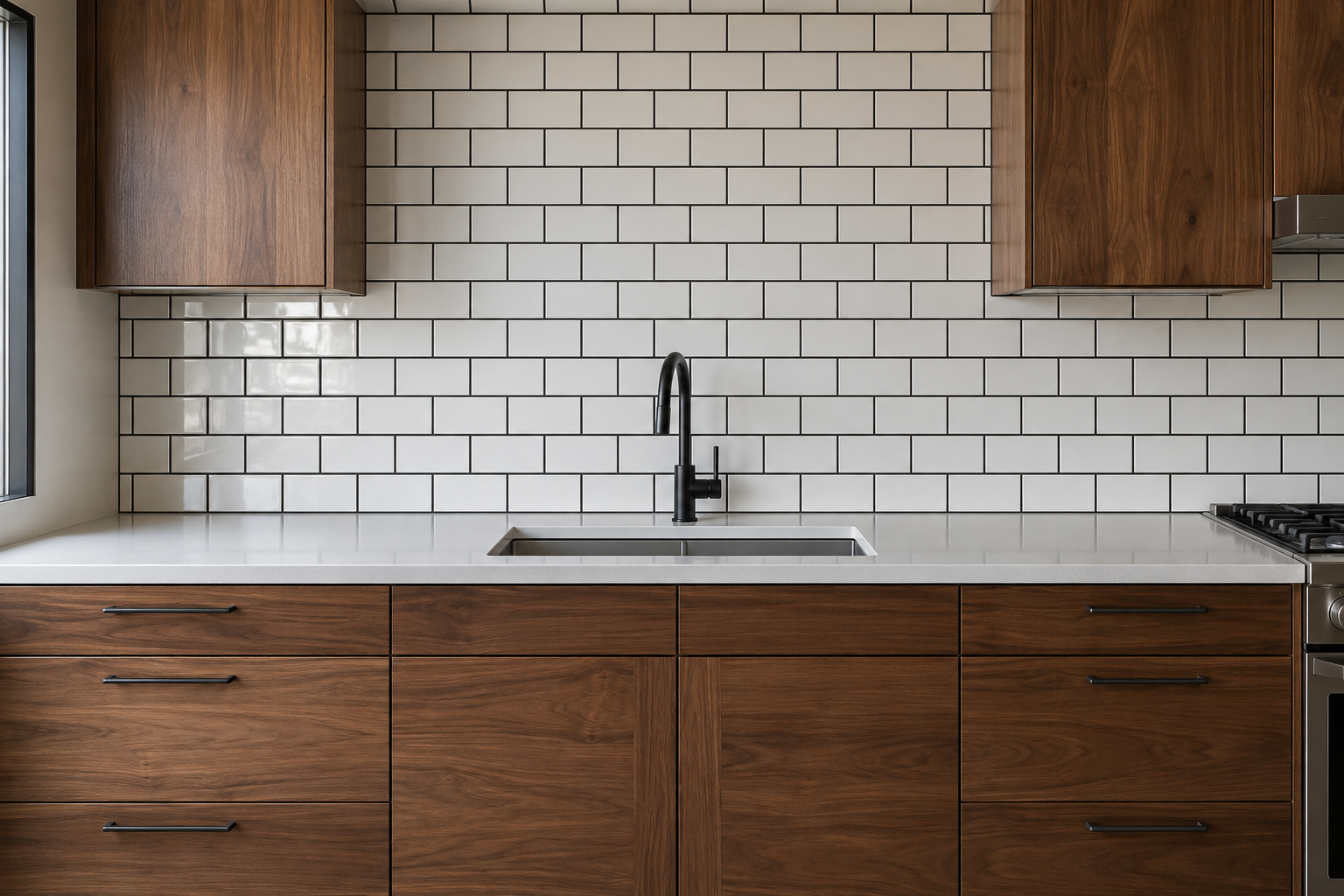
Grout color changes what a tiled wall reads as more than the tile color does, especially with a small-format tile like subway or hexagon, where grout lines run frequently across the surface. Pairing a plain, pale field tile with charcoal or black grout turns a quiet material choice into a graphic one, since the grid itself becomes the visible pattern instead of the tile.
This costs nothing extra over a matching light grout and needs no different tile, only a different order placed with the installer. Dark grout does show mineral haze and cleaning residue more visibly on a light tile than a matching grout would, so it asks for more regular wiping near the range specifically. Grout color is its own full decision, separate from the tile itself.
Wrap the Tile Into a Window Reveal
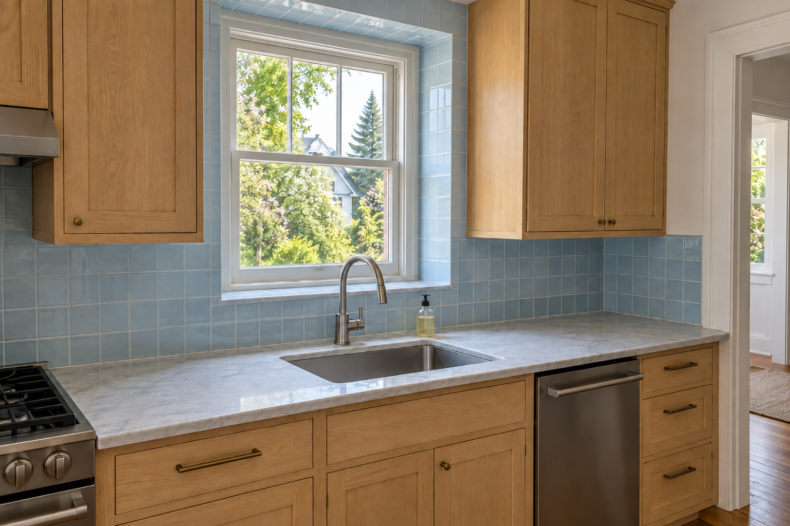
A window over the sink usually stops the backsplash tile at its own frame, leaving the reveal, the recessed sides and sill, in plain painted drywall. Carrying the same tile into that reveal removes the interruption and makes the window read as part of the tiled wall instead of a hole cut into it.
This works best with a tile thin enough to wrap a narrow reveal cleanly, a slim ceramic rather than a thick slab that would eat into the window’s actual daylight opening. Most kitchens skip this because it takes more cutting and a more careful installer, not because it looks worse finished. It rarely does.
Hang a Mirror or Glass Panel Instead of Tile
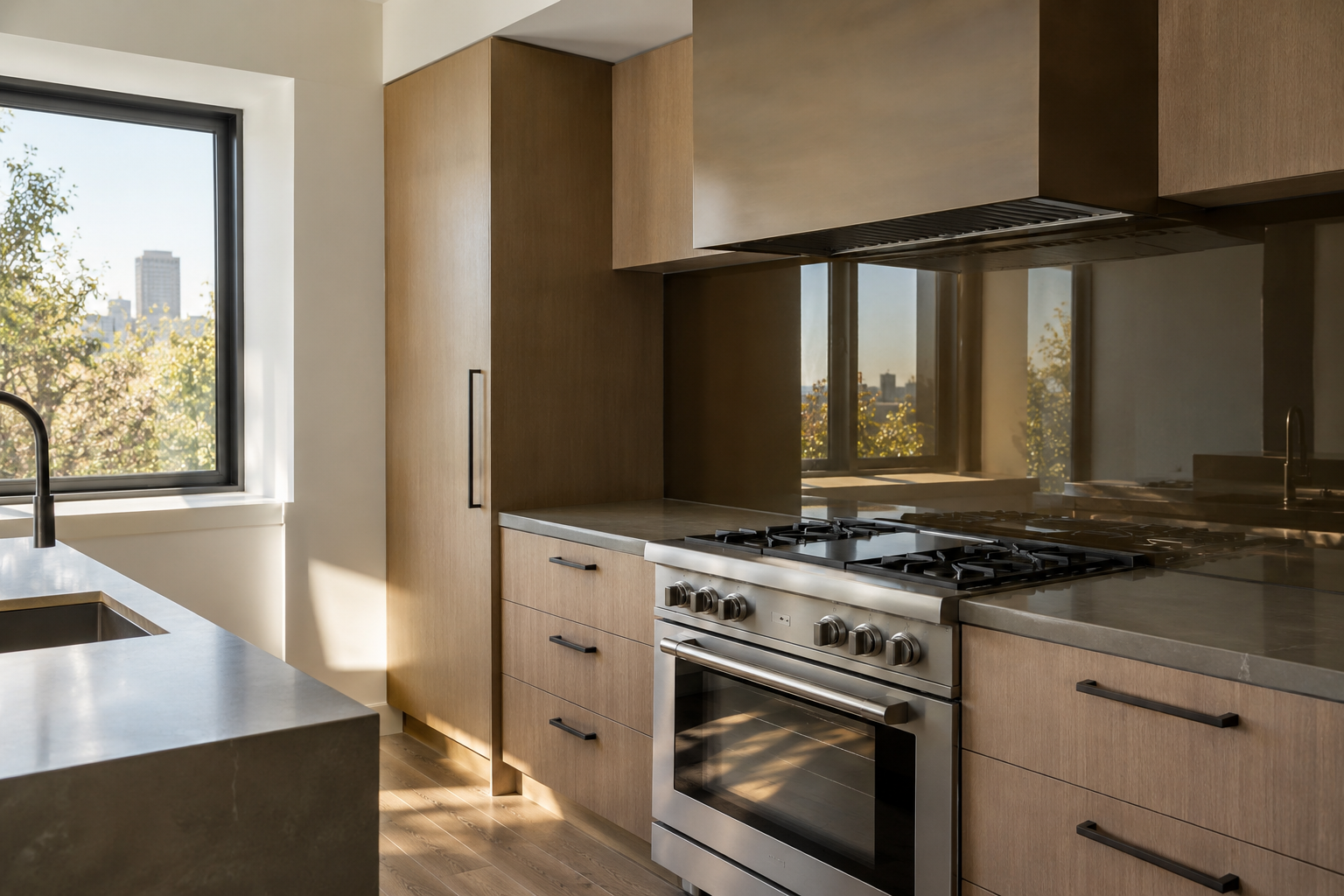
Tile is not the only material that qualifies as a backsplash. A panel of antiqued mirror or smoked glass, mounted the same way tile would be, reflects the room and the window light behind the cook rather than absorbing it, which makes a smaller or darker kitchen read noticeably more open.
Bronze or smoked glass avoids the sharper, more clinical look a clear mirror panel can have in a kitchen specifically, and it hides splatter better than a bright mirror finish would. This is a material for a kitchen that already gets genuinely good natural light to reflect. A mirror panel in a dark, north-facing kitchen mostly reflects more darkness back at the room.
Choose Terracotta for a Warmth Paint Can’t Match
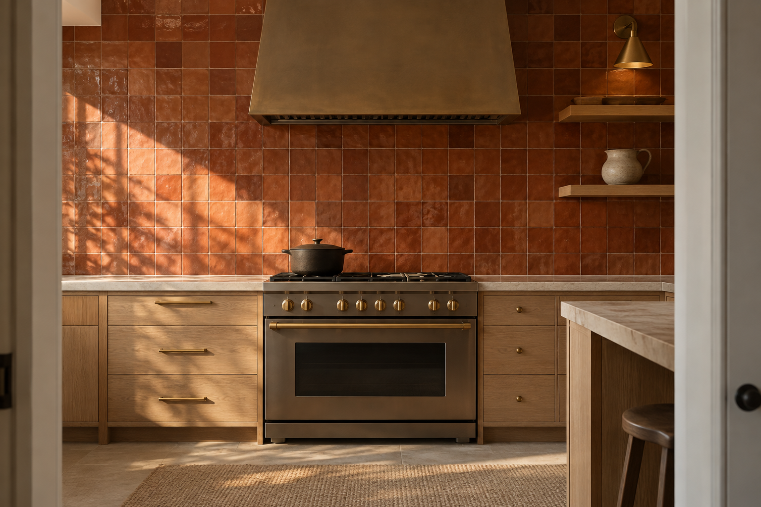
Warm paint can approximate the color of terracotta. It cannot approximate the way real terracotta tile, especially a handmade or lightly glazed version, shifts in tone across its own surface and catches afternoon light differently than a flat painted wall does. The material carries the variation, not a color choice layered onto a neutral tile underneath.
Terracotta reads warmest against white oak or pale plaster, materials that let its own orange-brown undertone lead rather than compete with a second warm tone nearby. It is a strong, specific choice, not a neutral one, so a kitchen already carrying a lot of warm wood should weigh whether it wants a second warm note or a cooler counterpoint instead.
Let One Patterned Wall Replace the Need for Art
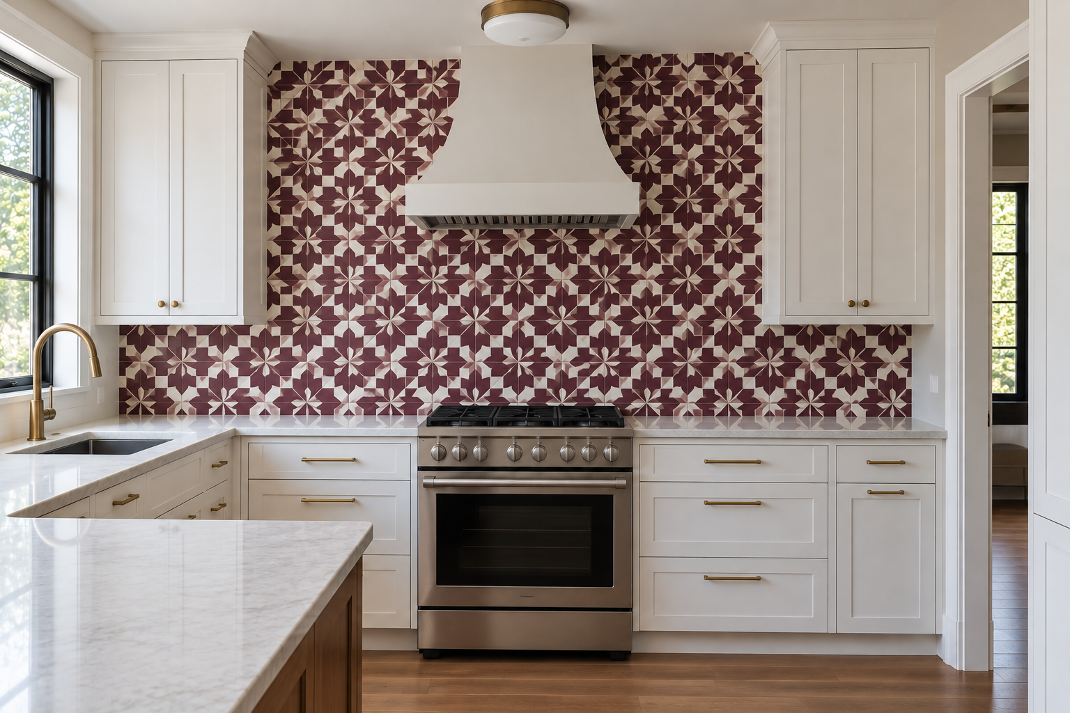
A kitchen rarely has much wall space for actual artwork once cabinetry, windows, and appliances take their share, so most kitchens end up with none at all. A genuinely bold patterned tile wall solves that differently, by making the backsplash itself the room’s one real visual statement instead of leaving that job to a wall that was never going to get one anyway.
This works specifically when the pattern is strong enough to stand alone, a deep plum tile in a clear geometric repeat, not a subtle texture that would still have needed art nearby to feel finished. Everywhere else in the kitchen can stay genuinely plain once this decision is made. It has already done the room’s one necessary decorating job.
Keep the Tile White and Let the Grout Disappear
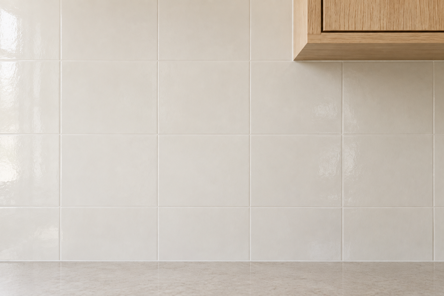
Not every kitchen needs its backsplash to be the loudest decision in the room. A plain white tile, paired with a grout in the same or a very close tone, lets the joints nearly disappear into the field, so the wall reads as one quiet, continuous surface rather than a grid.
This is the choice for a kitchen where the real material statement already lives somewhere else, a stone island top, a strong cabinet color, so the backsplash’s job is to stay out of the way rather than add a second competing decision. It is a genuinely different intention from the plain white tile that shows up by default when no decision gets made at all, and it should read that way.
Choose a Textured Tile When You Want Depth, Not Color
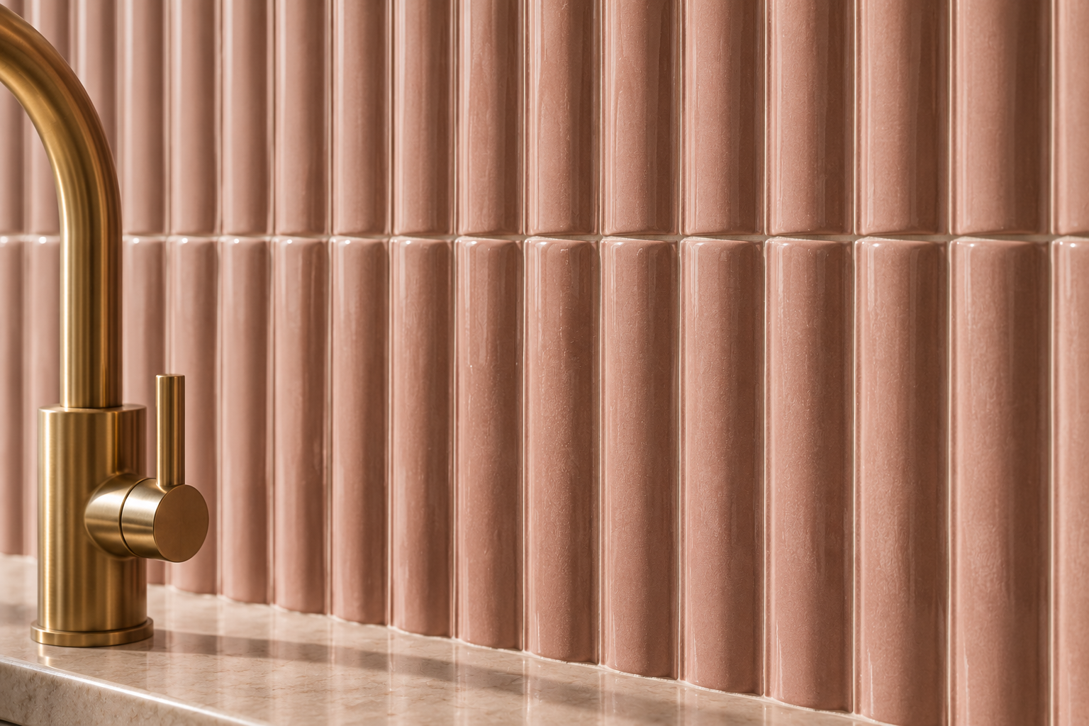
Depth in a backsplash does not have to come from color or pattern. A dimensional tile, fluted, scalloped, or gently ribbed, creates real shadow lines as light moves across it through the day, so the wall changes character morning to evening without changing color at all. This suits a kitchen that already has a confident palette elsewhere and wants texture rather than another color decision competing for attention.
Keep the tile in a single soft, close tone so the dimension itself stays the point, rather than getting flattened out by too much contrast with the grout or the surrounding cabinetry.
Carry the Tile Around a Corner Instead of Stopping at One
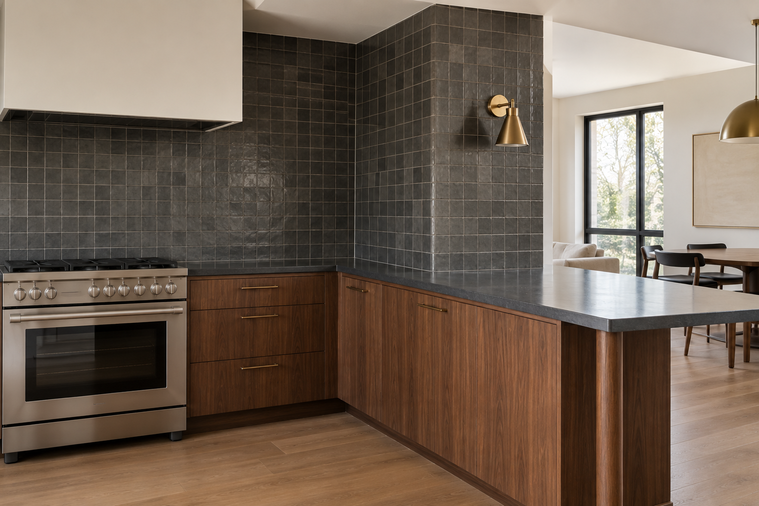
Most kitchen tile stops where the counter run stops, at an inside corner or the edge of a peninsula, leaving an abrupt seam where tile meets plain wall. Continuing the same tile around that corner removes the seam and makes the kitchen read as one considered material decision rather than a backsplash that ran out of budget partway through.
This matters most in an open kitchen where that corner stays visible from the dining or living space, not tucked behind cabinetry where no one would see it end anyway. A kitchen with a genuinely closed-off corner, one that turns into a doorway or a run of upper cabinets, does not need this and can stop the tile cleanly at the counter’s edge instead.
Frequently Asked Questions
Does the backsplash material affect resale value?
A well-executed, non-trendy backsplash rarely hurts resale, but an extremely personal or high-maintenance choice can narrow the pool of buyers who would keep it as-is. A material-led backsplash in a widely appealing tone, white, a warm neutral, or a single confident color used with restraint, tends to read as a genuine upgrade rather than a future renovation project for whoever buys the house next.
Can two backsplash materials work in the same kitchen?
Yes, when they are assigned to different zones rather than mixed across the same wall. A mosaic accent behind the range paired with a plain field tile everywhere else is one version of this. A slab behind the range with tile continuing around the rest of the kitchen is another. What does not work is switching materials mid-wall with no architectural reason, a doorway, a corner, a change in counter height, marking where one stops and the other begins.