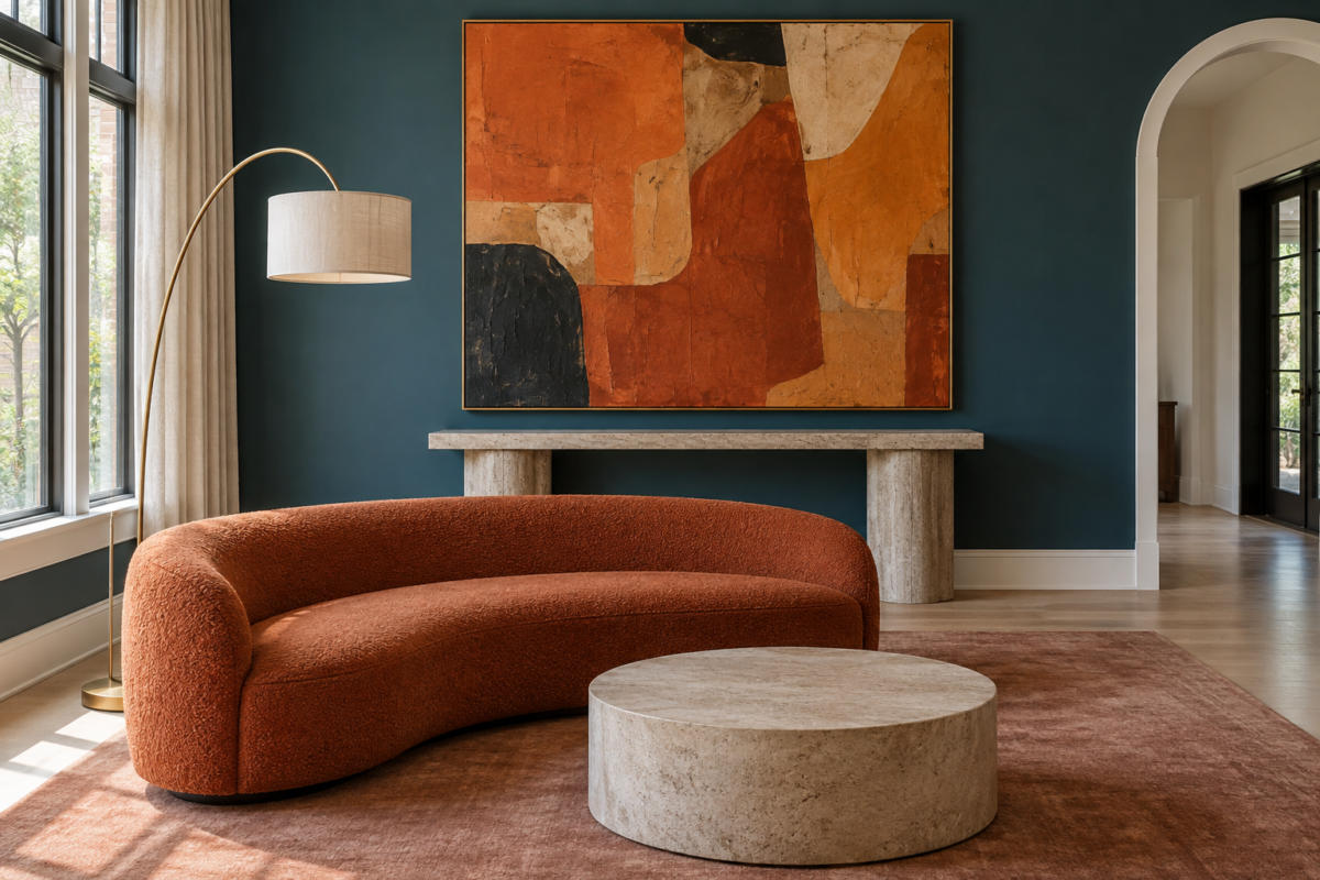
Wall art gets treated as an afterthought, something to fill space once the furniture is in. That’s backwards. A room’s whole mood often traces back to one piece on the wall, the color it introduces, the scale it commands, the mood it sets before anyone notices the sofa. The eighteen picks below cover real, different decisions: bold graphic color for a room confident enough to hold it, black and white photography for something quieter, a multi-piece gallery set for a stairwell that needs several smaller moments instead of one big one, sculptural and woven pieces for texture over flat color. None of these are interchangeable. Each one solves a specific room, budget, or style question, and the guidance below explains which is which.
Five of these stood out enough to shortlist first. The full set, with the reasoning behind each pick, follows below.
Shop Our Top Picks
Contemporary Orange and Teal Wall Art
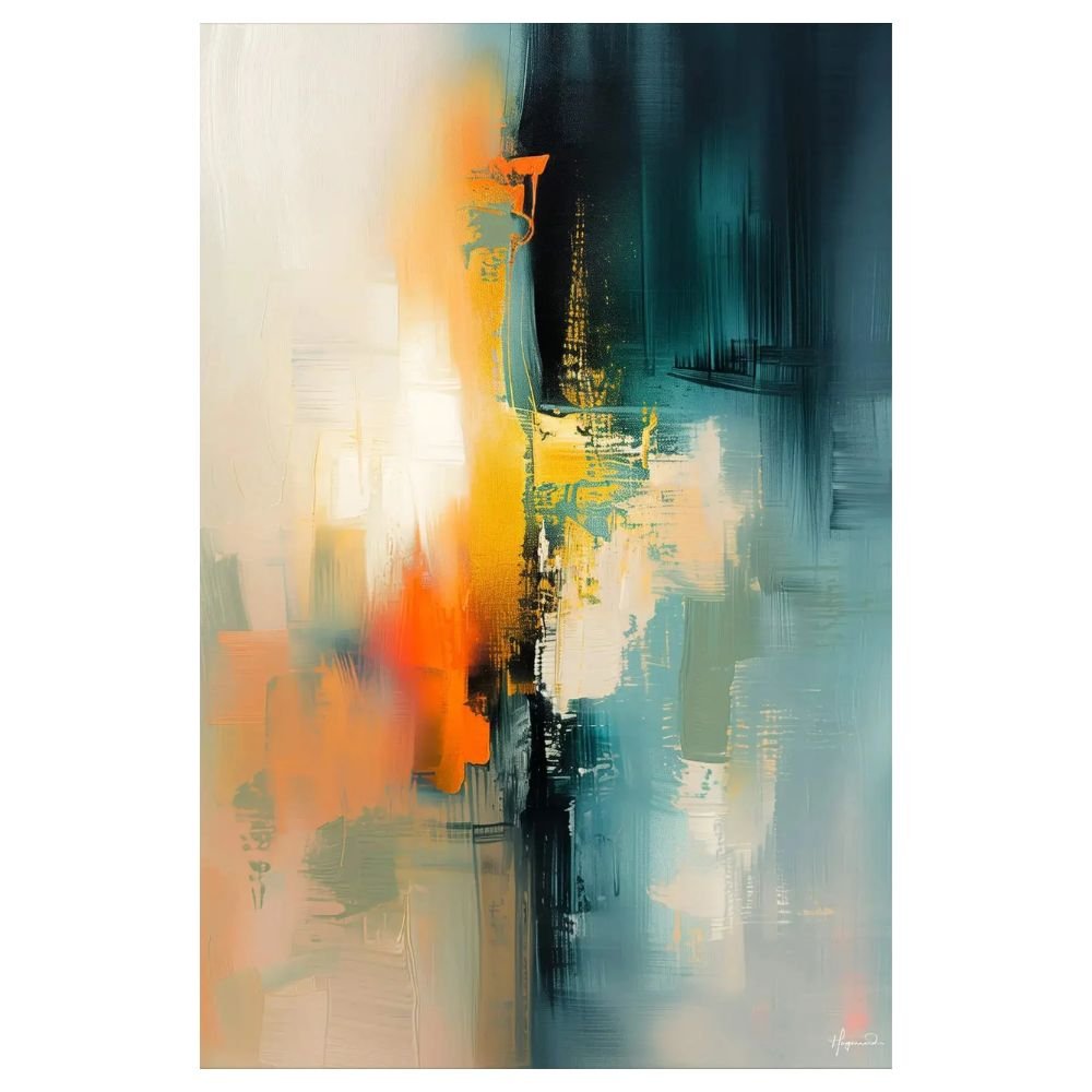
A confident abstract built around warm orange and cool teal, the kind of piece that sets a room’s color story before the furniture does. It works best as the single bold move in an otherwise calm space, a living room or entry where the walls stay neutral and the seating can stay quiet. Keep upholstery and rugs simple nearby so the art carries the color, not a competing pattern.
Cool Blue and Yellow Abstract Sunset Art
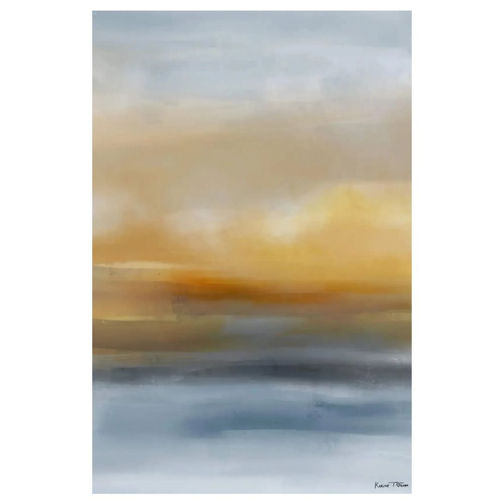
Same bold-abstract idea as the piece above, built on a different palette: cool blues against warm yellow instead of orange and teal. It suits a room that wants graphic energy without warmth, a home office or a north-facing room that could use some visual heat. White or pale oak furniture keeps the contrast clean. Darker wood would muddy it against this palette.
Sand Wall Art
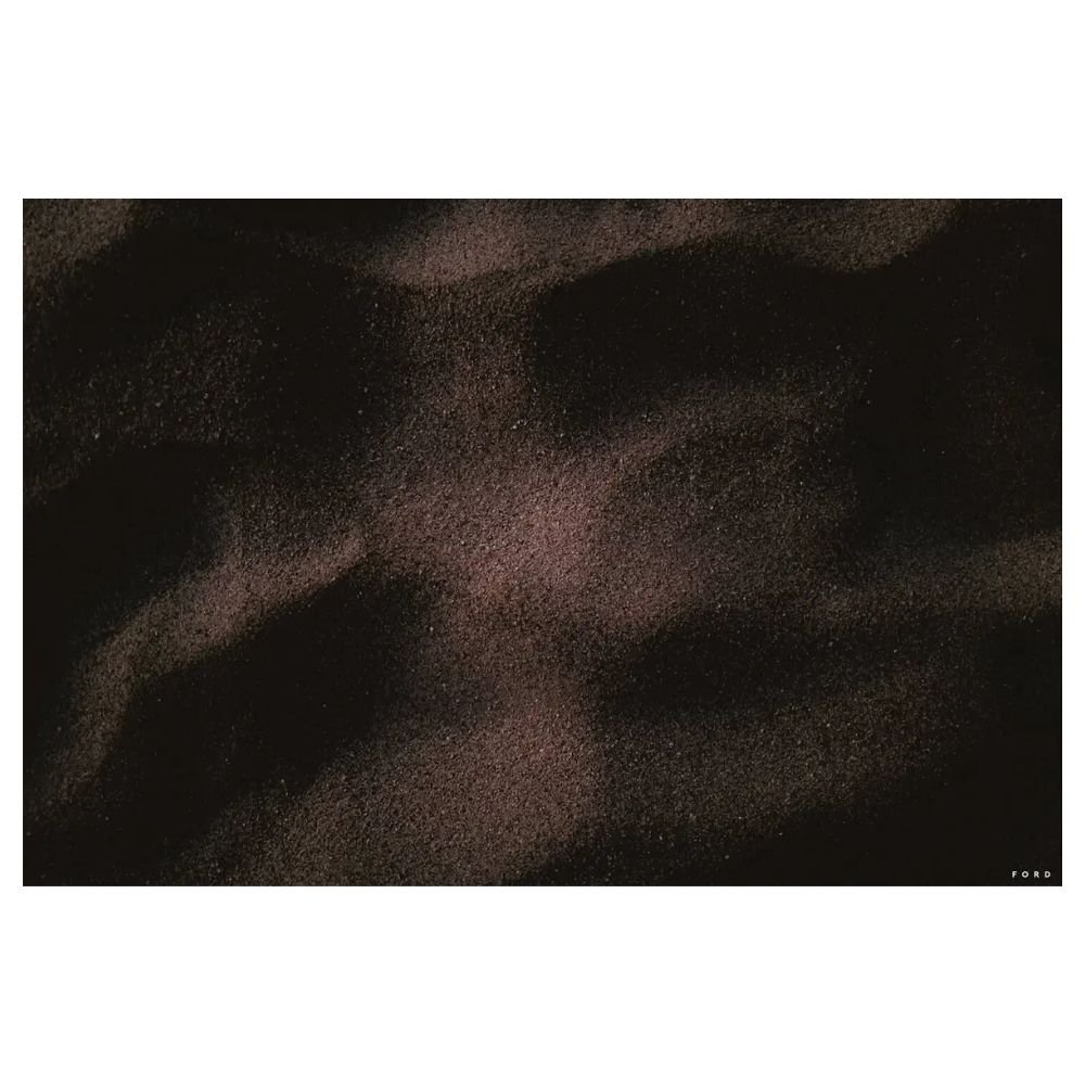
The most broadly useful piece on this list. Its warm, textural abstract in neutral sand tones reads as considered without locking you into a specific color scheme, which makes it the safer pick when the rest of a room’s palette isn’t settled yet. That flexibility is the reason it tops this roundup, not any single standout design detail.
Minimal Blue Scribble Lines Wall Art
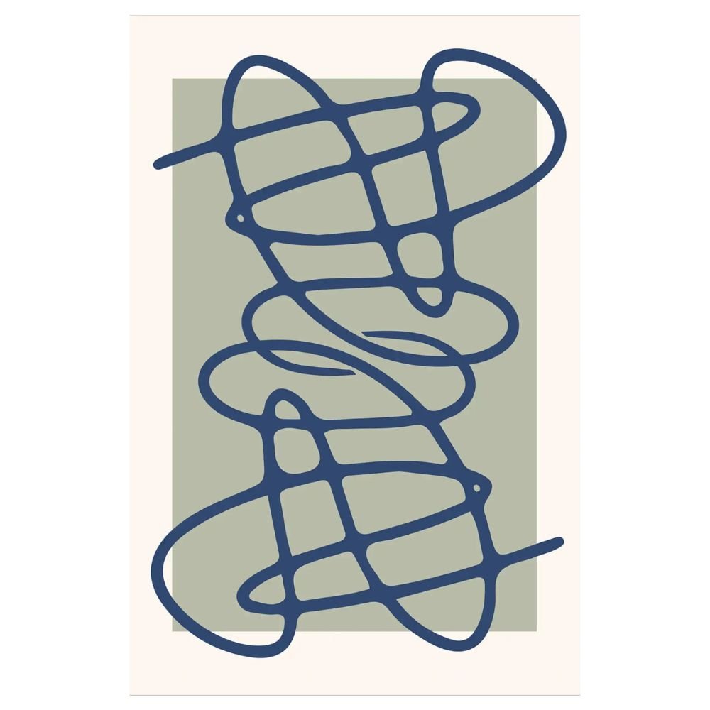
A line-art piece, loose blue scribbles on a white ground, for a wall that shouldn’t carry heavy visual weight. It suits a hallway, a reading nook, or above a desk, spots where a large solid-color abstract would dominate more than the room needs. The white background keeps it light, so it earns its place in a room that already has color or pattern elsewhere.
Coral Pink Floral Botanical Art
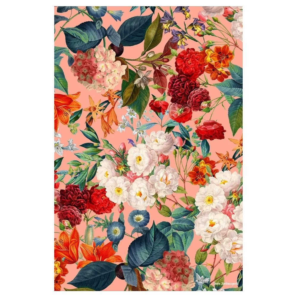
A graphic floral in coral and pink, scaled and saturated enough to read as abstract from across the room, not literal. It brings warmth to a bedroom or powder room without tipping into fussy florals, provided the wall gets to carry the room’s one statement rather than compete with patterned bedding or wallpaper.
Retro Teal Floral Botanical Print
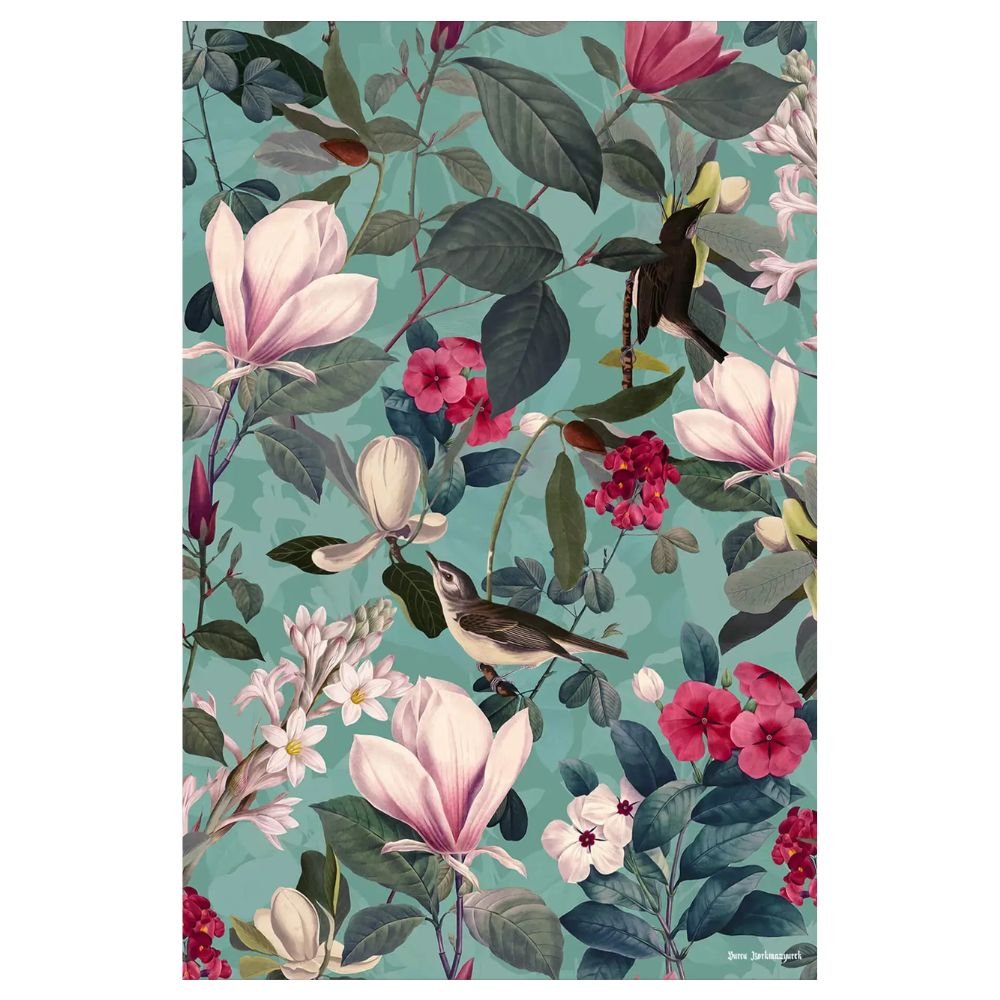
The cooler counterpart to the coral piece above, a retro-styled floral in teal and green. It belongs in a room already leaning blue or green, a kitchen nook or sunroom, where the botanical subject and the cool palette both make sense in the same breath. The retro styling gives it more personality than a plain floral print, useful when the rest of the room stays fairly quiet.
Black Forest III, Floral Art Print
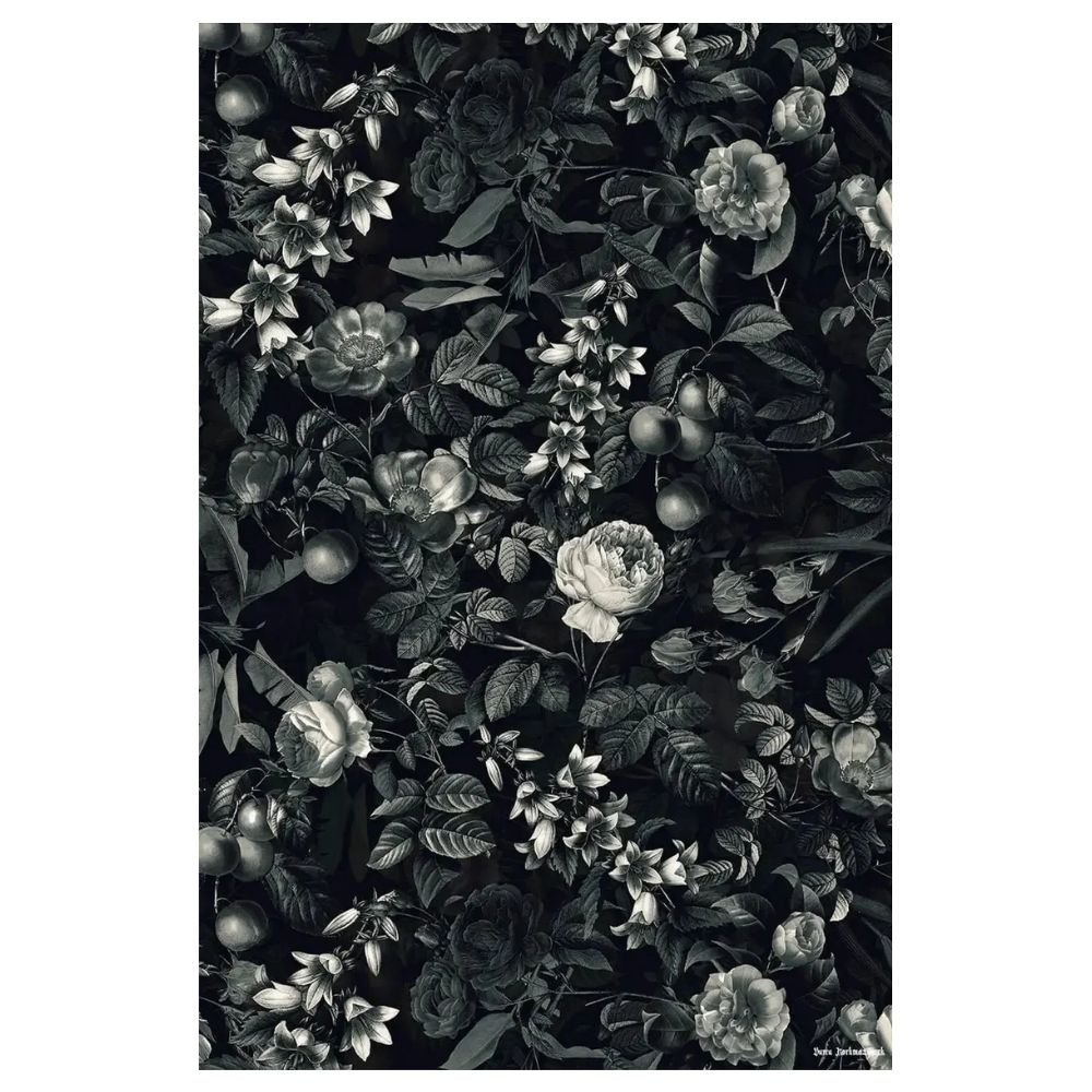
A monochrome floral in black and white, not color, for a room that wants the botanical subject without adding a new hue to work around. It’s the most flexible of the three floral pieces here for exactly that reason. It drops into an already-settled color scheme and adds texture without anything new to match.
Watercolor Mountain Range
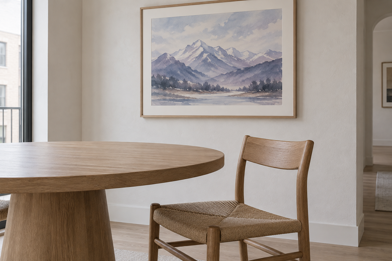
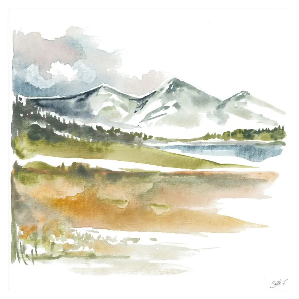
A softer, painterly landscape in cool blues and lilacs, with visible brushwork that sets it apart from the photography elsewhere on this list. Watercolor reads as quieter and more intimate than a photographic print of the same subject would, which suits a bedroom or dining nook that wants a calm anchor over a bold statement.
Black White Manhattan Skyline Photography
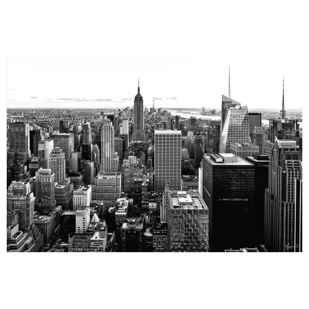
A large-scale black and white cityscape, strong in a home office, media room, or any space after an urban, editorial mood. The monochrome treatment stays out of the way of whatever color scheme is already in the room, while the subject gives it a specific point of view a generic abstract wouldn’t have. It needs real wall space to read as large-format photography rather than a squeezed-in print.
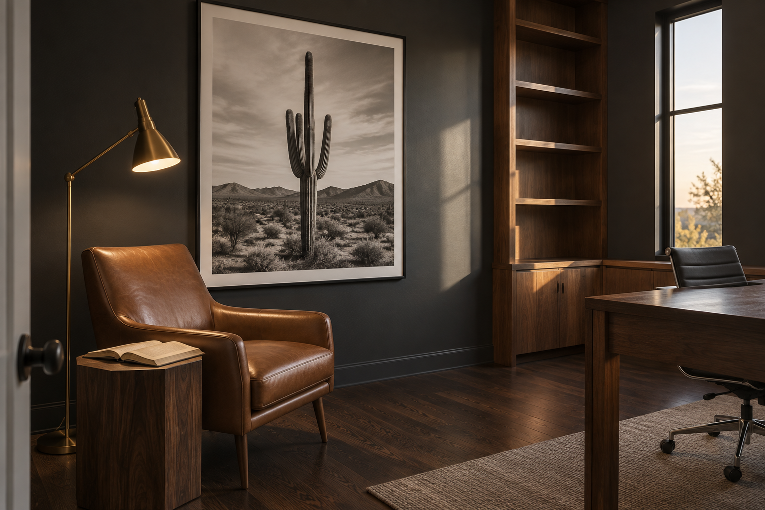
Black White Saguaro Cactus Photography
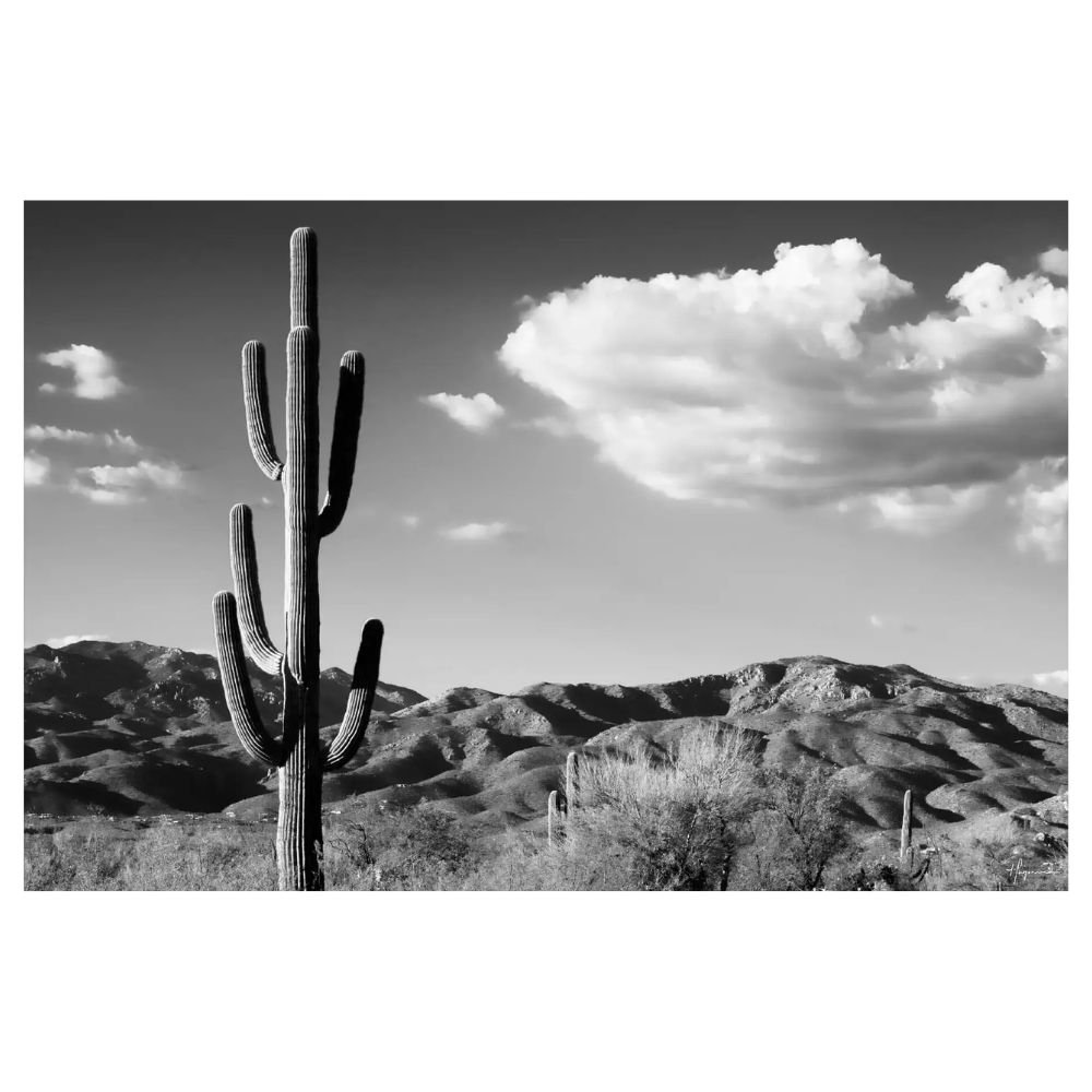
The desert counterpart to the skyline piece above, same black and white treatment, different subject and a quieter mood entirely. Where the skyline reads urban and graphic, this one suits a reading nook or bedroom better than a high-traffic room. Its subject is different enough from the skyline that both can live in the same house without feeling repetitive.
Vancouver Island Mountain Landscape
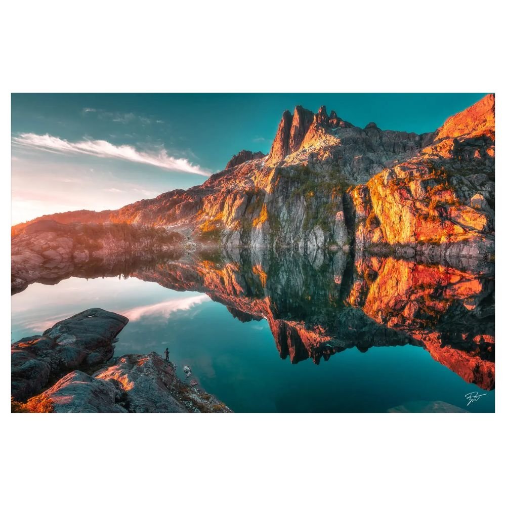
A large color landscape, mountains and water in natural tones, built to anchor a room the way a great piece of furniture does. It’s the pick for a living or dining room that wants one unmistakable focal point and has the wall space to let a big photograph breathe. Its natural palette plays well with wood tones and greenery without needing the rest of the room to go neutral.
Pastel Beach Wall Art
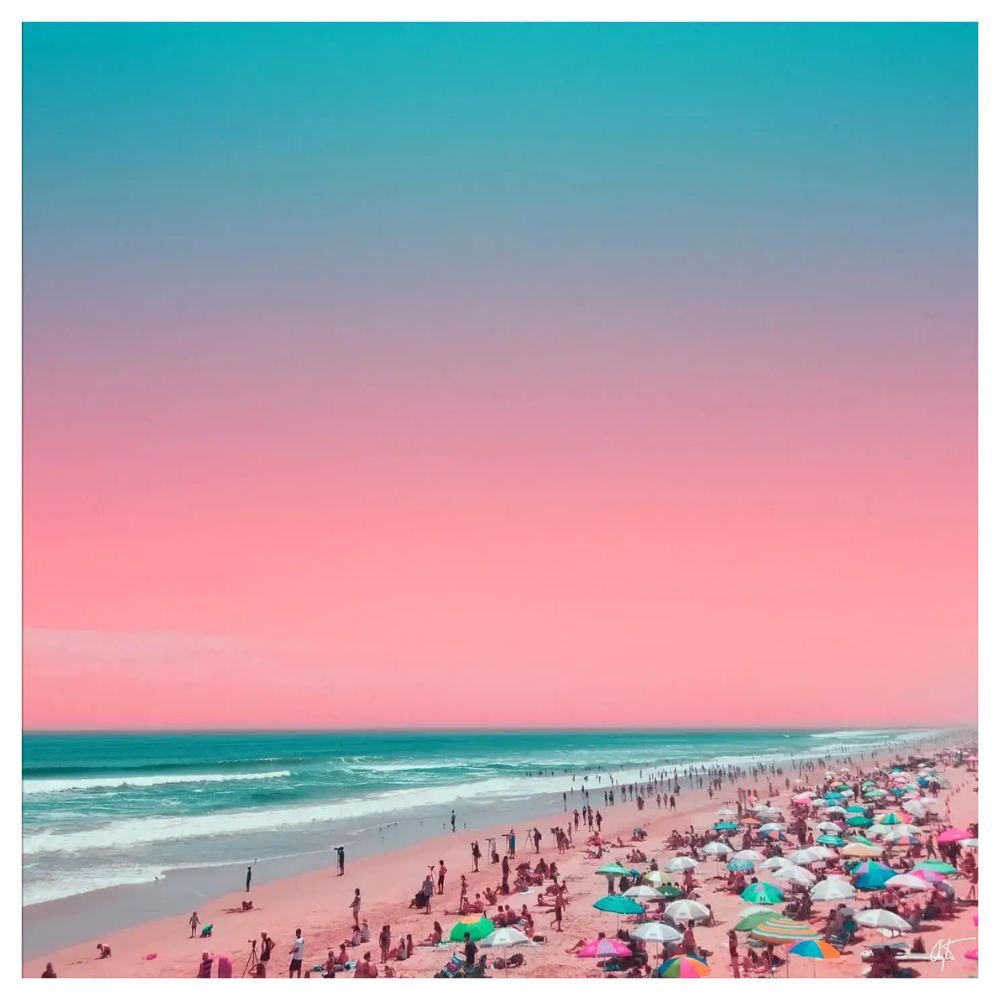
A coastal piece in soft pastel tones, the gentlest palette in this list. It suits a room after calm rather than impact, whether that’s a primary bedroom, a nursery transition space, or a reading corner. Because the palette is so pale, it works best against a wall that isn’t already busy, where the piece can stay the visible detail on its own.
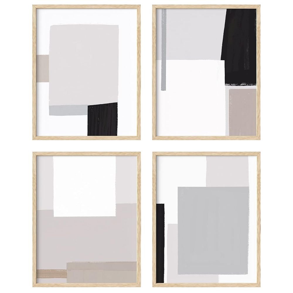
HAUS AND HUES Abstract Minimalist Wall Art, Set of 4
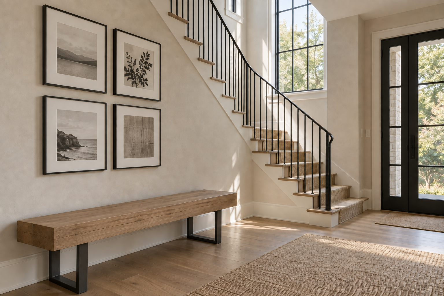
A four-piece framed set in black, white, and grey, the only multi-piece option on this list and the least expensive way to fill a large wall. Instead of one big statement, it spreads interest across several smaller frames, which suits a stairwell, entry, or long hallway better than a single large piece. The neutral palette also makes it the easiest pick to drop into a room with an already-set color scheme, since it won’t compete with anything already there.
“You Are My Sunshine” Nursery Canvas Print
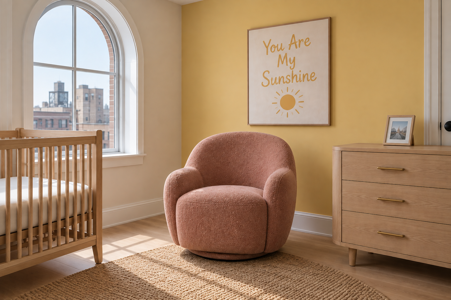
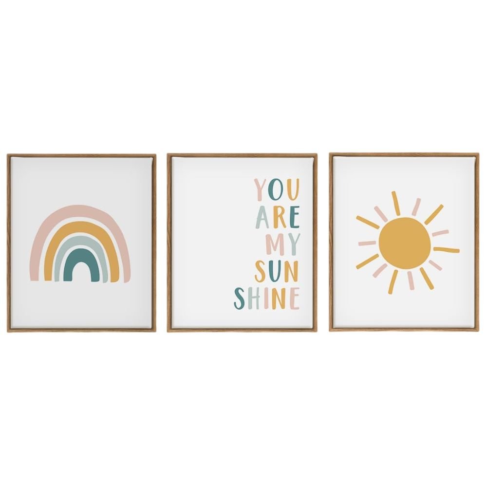
A quote-style canvas built specifically for a nursery or child’s room: simple text and a small graphic, not a busy illustration. It reads as considered rather than a mass-produced nursery cliché, which matters if you want the room to still feel decorated once your child outgrows the theme. Hang it at a child’s eye height near the glider or crib, not at standard adult sightline.
Empire Art Direct “Rugged Blocks” 3D Wood Wall Art
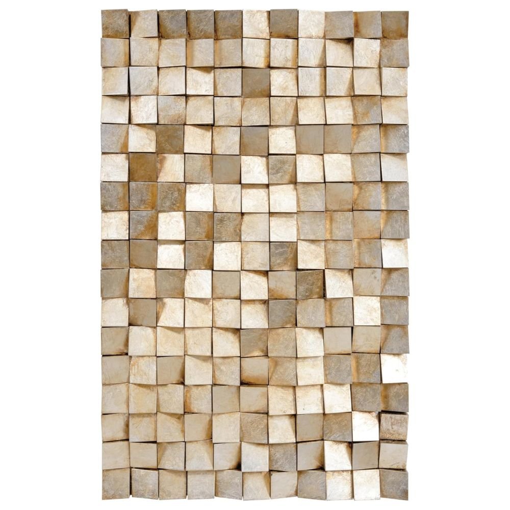
A dimensional wood piece with gold leaf accents, built with genuine physical depth, so it catches light differently through the day. It belongs in a room that already has strong flat art or photography and wants one piece with physical texture instead, a primary bedroom or a living room feature wall. At 48 by 30 inches it needs a wall to itself, not a shared gallery arrangement.
“Everything You Need” Inspirational Quote Art
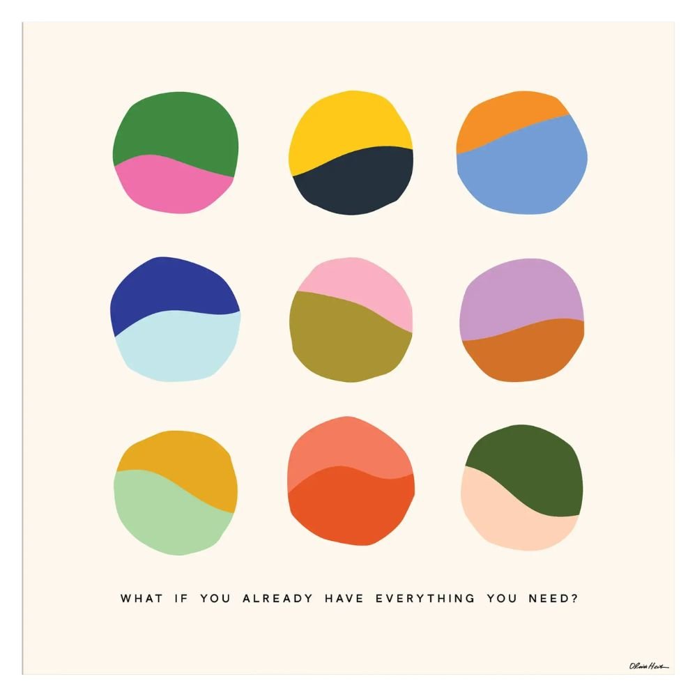
A text-driven piece with a quiet, reflective message instead of generic motivational language, the only quote art here besides the nursery canvas. It suits a reading nook, home office, or bedroom, somewhere the sentiment has room to land. Plain typography keeps it from reading as twee, the main risk with quote art generally.
Mid Century Modern Metal Wall Art, Starburst/Atomic Geometric Sculpture

A sculptural cut-metal starburst, the only dimensional metal piece on this list and a different silhouette entirely from every flat print here. It belongs in a room leaning mid-century or eclectic modern, where a period-appropriate shape does more for the space than another framed print would. Solid iron construction gives it real physical weight and shadow, the kind of presence a flat print can’t fake.
Flber Macrame Wall Hanging, Boho Tie-Dye Tapestry
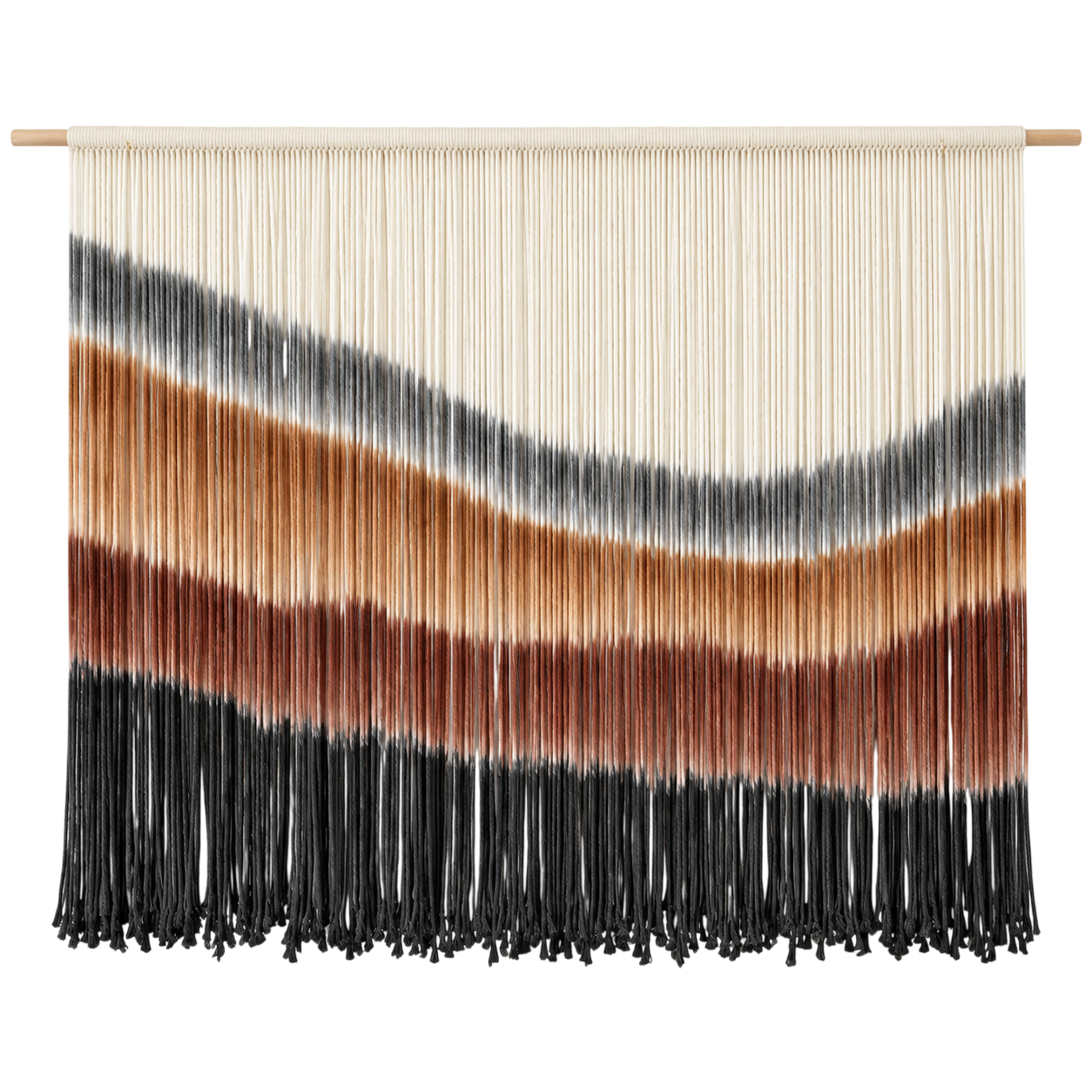
A large woven macrame piece in an ombre tie-dye colorway, the only fiber-based art here and a texture nothing else on this list has. It suits a boho or organic-modern room, over a bed or a sofa, somewhere the woven fringe can read clearly against a plain wall. At close to five feet wide, it covers real wall space for the price, useful when you’re filling a large area on a smaller budget.
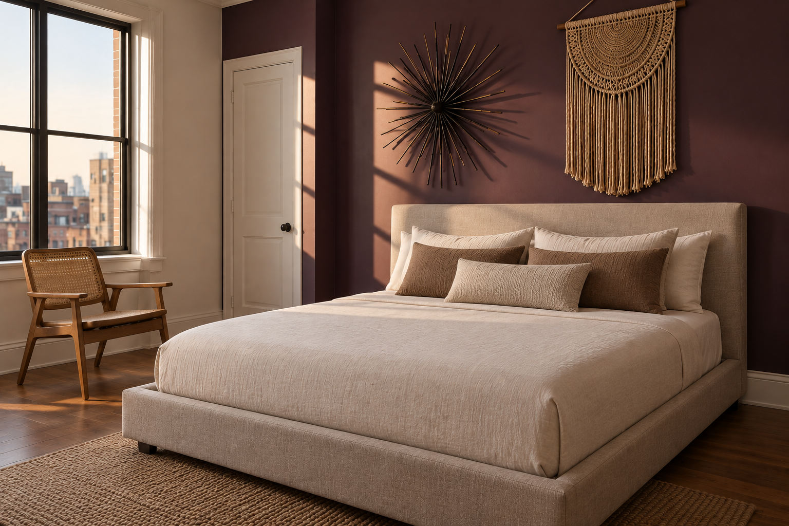
What to Look For When Buying Wall Art
A few things matter more than personal taste once you’re actually choosing a piece.
Medium changes how a piece reads in a room. Canvas and framed prints are the most flexible, working in nearly any style of room and holding up well over time. Metal and acrylic prints have a harder, more reflective surface, which can pick up glare near a window but reads as more contemporary. Dimensional pieces, wood, woven fiber, sculptural metal, add texture and shadow that a flat print can’t, which matters most in a room that already has plenty of flat art or photography and needs real contrast, not more of the same.
Scale relative to the wall matters more than most people expect. A piece that looks large in a product photo can read as undersized once it’s actually on a big wall. As a rough guide, art works best filling roughly two thirds of the available wall space above a piece of furniture, not floating in a sea of blank wall or crowding the ceiling. If a single piece can’t cover that much space affordably, a multi-piece set like the HAUS AND HUES framed grid above solves the same problem differently.
Single piece or gallery set comes down to the wall itself. A tall stairwell or a long hallway usually suits several smaller pieces better than one large one, since the eye needs several stopping points along the way rather than one distant focal point. A single large piece works best on a contained wall where it can be the room’s one clear statement.
Once you’ve settled on a piece, where it hangs is its own decision. Our guide to getting the hanging height right covers the standard eye-level and above-furniture rules in more detail.
If you want one piece that works almost anywhere, start with Sand Wall Art or the Vancouver Island Mountain Landscape, both flexible enough to anchor a room without a settled color scheme. If you’re filling a stairwell or an awkward long wall, the HAUS AND HUES framed set solves a problem a single piece can’t. For a nursery, the You Are My Sunshine canvas is built for the room rather than borrowed from a general collection. And if your walls already have plenty of flat art or photography, the Empire Art Direct wood piece, the metal starburst, or the macrame hanging add the physical texture a print can’t.
Skip the bold color picks if your room’s palette isn’t settled yet. Color-forward abstracts like the orange and teal or the blue and yellow pieces work best as a deliberate choice, not a placeholder while you figure out the rest of the room.